Opéra de Paris

Streaming platform

Making the opera accessible to anyone thanks to a new streaming platform dedicated to culture.

  • End-to-end design
  • Art Direction

Expertise

UI/UX Design

Responsive Design

Art Direction

Design team

  • Visual artworks & logo by Bruno Landowski

Timeline

  • 2023 — Made at Mazarine agency

Context

Opéra de Paris launches Paris Opera Play (POP) to make its shows accessible to everyone, even to remote or disadvantaged audiences. POP offers a wide catalog of classics and contemporary productions, enriched each month with new shows available on replay or live, as well as exclusive content.

POP offers advanced features like navigation by act, playlist creation, availability on all screens, broadcast on external display and discovery mode inside a immersive video player.

The UX design seamlessly bridges the digital and physical realms of opera, enhancing user experience.

Below are highlights of my contributions as a UX/UI designer alongside Bruno Landowski, my designer peer during the project.

An opera and culture gateway

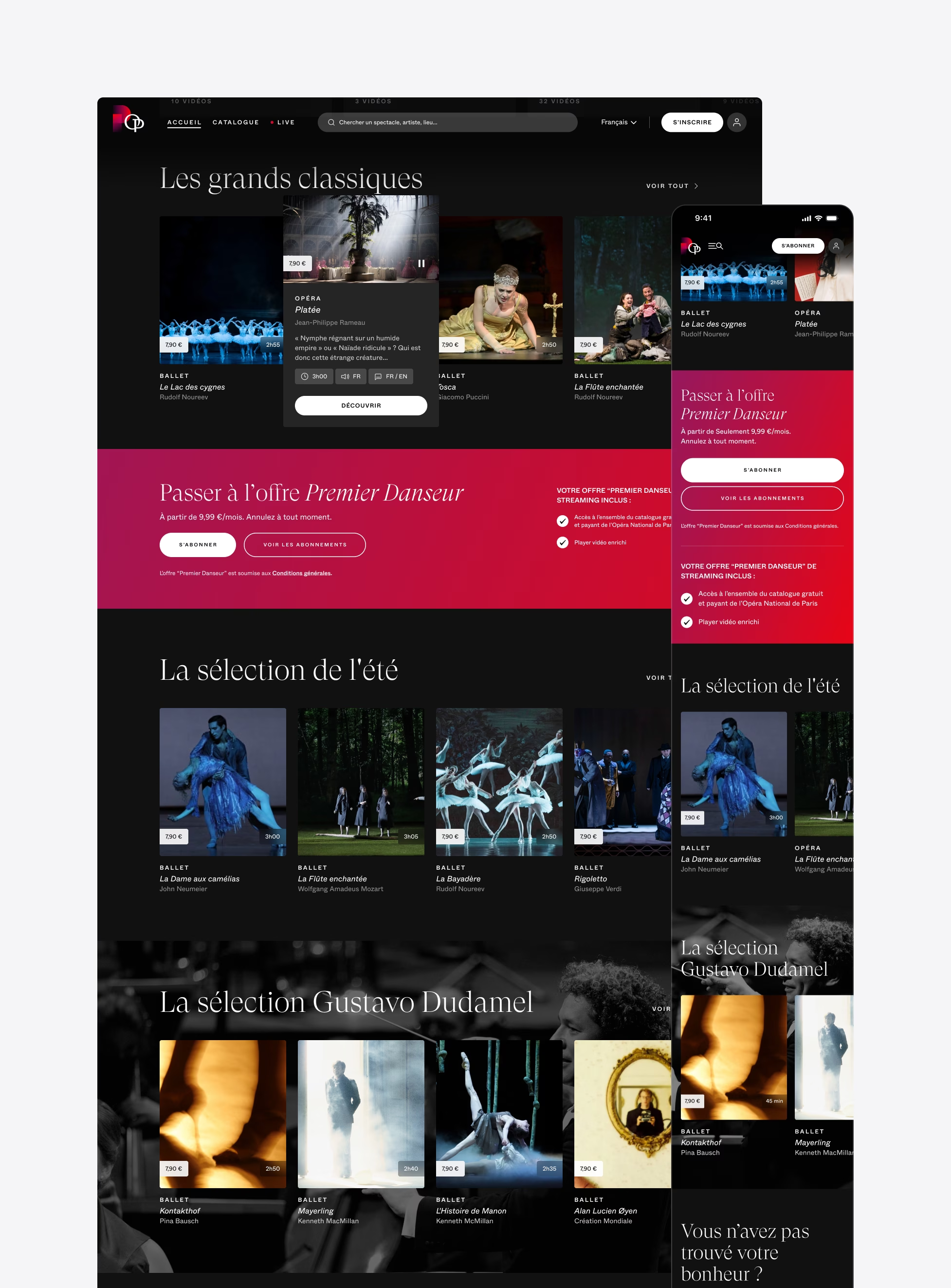
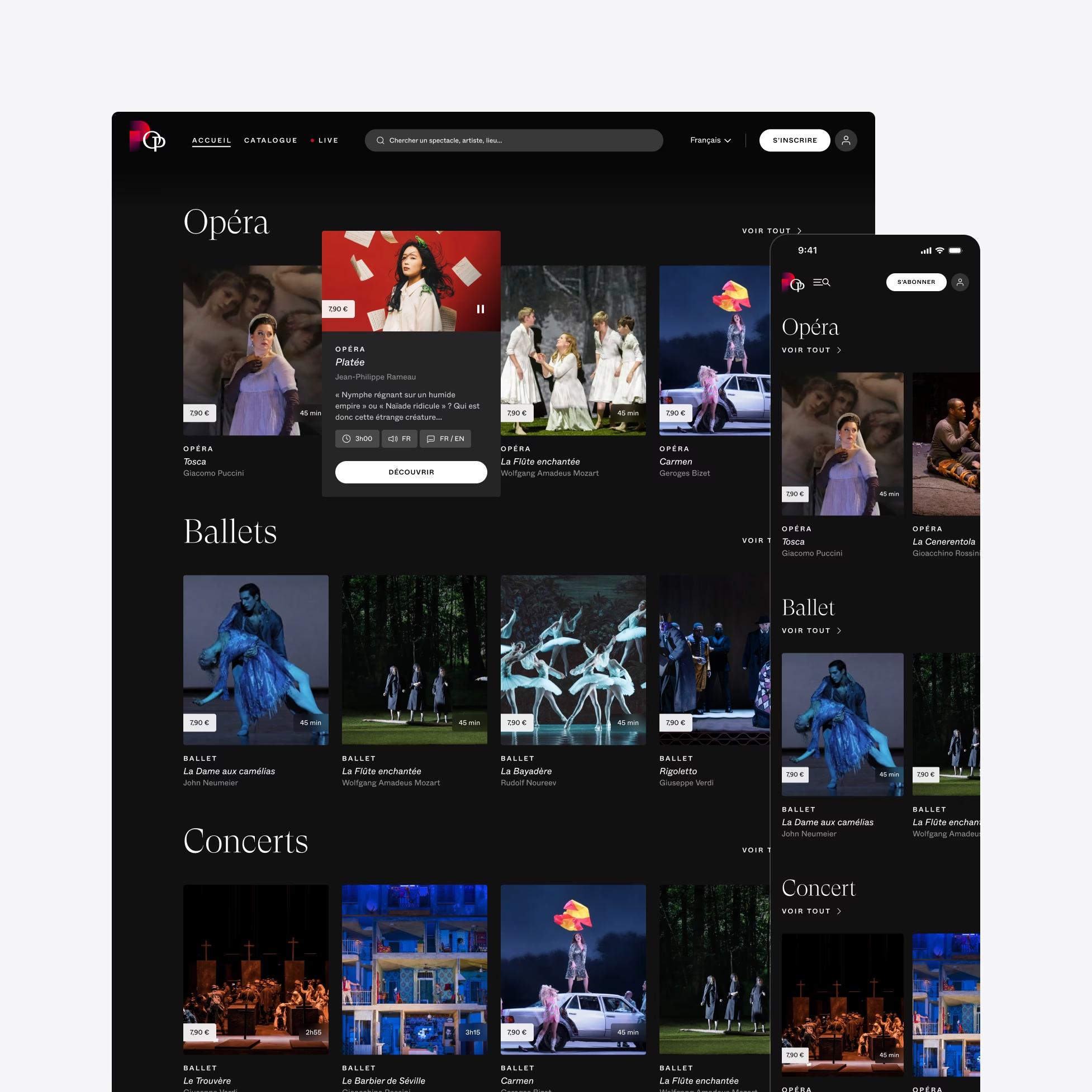
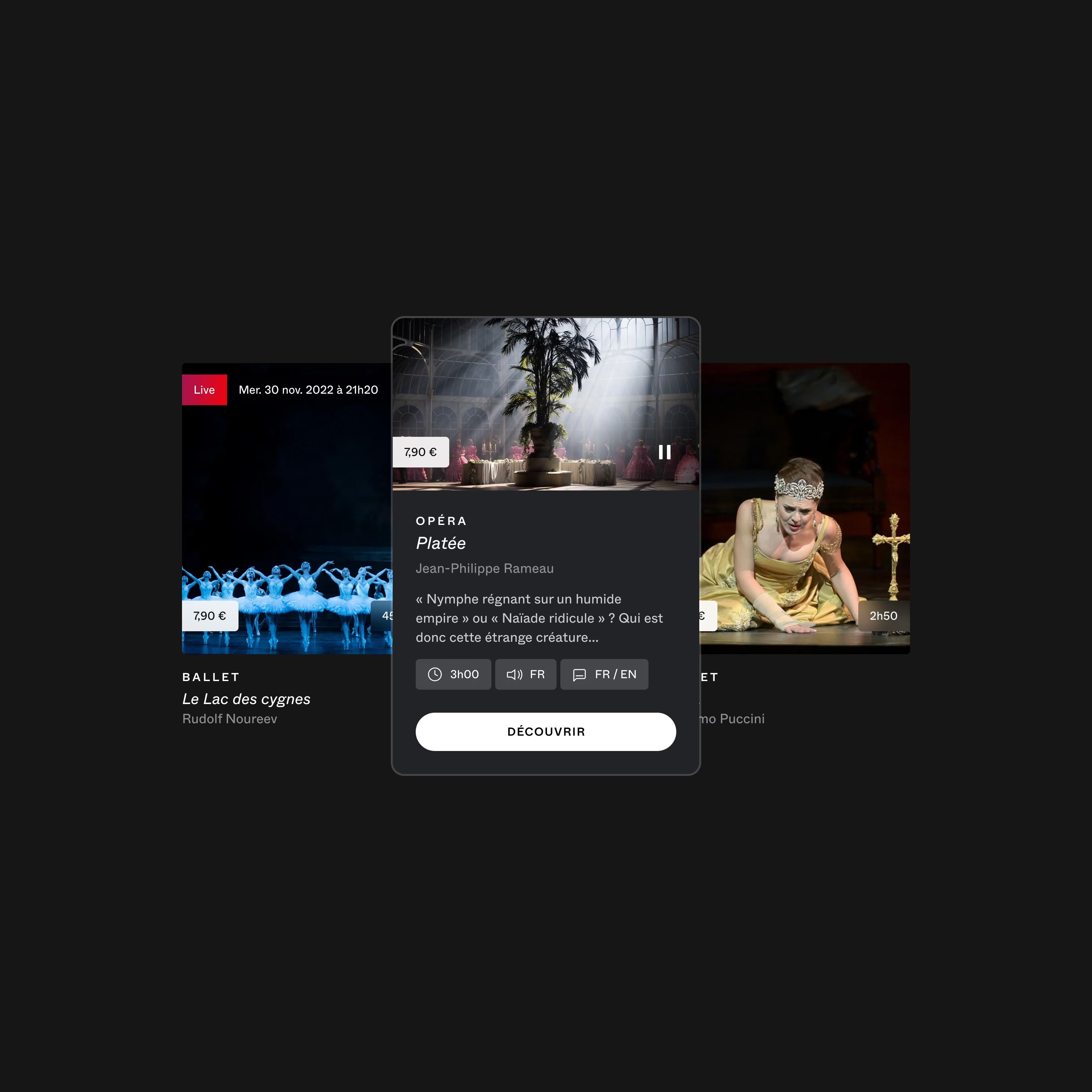
Rhythmed from the homepage to each show detail pages with a strong art direction and immersive look and feel that align with Opéra de Paris DNA, Paris Opéra Play serves as a gateway to the world of opera, providing an accessible experience for all audiences.
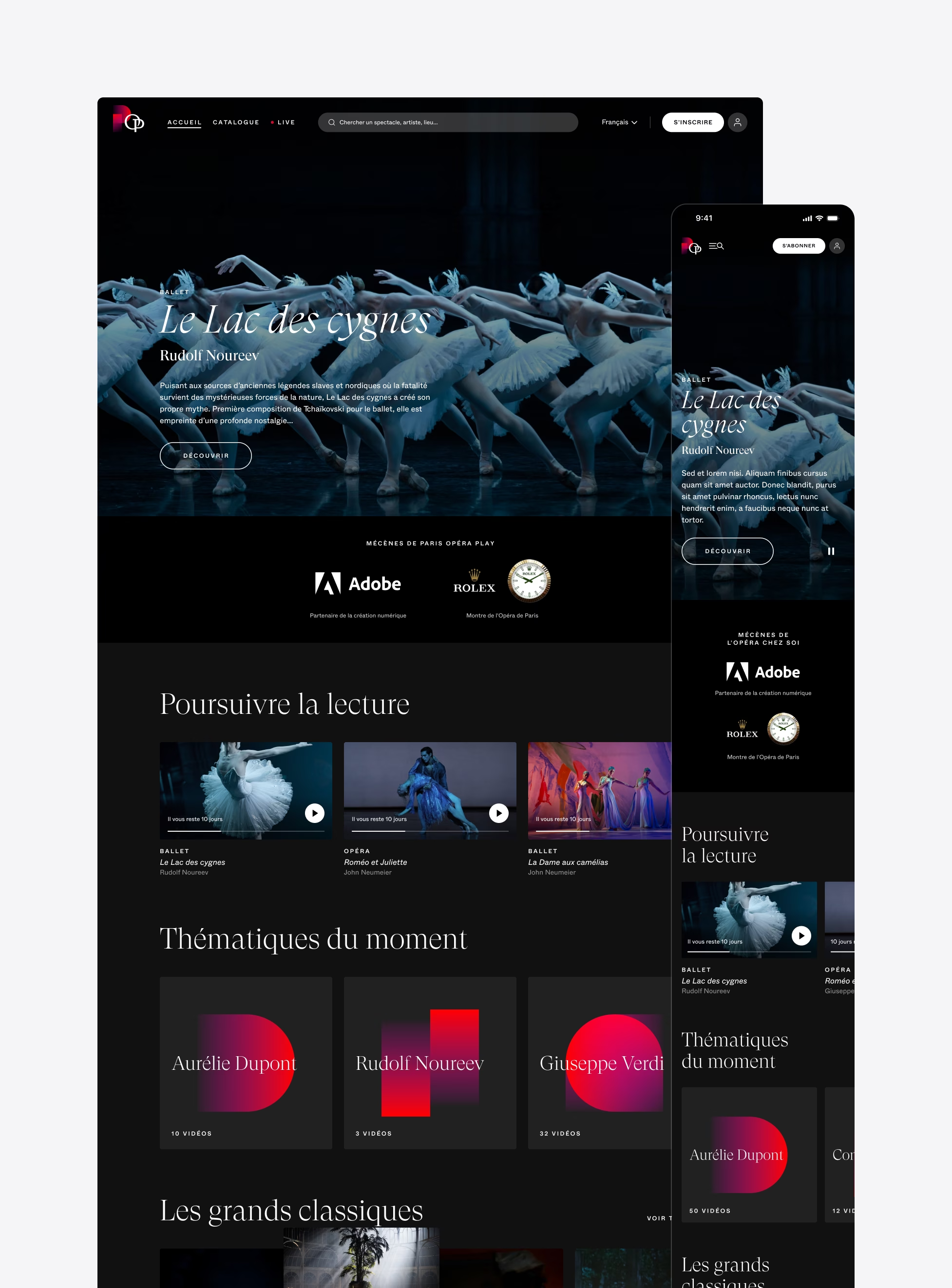
Screenshot of a website showcasing 'Le Lac des cygnes' (Swan Lake) with ballet dancers in the background. Sections include 'Poursuivre la lecture,' 'Thématiques du moment,' and 'Les grands classiques', containing articles and videos. The UI design is elegant, with Adobe and Rolex logos visible.
Screenshot of a music streaming web page showcasing various classical music playlists, categorized into sections like 'La sélection de l’été' and 'La sélection Gustavo Dudamel.' The dark-themed UI design features images of orchestras and musicians, along with multiple action buttons and navigation links for a seamless user experience.
A webpage displaying a selection of operas, ballets, and concerts, with a focus on a featured opera 'Phénix'. The sleek UI design showcases images from each performance with dark tones and minimalistic icons. A mobile version of the site is shown to the right, highlighting its responsive UX interface.

From screen to real

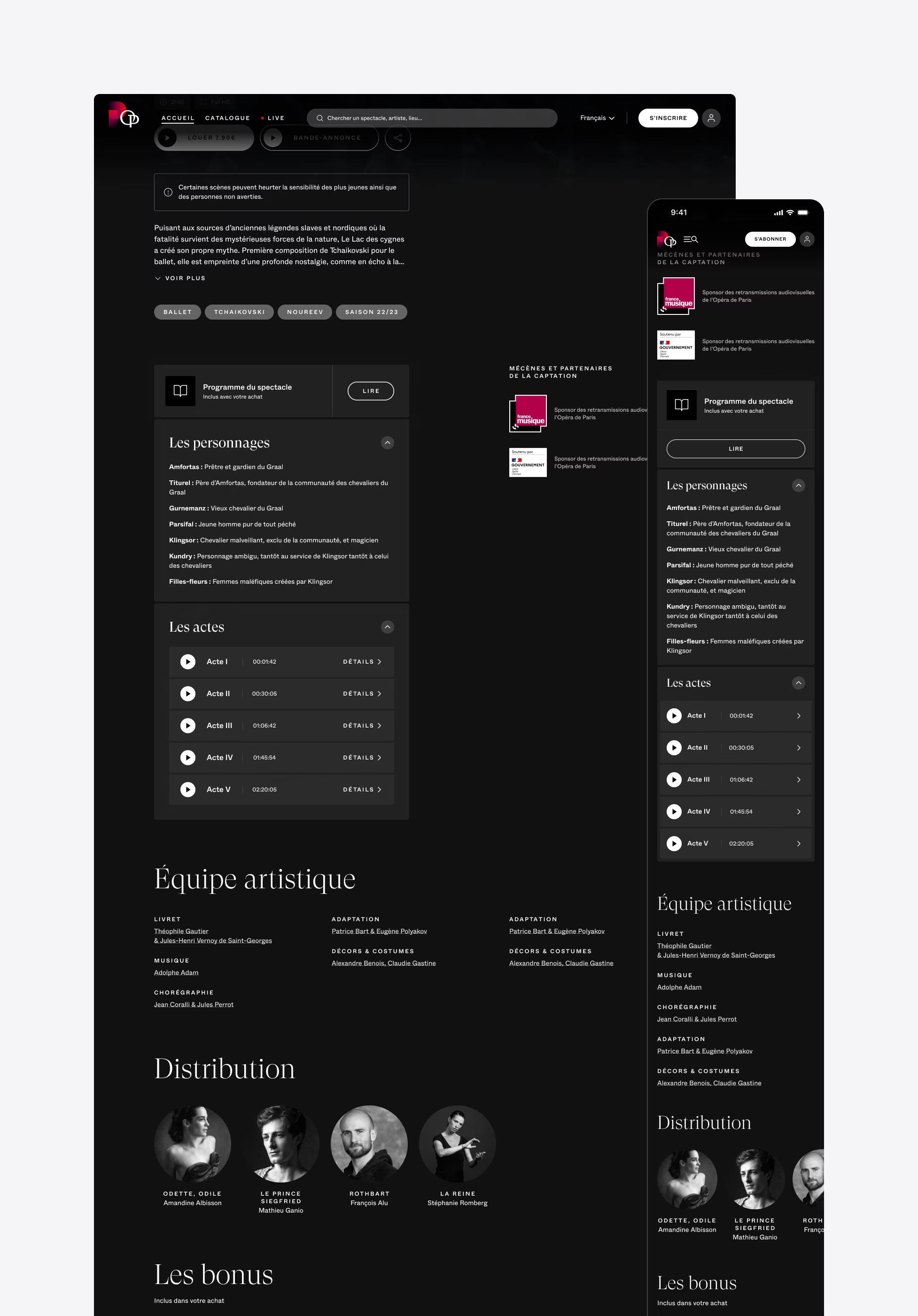
The spectacle page is where the magic happens. Here, you can delve into the details of each performance, access exclusive content such as podcasts and behind-the-scenes.

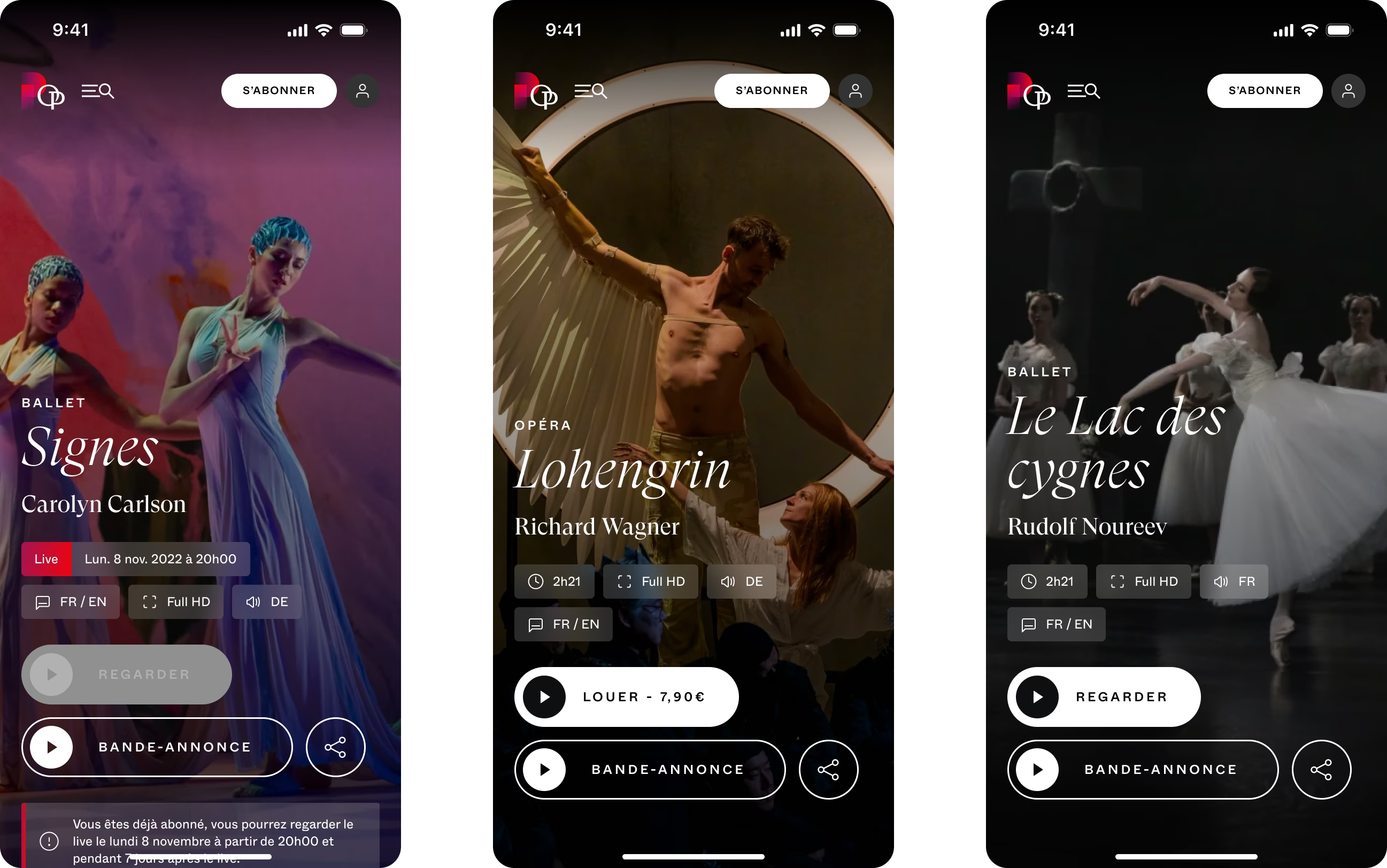
Navigating by acts make an opera or ballet approachable for users, and discover the dancers and actors who bring our ballets to life. This page seamlessly bridges the gap between the screen and the real spectacle.
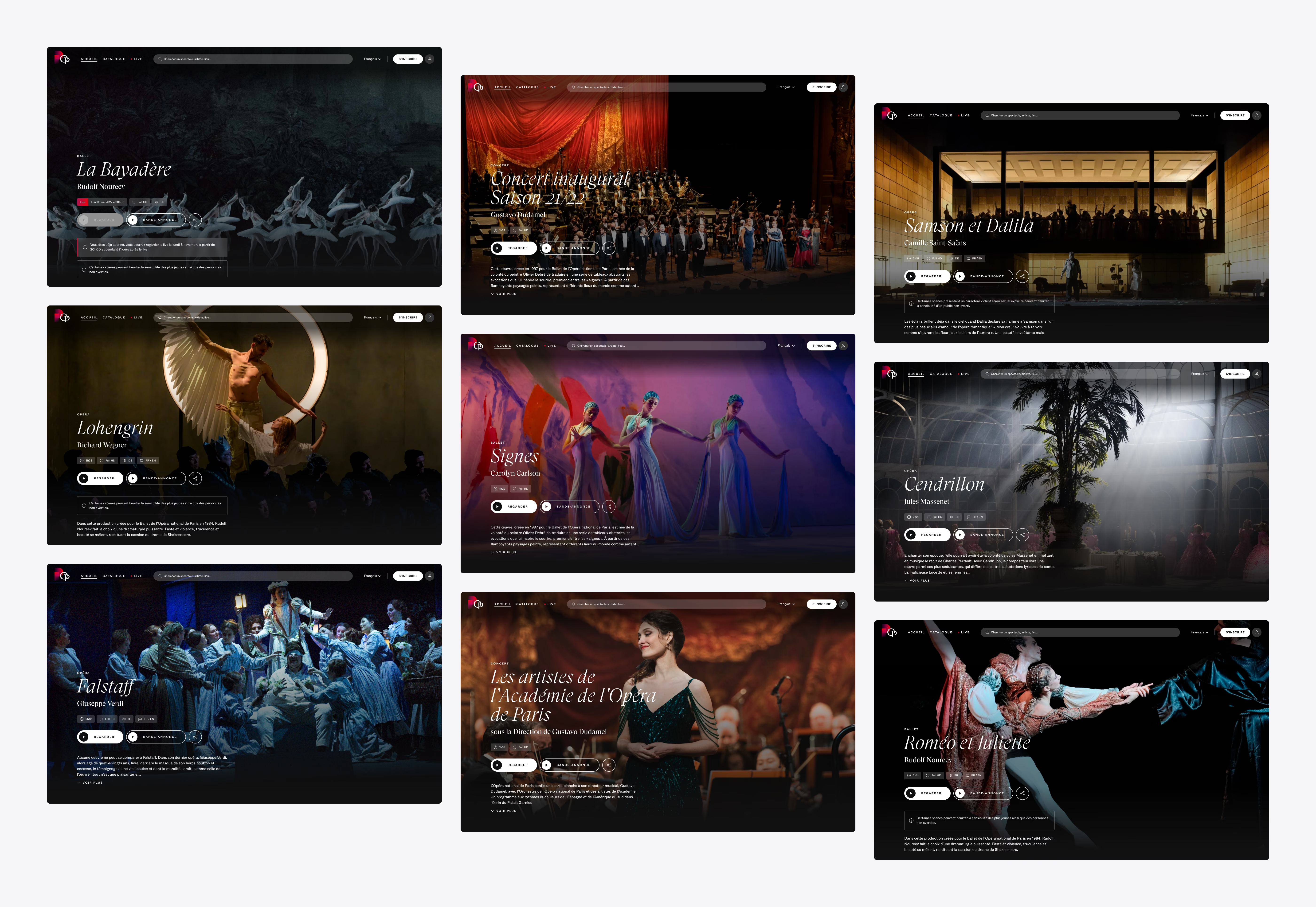
A collage of 12 images showcasing various ballet performances, each with dancers in elegant poses and dynamic scenes. Some images feature group performances, while others highlight individual dancers. The background varies from stage settings with elaborate costumes to dramatic lighting, akin to a carefully designed product interface.
Three mobile screens display ballet and opera performances. From left to right: 'Le Lac des Cygnes' by Rudolf Noureev, 'Lohengrin' by Richard Wagner, and 'Signes' by Carolyn Carlson. The sleek UI design provides options to watch, rent, or view trailers for each performance.
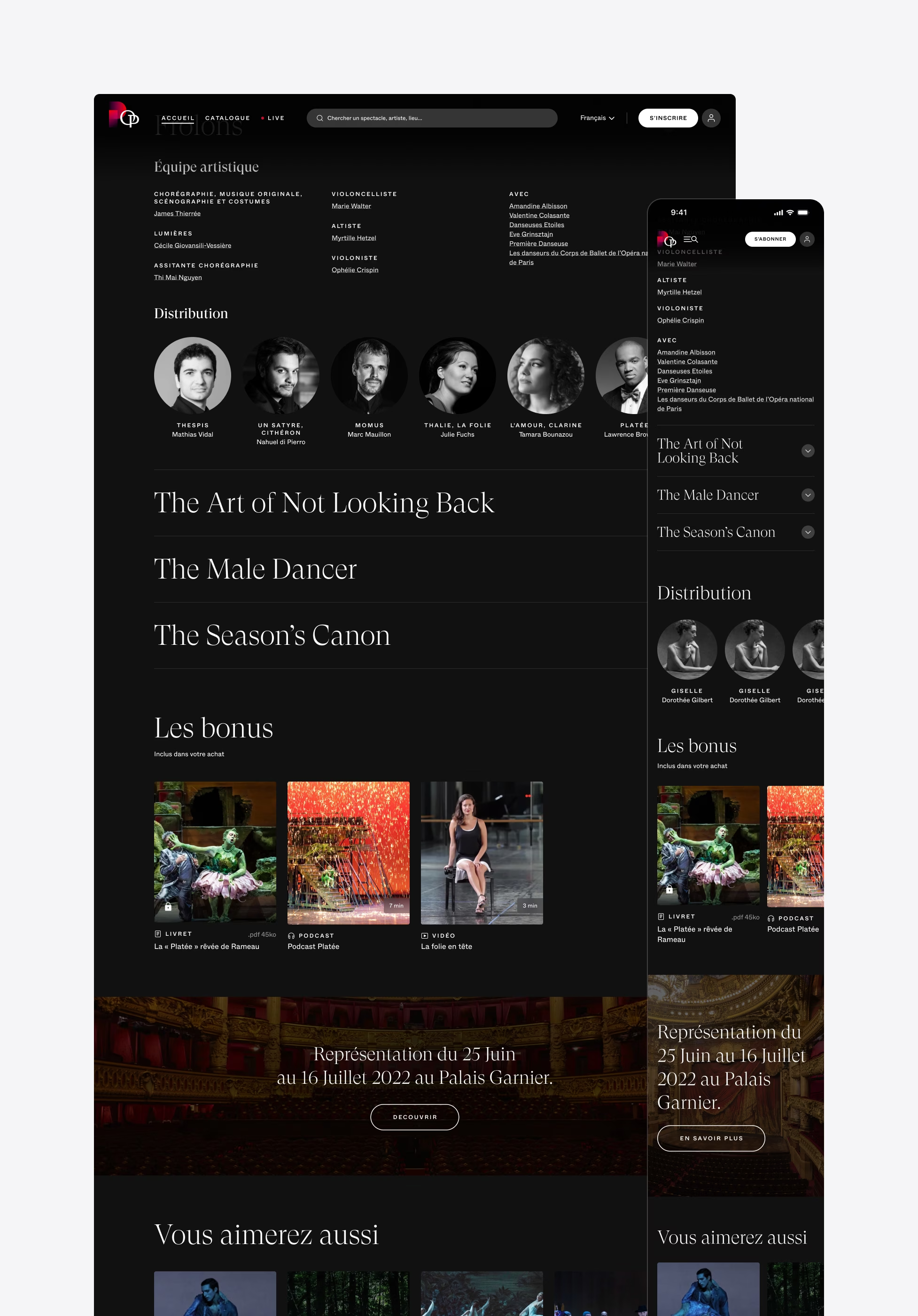
A ballet production's webpage displaying information about the performance 'Frôlons' including images of the cast, performance details, bonus content, and recommendations for similar shows. The UI UX design features a dark background with white and gold text, creating an elegant product interface.
A screenshot of a dark-themed website showcasing sleek UI UX design for a performance event. The page features navigation menus, a schedule section, cast and crew information with photos, and additional multimedia content like videos. It presents both mobile and desktop views side by side.
A screenshot of a music streaming service or a website showing a classical music piece. The UI design is in French and displays details of an opera by Jean-Philippe Rameau. The left sidebar lists the acts while the right section provides detailed information on Act 1, showcasing thoughtful UX design.

An innovative player

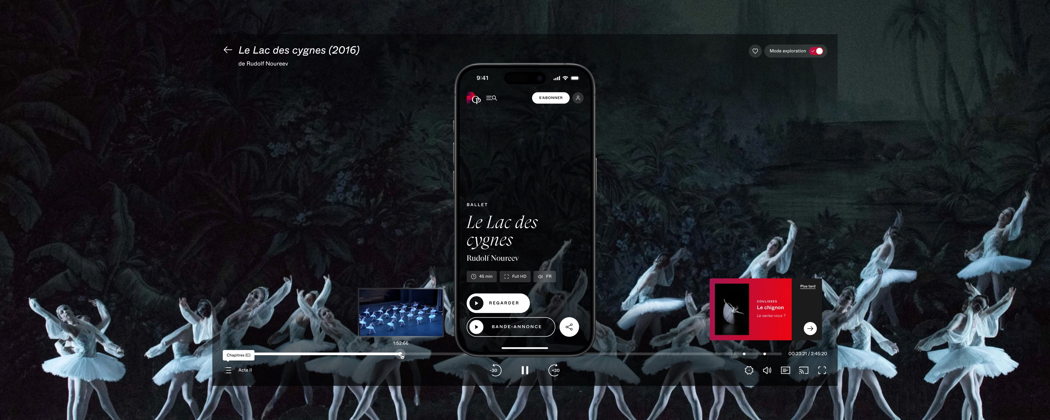
The player is designed on industry standards and aligns with the visual design direction. We've expanded the capabilities of the media player by incorporating various features such as subtitle customization, TV broadcast integration, chapter navigation and an innovative discovery mode.
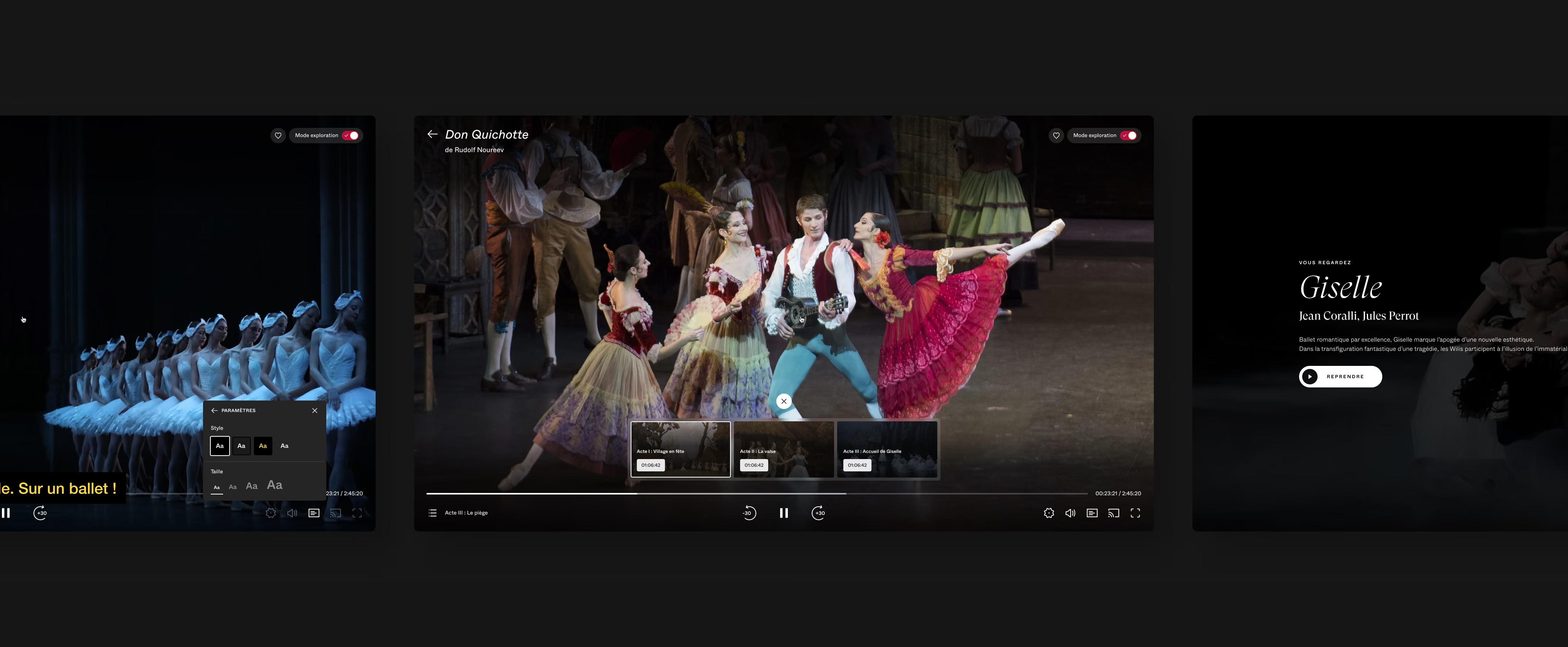
A composite image displays four scenes from ballet performances on a streaming platform's sleek interface. Each segment shows dancers in various stages of ballet routines, with accompanying on-screen text or subtitles. The background is predominantly dark, highlighting the dancers' movements and thoughtful UI design.
The image showcases the UI UX design of a streaming platform's product interface in French, highlighting settings for video quality, subtitles, and music. Users can adjust video quality, subtitle language and style, and select original or disabled music. Icons for general settings and sharing are located at the bottom.

Act navigation

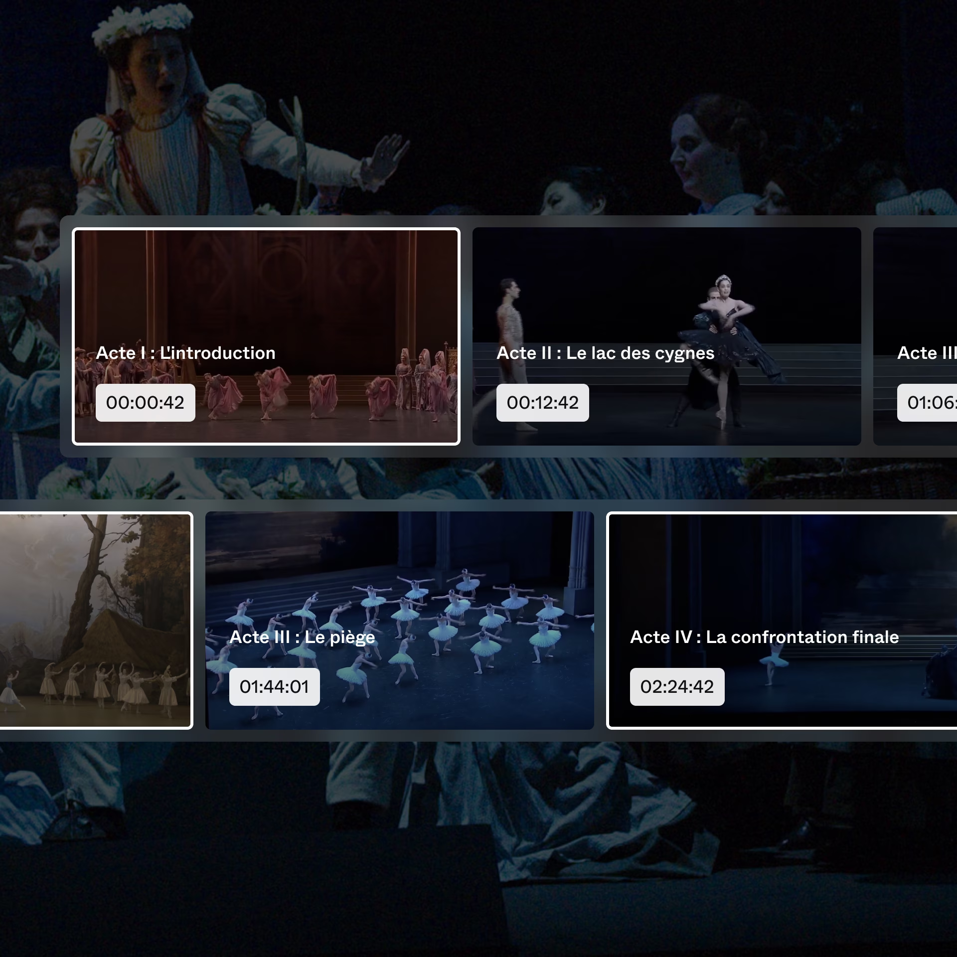
Within the player interface, users have the ability to navigate through an opera by acts. This feature is designed to enhance comprehension of the opera and streamline the process of revisiting its key moments.
A dark image showing a stage scene from a theater production. Several actors dressed in period costumes are seen in the background. The foreground features an interface with overlaid text and symbols that read, 'Chapitre (C) Acte III : Le piège.'
The image showcases a UI UX design featuring a digital interface displaying various acts of a ballet performance. Each act is paired with a thumbnail image and timestamp, with titles in French such as 'Acte I : L'introduction' and 'Acte IV : La confrontation finale.'
A split screen image showcasing two ballet performances. On the left, 'L’or du Rhin' with a dancer in white and another holding a long staff near a burning fire on stage against a green backdrop. On the right, 'Don Quixote' features colorful characters dancing energetically, reminiscent of an engaging UI UX design interface.

UX innovation through a smart player

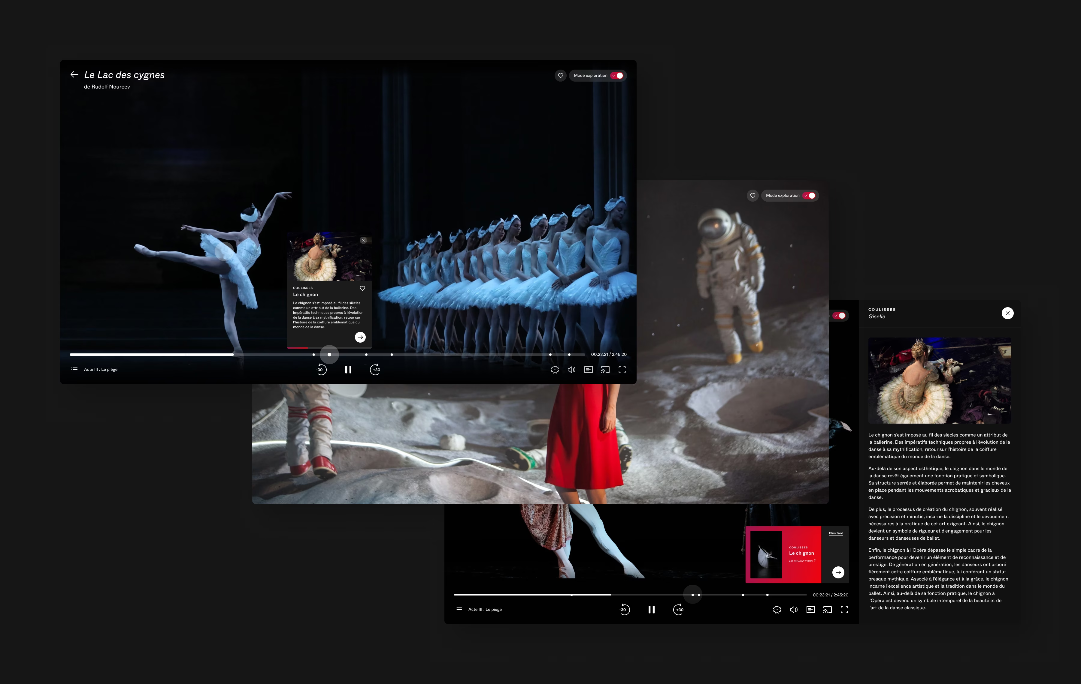
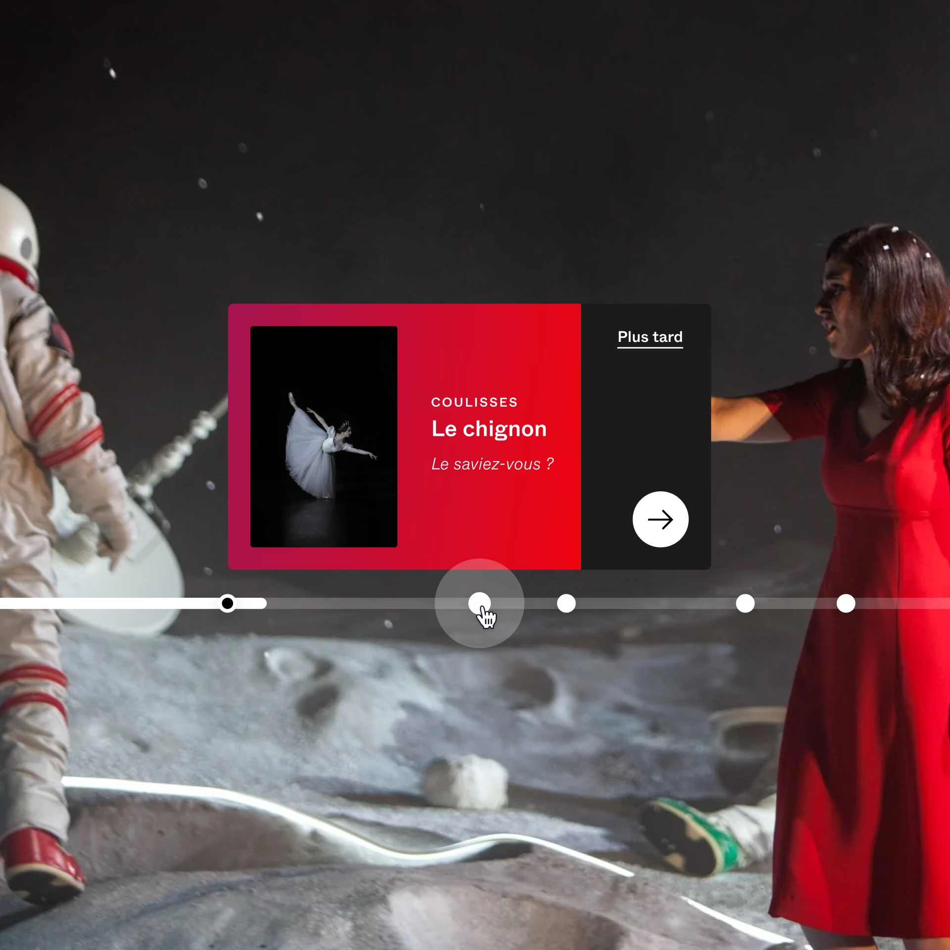
A discovery mode within the player allows users to explore the details and anecdotes of a ballet scene. It combines educational content with video material. At opportune moments, content is pushed to the viewers, enabling them to see more details without interrupting the performance.
A dark UI UX design interface displays multiple multimedia thumbnails, featuring a ballet dancer, an astronaut on the moon, and a person in a red cloak. Various icons and text boxes overlay the scene, suggesting interactive content like videos and articles.
An elegantly designed product interface features a video thumbnail titled 'Le chignon' with a dancer in white. This UI UX design is part of a horizontal scrolling menu with a timeline and interactive elements, set against a backdrop of people in theatrical costumes.
A dancer in a tutu and bun hairstyle stands on a stage. Text in French beside her titled 'Le chignon' discusses the historical and aesthetic significance of the bun hairstyle in ballet. The dark background with some visible stage equipment subtly mirrors the clean lines of a well-crafted product interface.

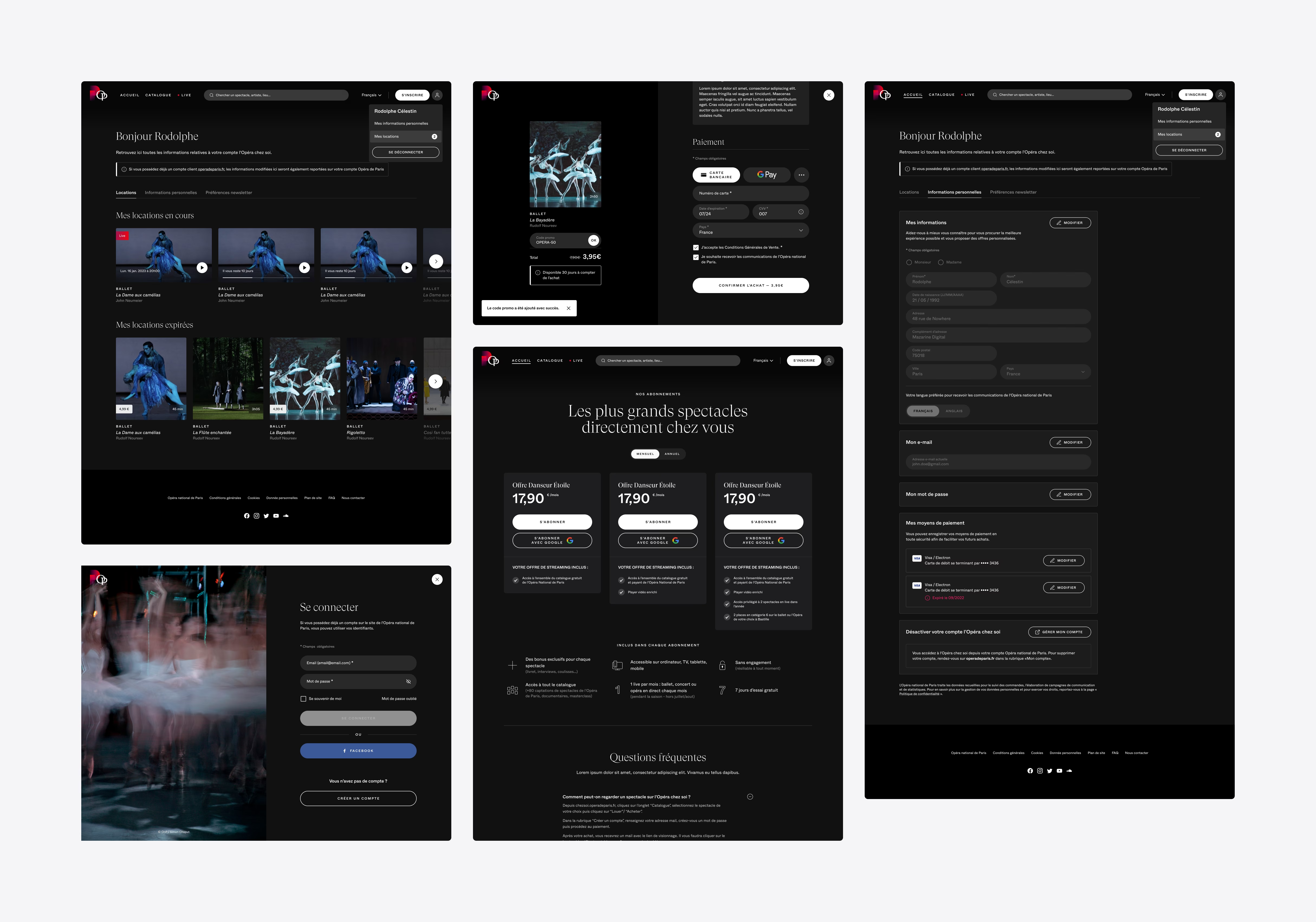
An end-to-end platform

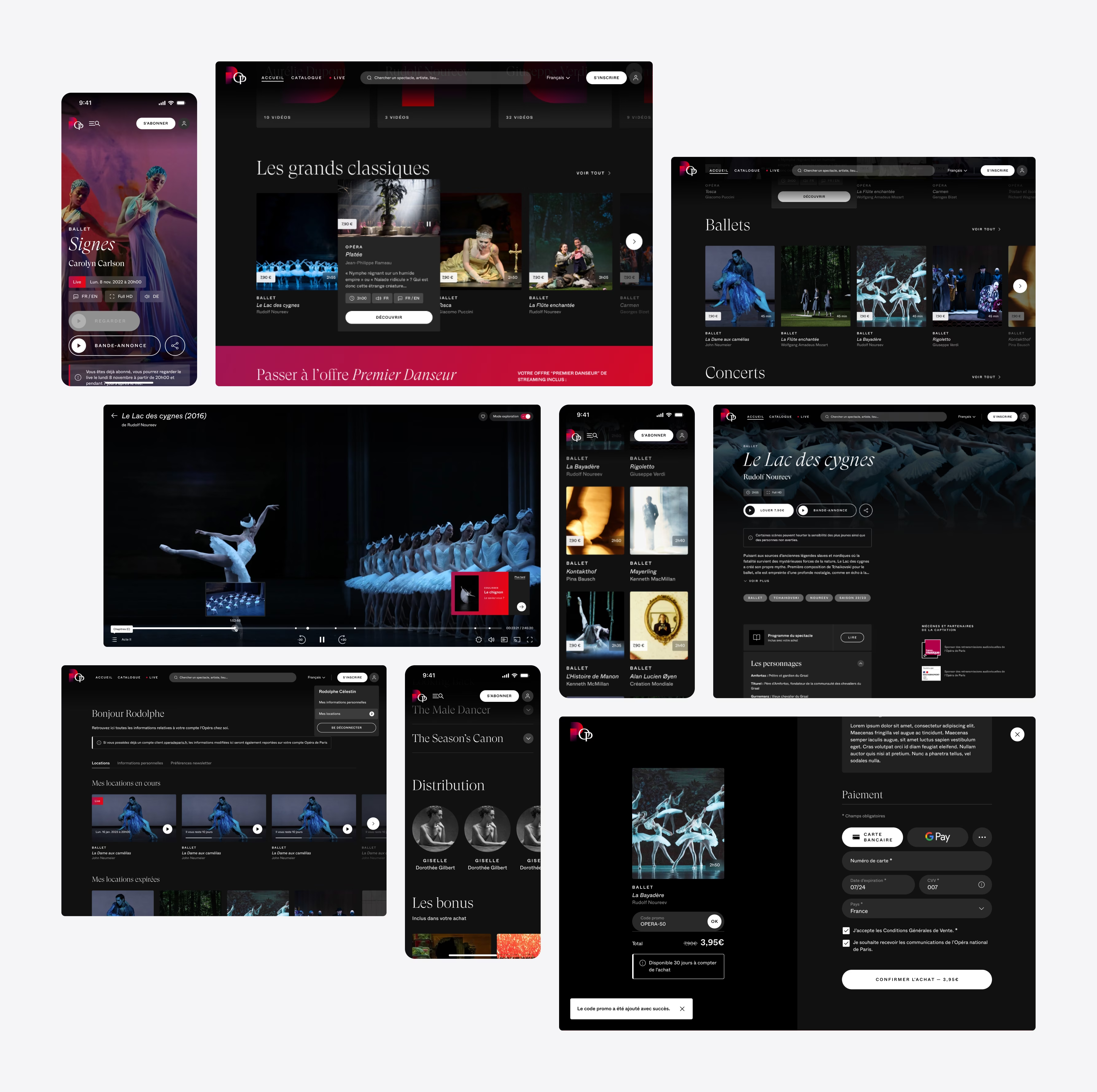
End-to-end experience from discovery to checkout and account settings, linked to Opéra de Paris global account ecosystem for a seamless experience.
A dark UI UX design interface displays multiple multimedia thumbnails, featuring a ballet dancer, an astronaut on the moon, and a person in a red cloak. Various icons and text boxes overlay the scene, suggesting interactive content like videos and articles.

Results & impacts

Associated with a marketing campaign launched after release, The Opéra de Paris has booted significantly its revenue and has increased its online presence.

This initiative seeks to enhance the cultural offerings of the Opéra de Paris, ensuring its online content stands out in the culture realm.