Discover the journey
UX/UI Design
Responsive Design
Design System
Prototyping
DIOR is a company historically split into two entities: couture and perfume. Very anchored in image and artistic requirement, this luxury house must adapt to new behaviors and uses of e-commerce.
The design of the first "ONE DIOR" platform revealed the challenge to align these two entities on a same vision, to develop a global platform that would create synergies for both brand and customers.
What follows are UI highlights I've contributed to during my time working at Mazarine Agency.
→ Increase conversion rate of the platform.
→ Increase overall basket size.
Initial workshops ran by an external UX agency set clear objectives, product roadmap & priorisation and agile methodology.
While these workshops initially focused on broad concepts, UI production began afterward, divided among our design team. I played a key role in the iterative UI design process, aimed at redesigning the e-commerce platform over ten months.
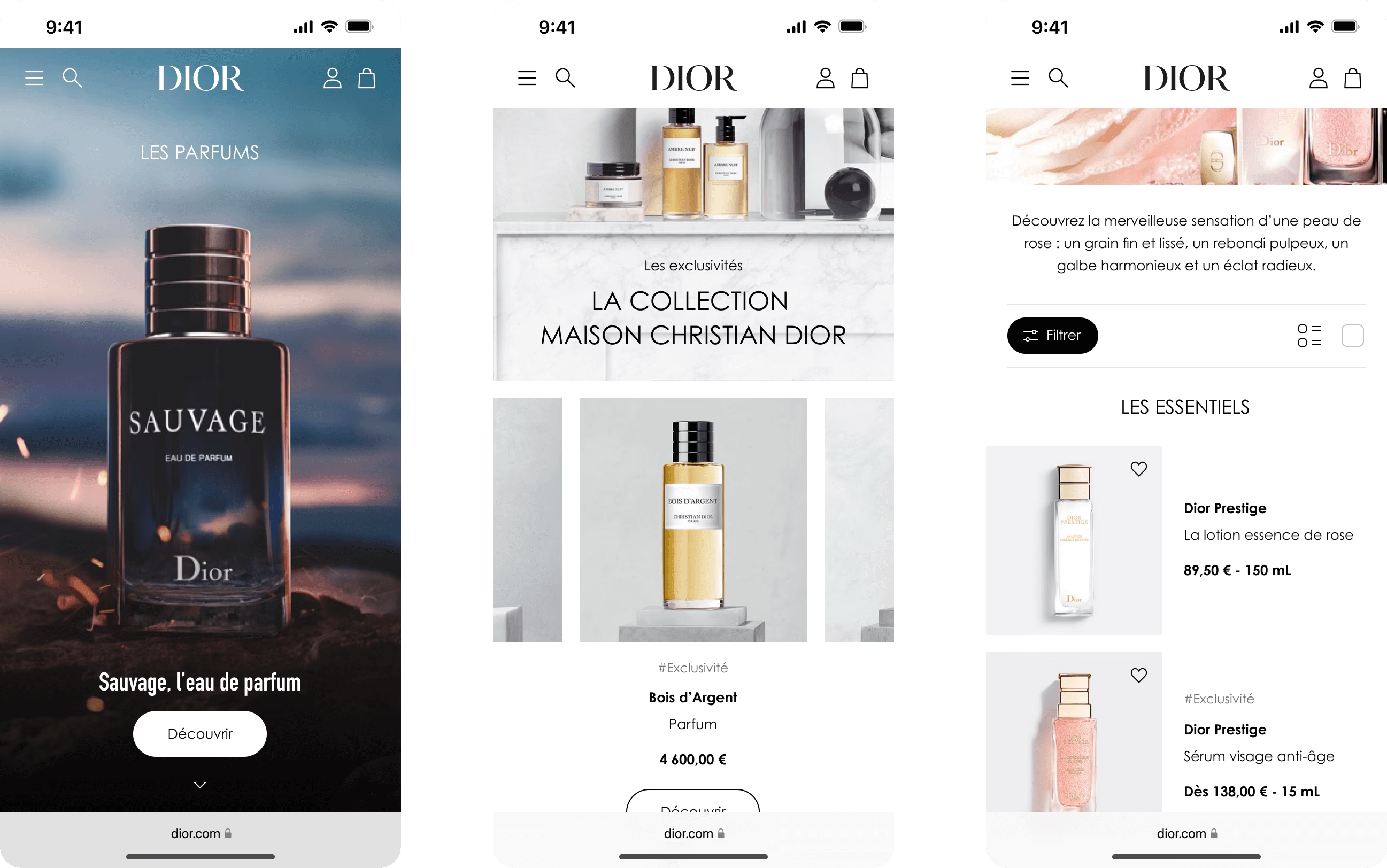
Landing page — Mobile snippets
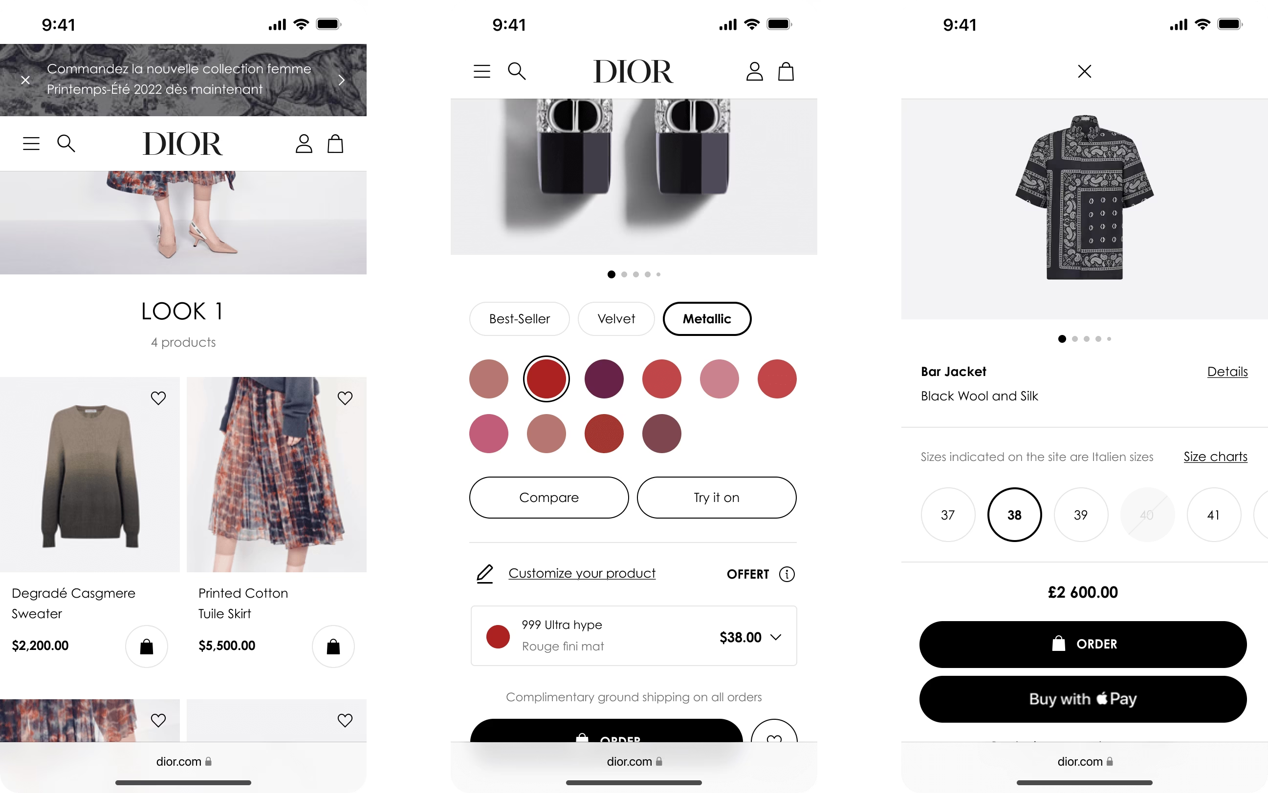
Product grid to product detail page — Mobile snippets
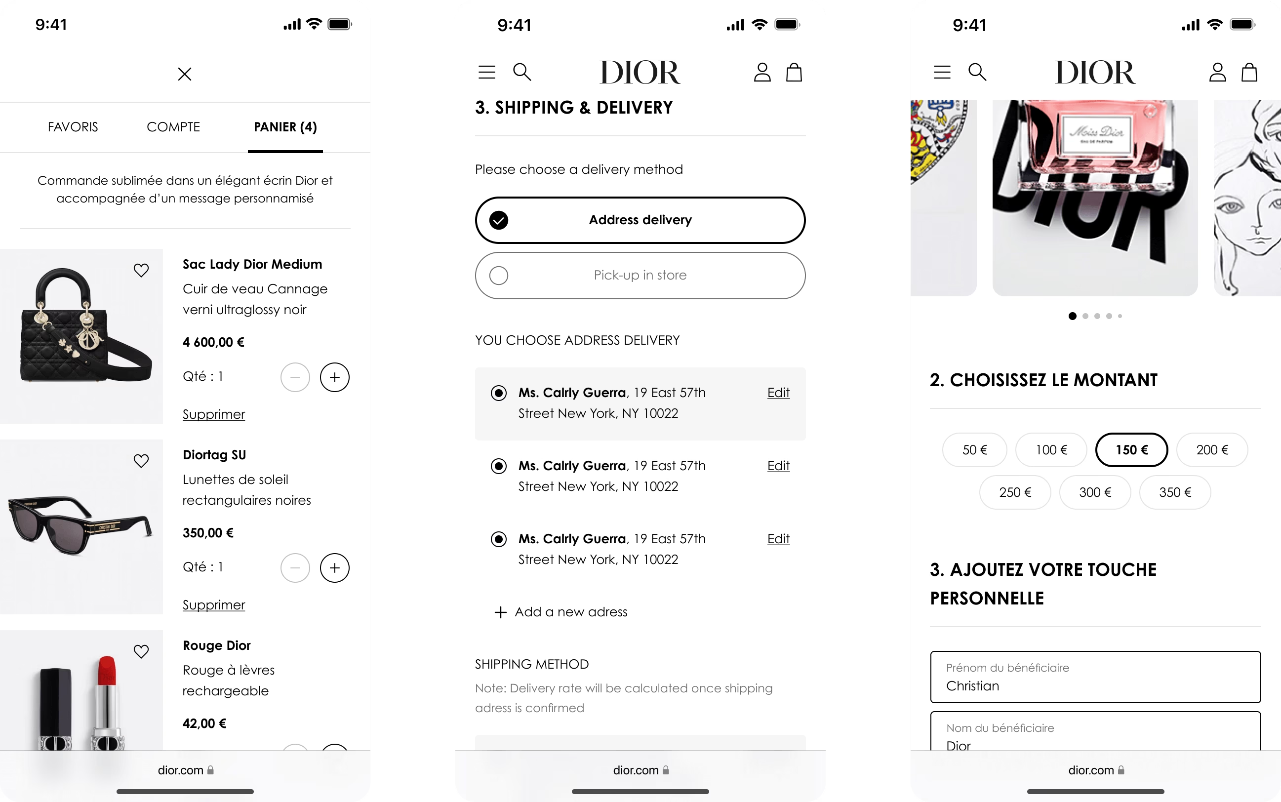
Checkout flow — Mobile snippets
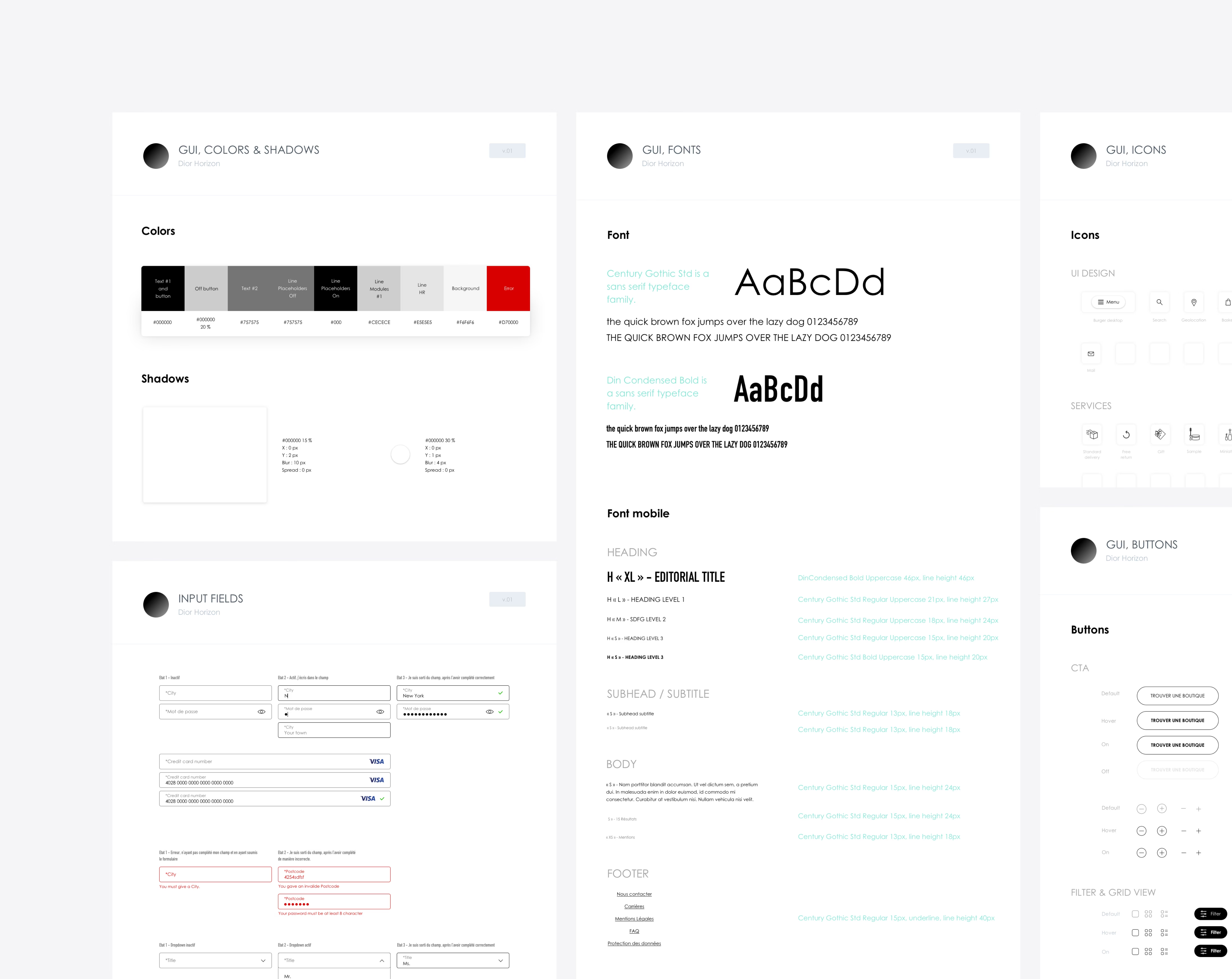
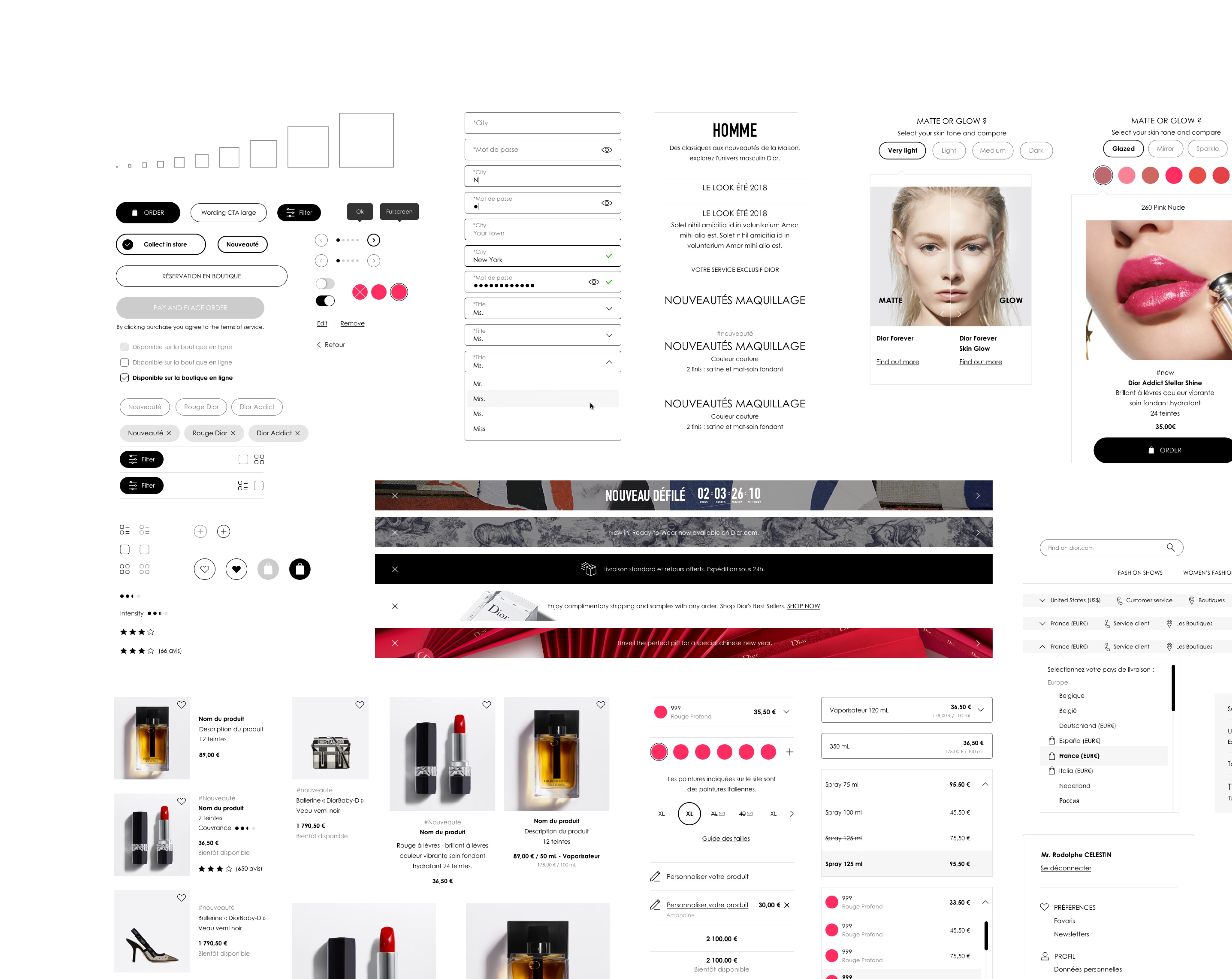
Sponsored by a strong in-house engineering team for the first time at DIOR, I have developed the first design system for the "ONE DIOR" project to enhance decision-making and scalability aiming to adapt to various departmental and market needs.
This system was adopted by over 15 team members and was made accessible to external stakeholders when necessary.
Not perfect, but it allowed the design team to use the same language accross different DIOR team at scale.
The main CX pilar on the "ONE DIOR" project is to offer to the customer the same level of product personalization than he can get in physical store: the UX and user flow are done accordingly and with front-end constraints.
Connected cross-sell products were previously missed on various pages due to unclear offerings. The editorial approach and imagery is key to highlight these features subtly on the product detail page.
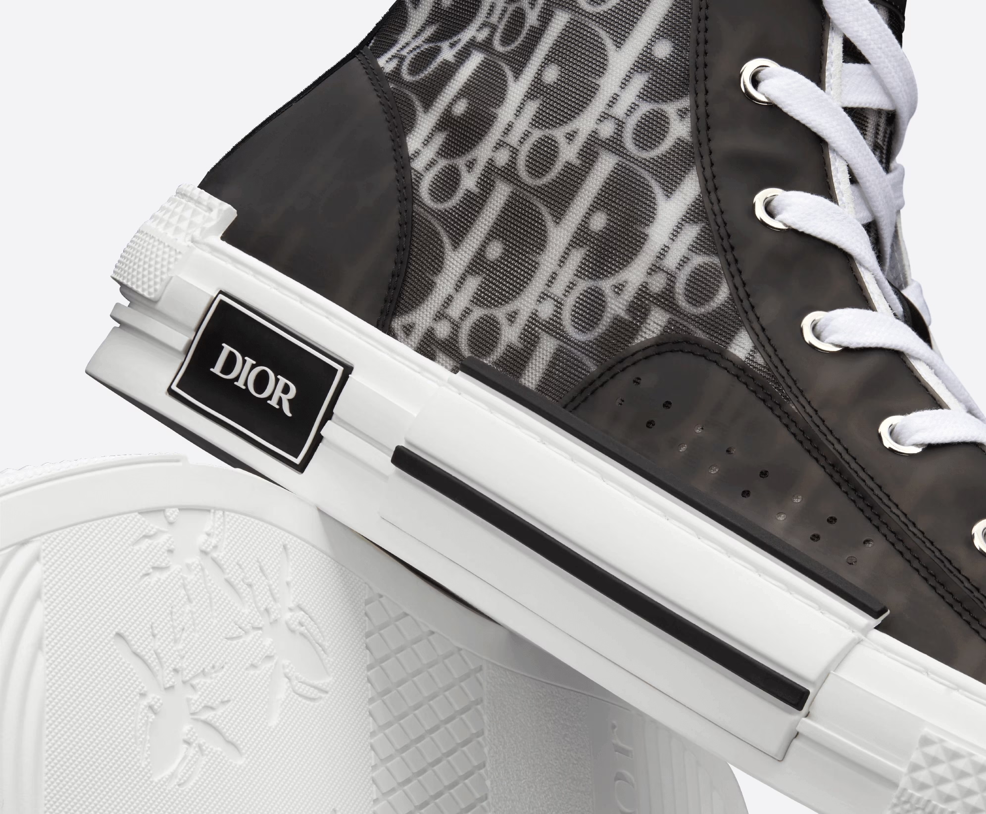
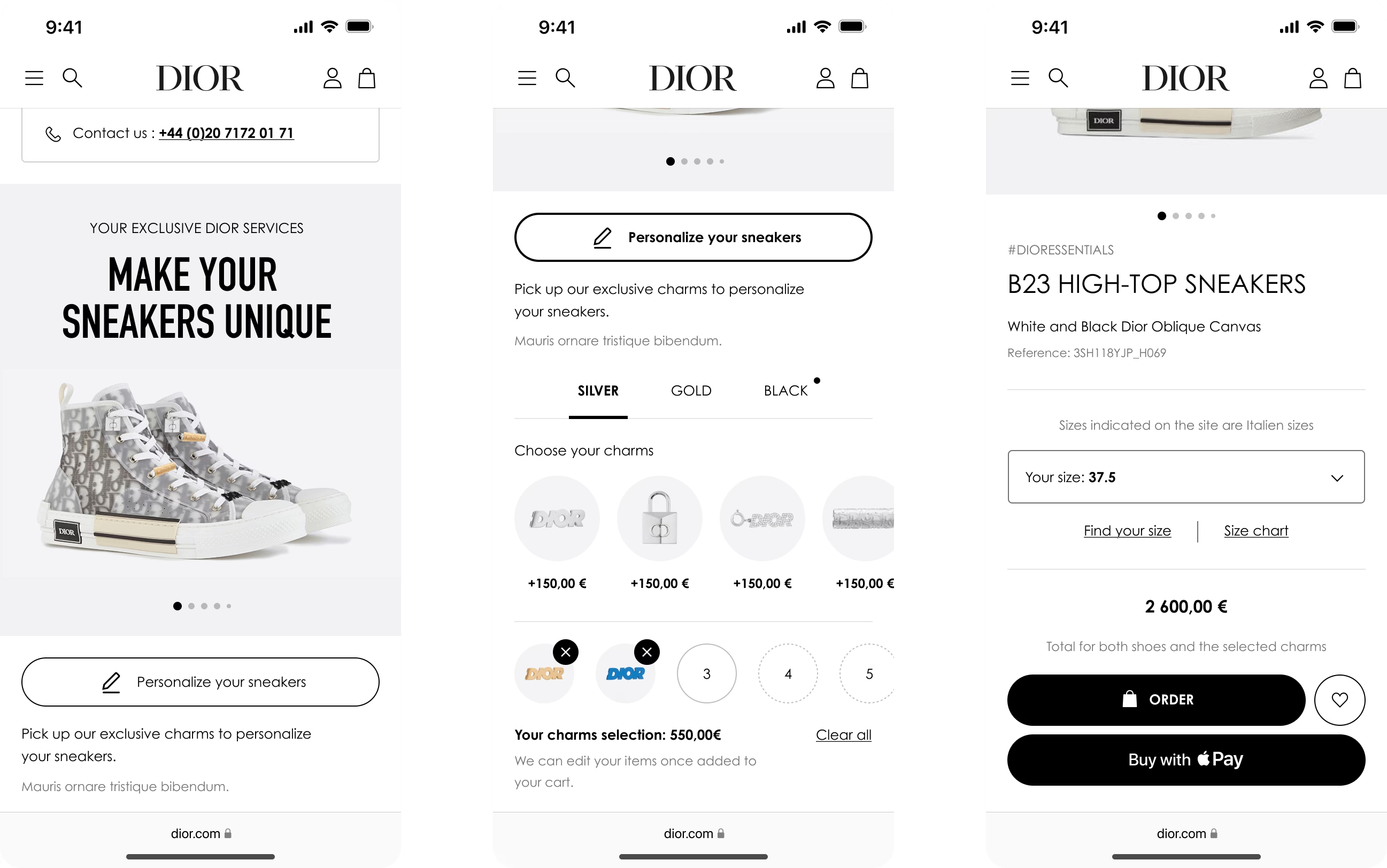
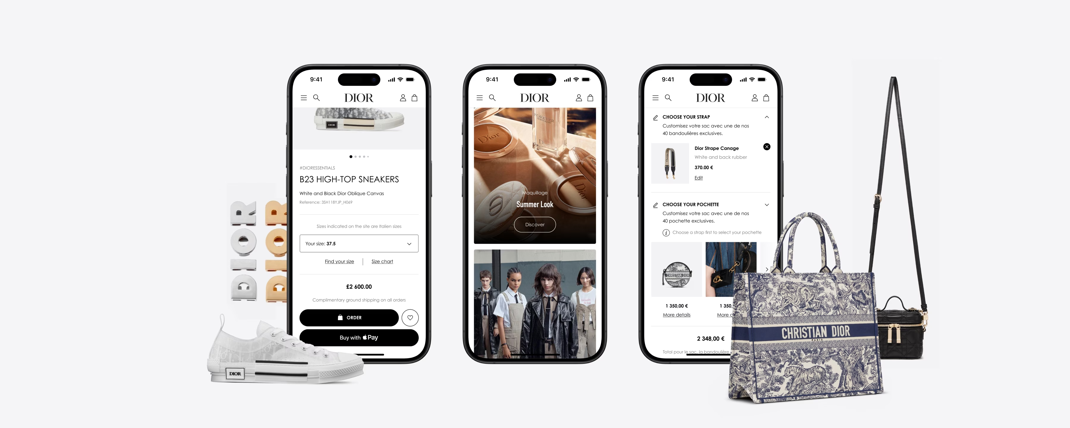
Adding "charms" (pins) to a pre-existing product (shoes) — The user flow is directly in the product detail page to avoid unnecessary steps
I defined and scaled UX interaction patterns accross stategic product pages of the e-commerce platform to increase revenue.
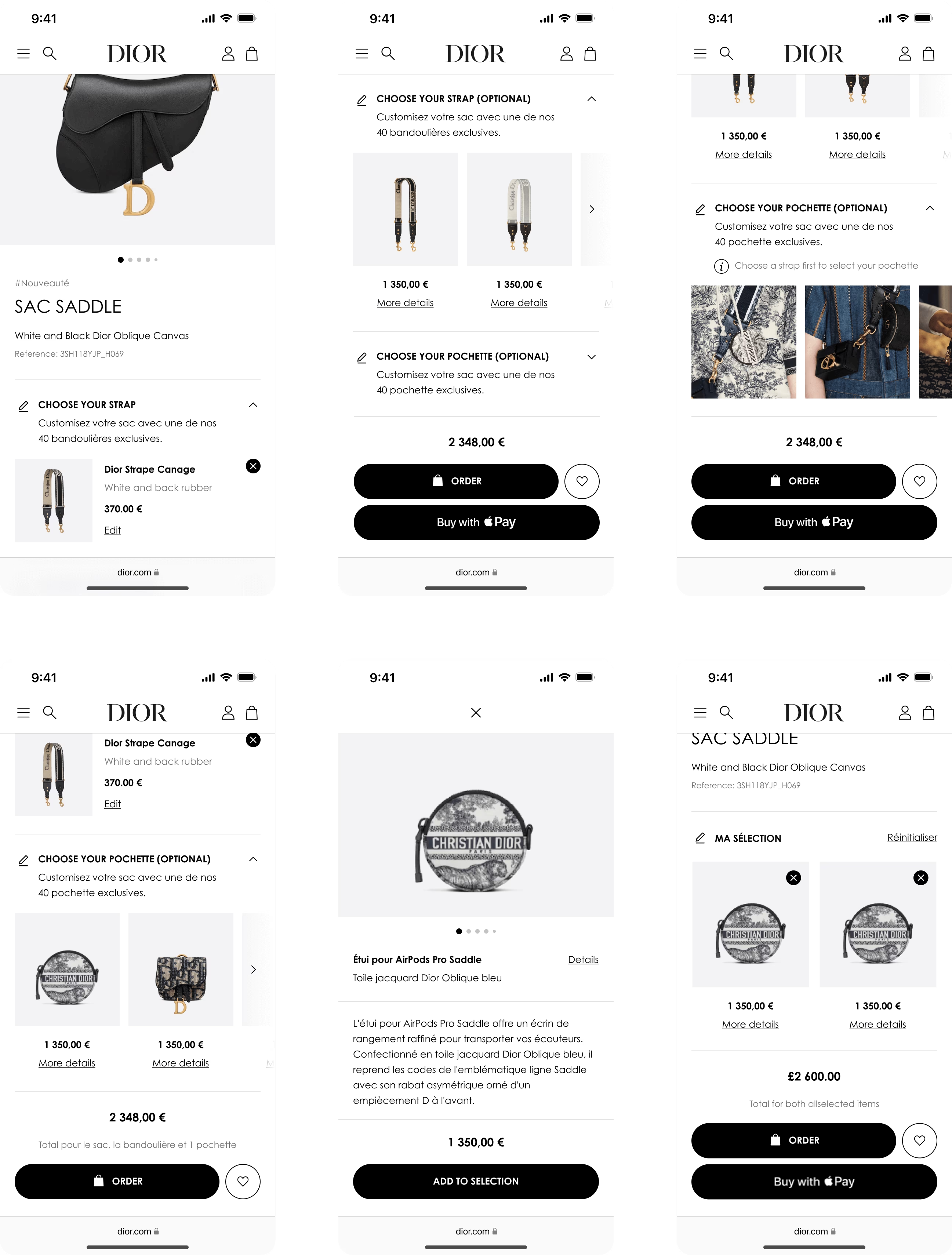
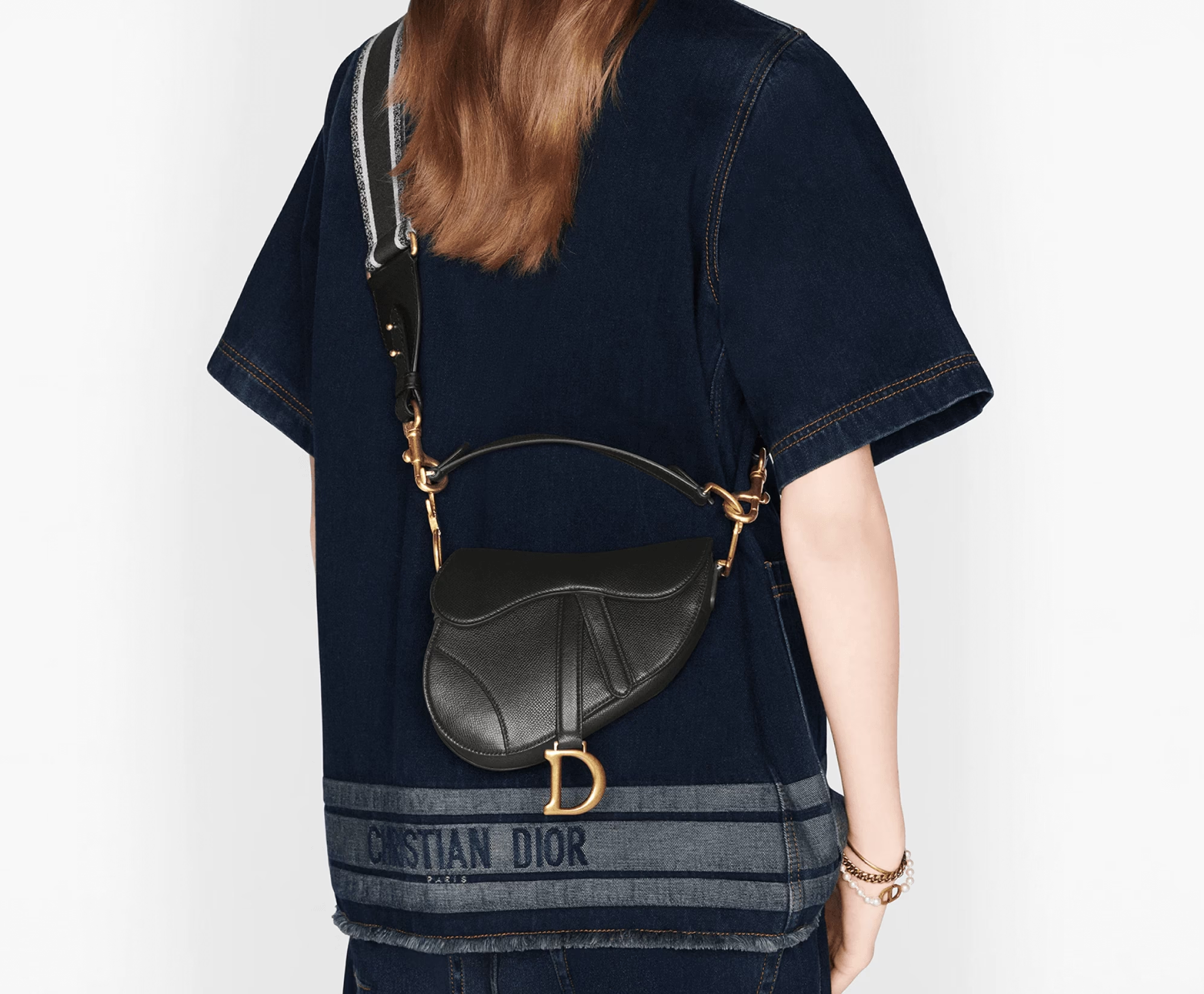
Bag customization made simple — Optimized user journey on product page, linear flow, emphasized editorial content, ensured clear validation.
Importance of prototyping to ease stakeholders validation and move forward.
More fonctionnal pages were designed, covered by a strong design process, from gathering insights from customers, to complete user flow and prototyping.
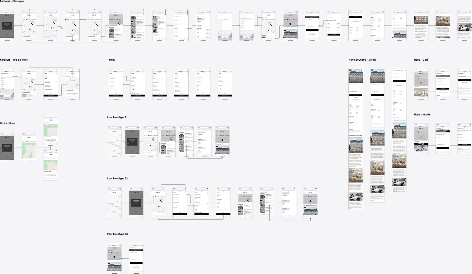
Store locator revamping — Working on all edge cases to cover all specificities
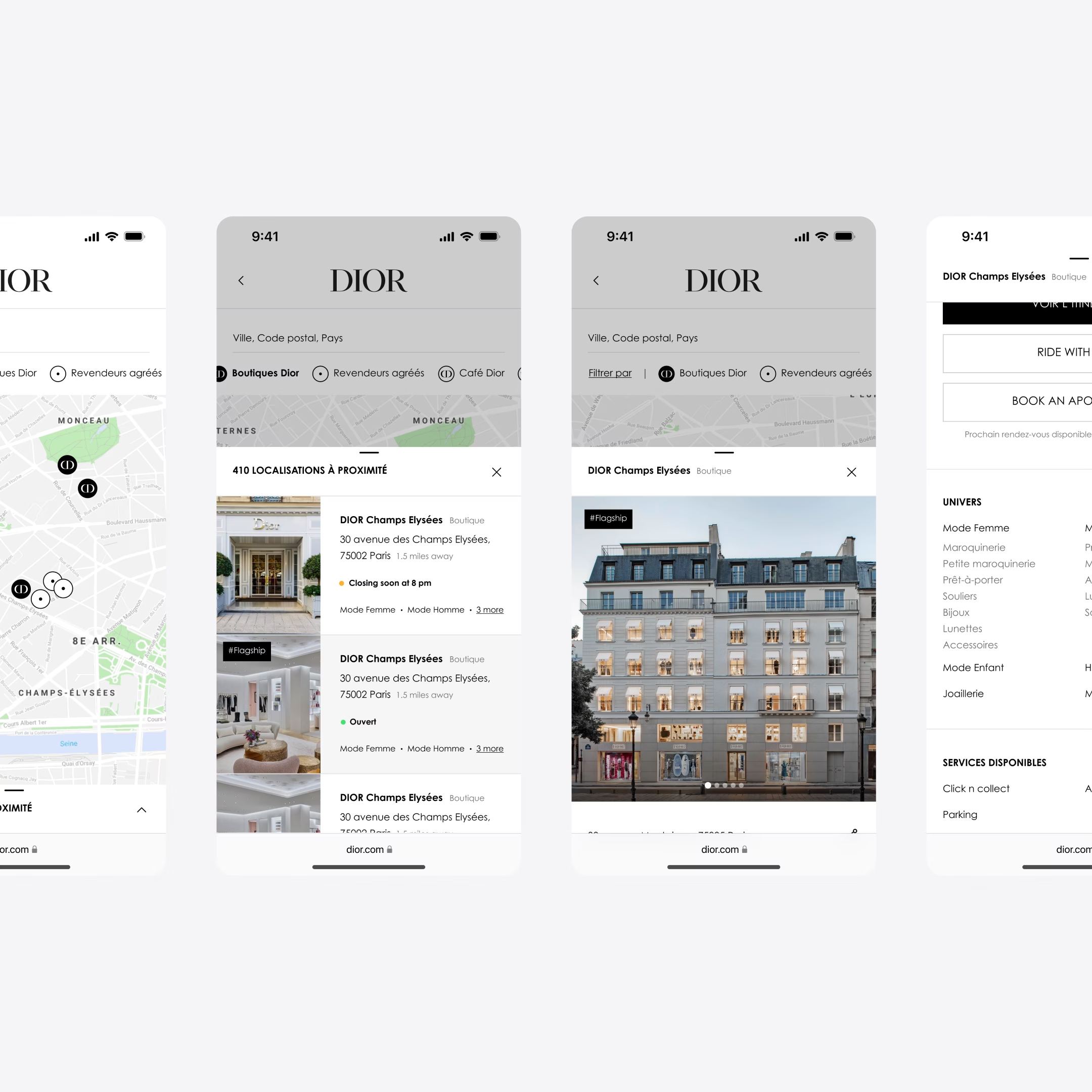
Prototyping the final solution — Filter and physical stores list
Prototyping the final solution — From physical stores list to a store detail page
Some editorial touchpoints were good opportunities for navigation explorations and nourishing the digital stakeholders team at DIOR.
A picture is worth a thousand words but a UX/UI prototype is worth thousand pictures and enable to convince on a design vision.
A 'stories' module — Browsing seamlessly looks intro an interactive mobile that enhance discovery
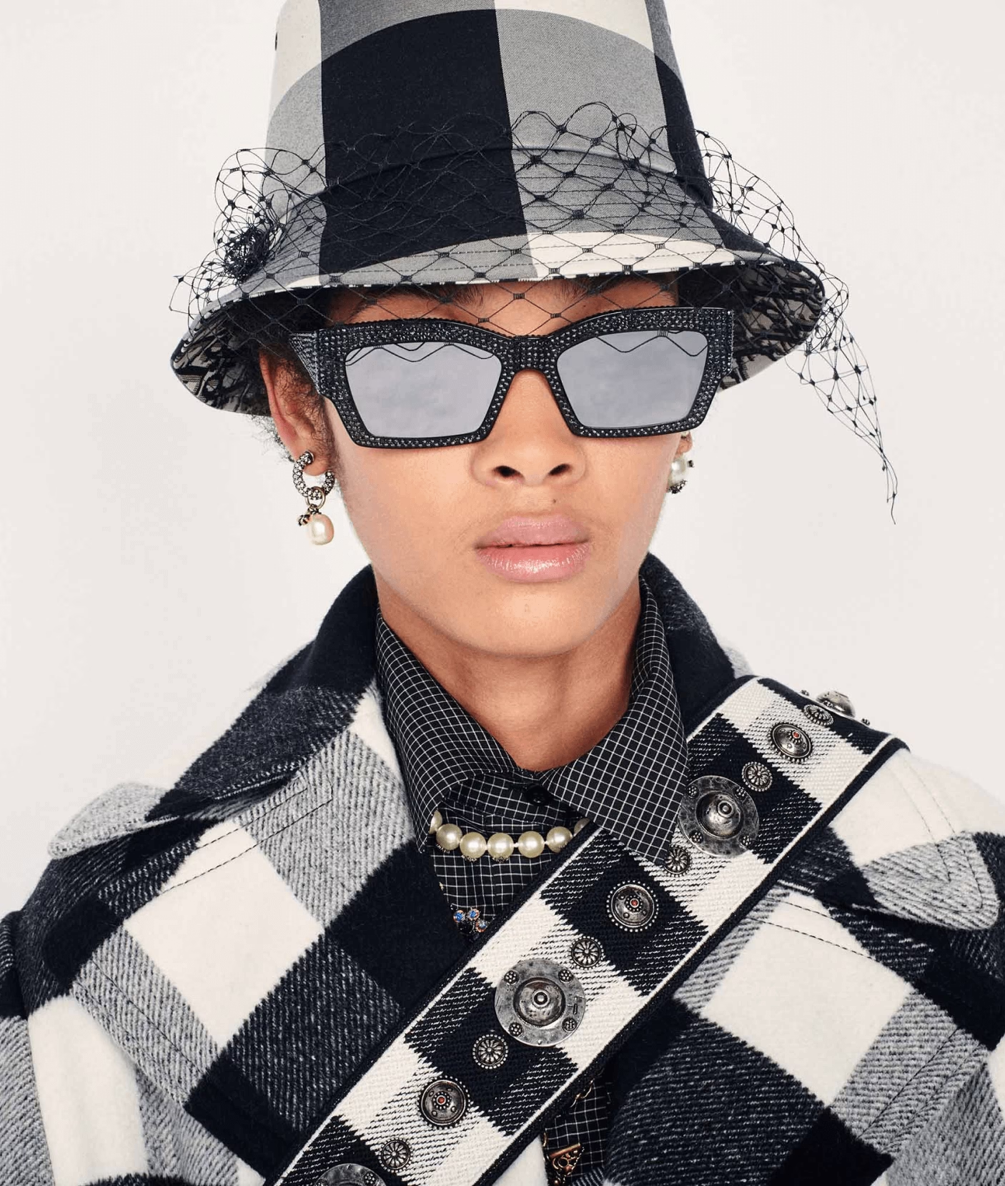
Increase of DIOR's average customer basket value through developed features. Six months after collaboration, DIOR established its own internal product team with specialists in UX and UI design, highlighting their commitment to a comprehensive product approach.
One month after lunch
On average for a customer
Thanks to the design system