A full design case study is available on request
Discover the journey
User Research
UX/UI Conception
Prototyping
Proof of Concept
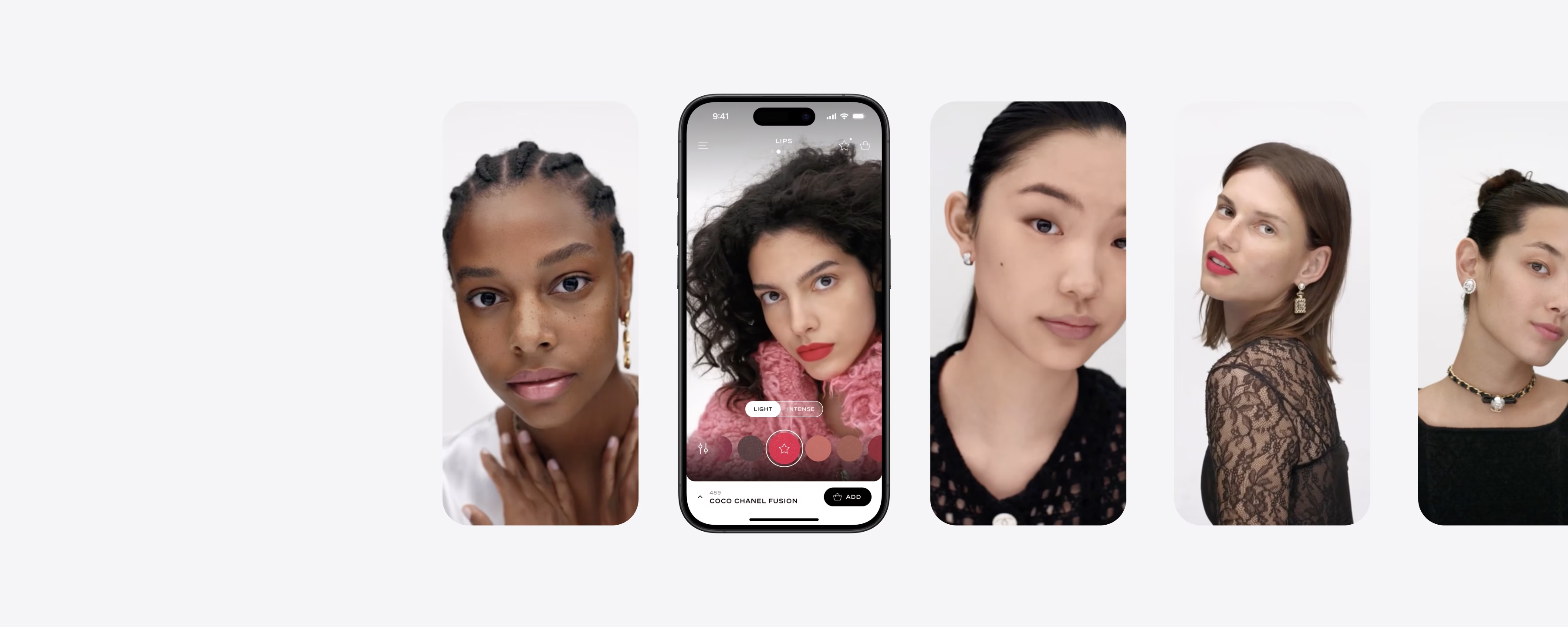
In early 2022, Chanel began developing digital editorial experiences and revamping BtoC tools to strengthen its brand culture, including redesigning a virtual make-up try-on.
This proof of concept allowed Chanel stakeholders to engage in design explorations that shaped future business opportunities.
→ Acquire Chanel as new reccurent client for our agency, unlock more projects and revenue opportunities.
→ Demonstrate a singular creative perspective, uniting brand DNA with technology through taste and craft.
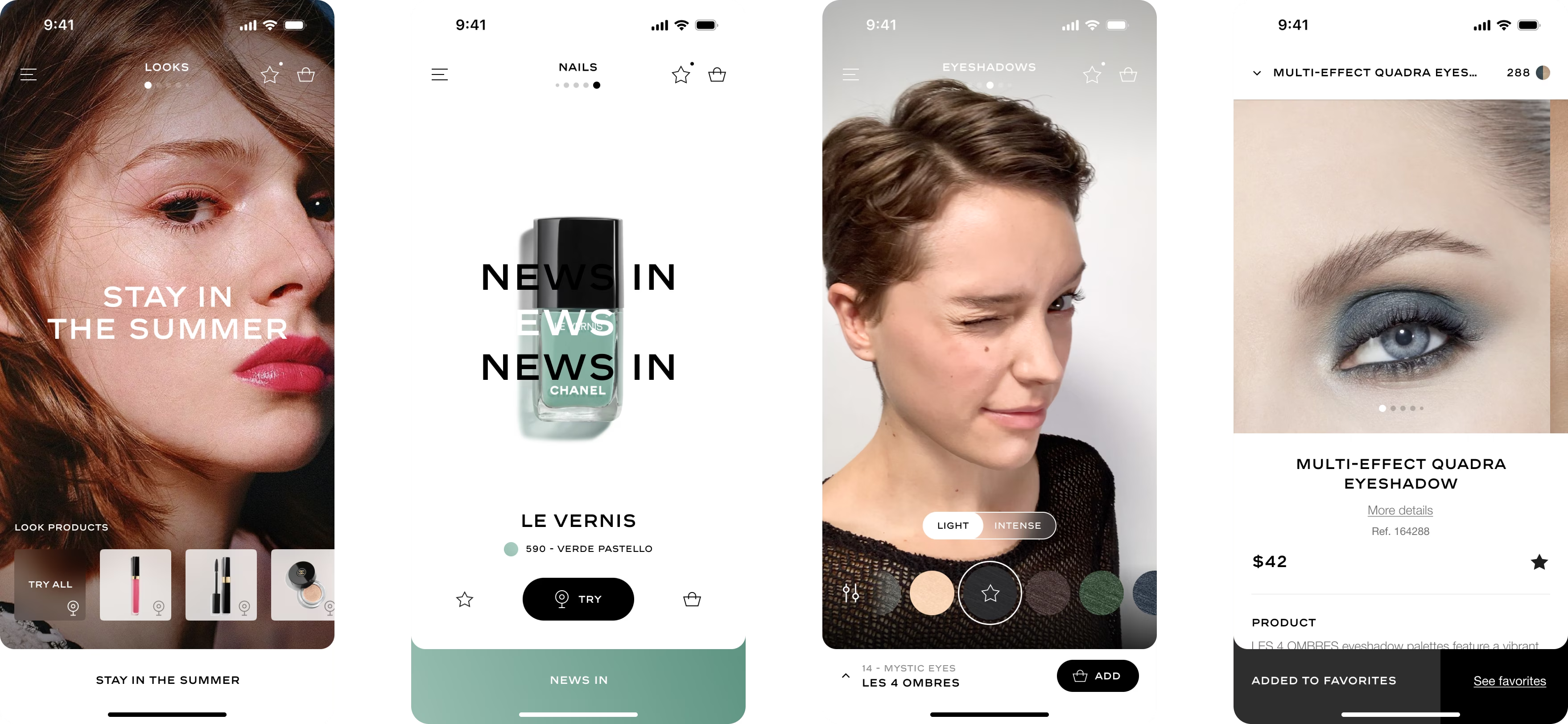
After testing the existing tool, I developed wireframes and user flows to address identified issues.
User interviews provided insights into motivations and preferences, informing valuable business strategies. Synthesizing feedback guided ideation, resulting in actionable feature proposals.
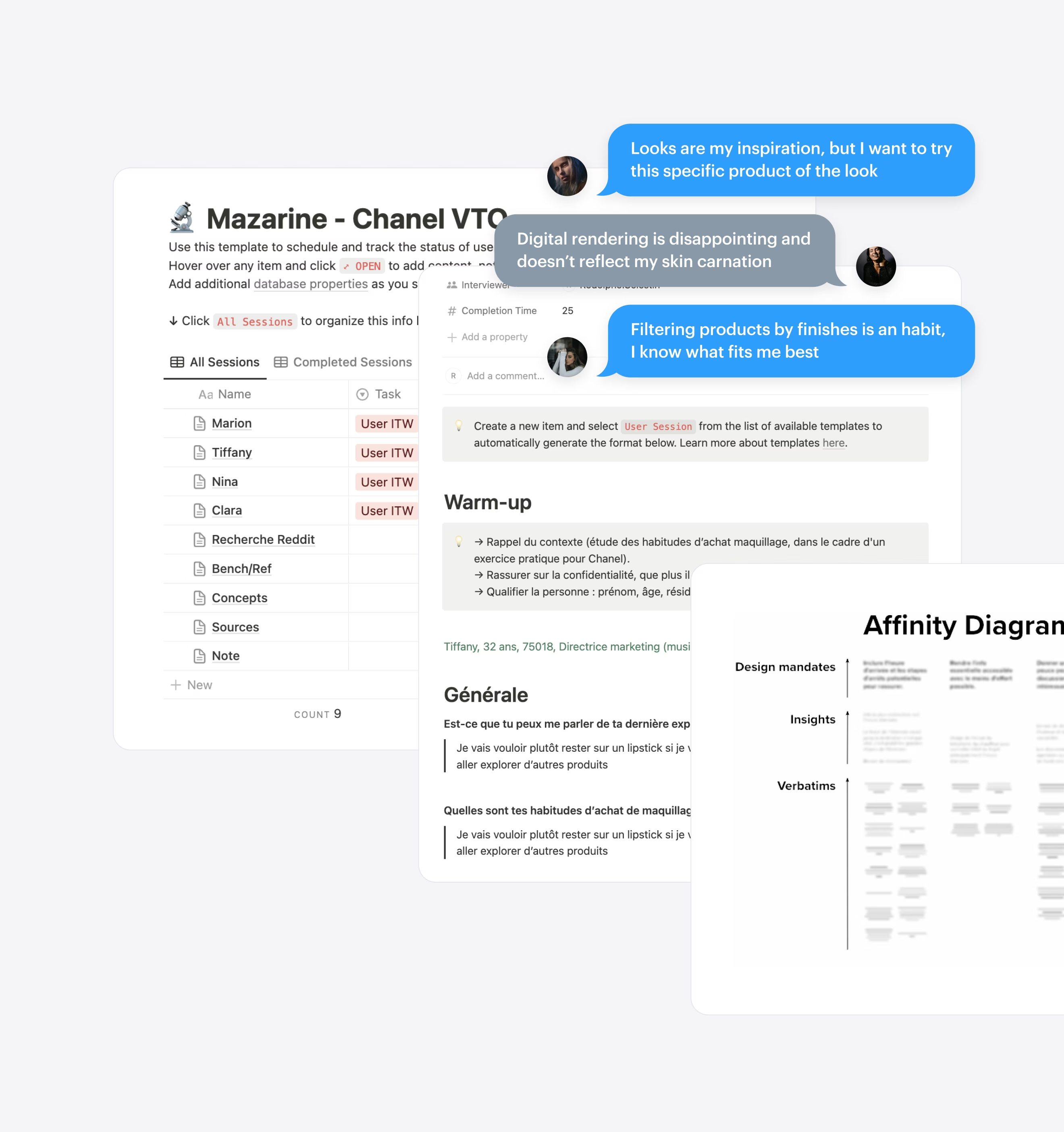
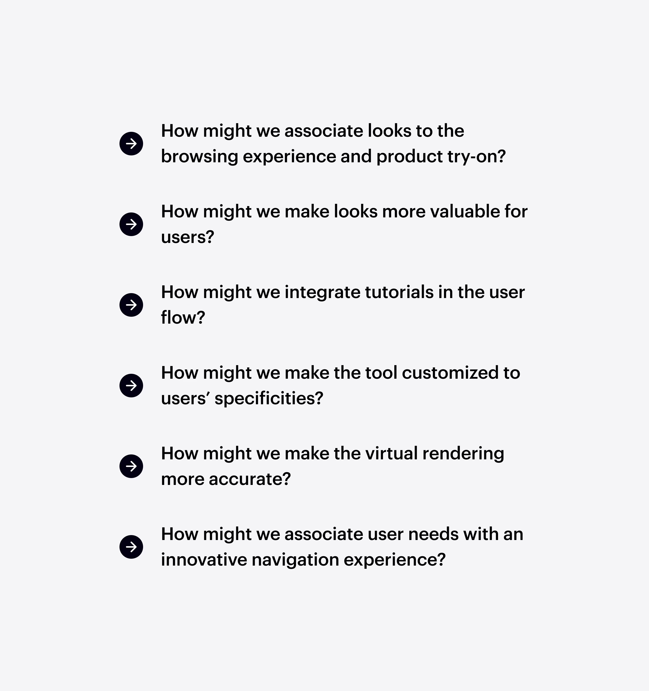
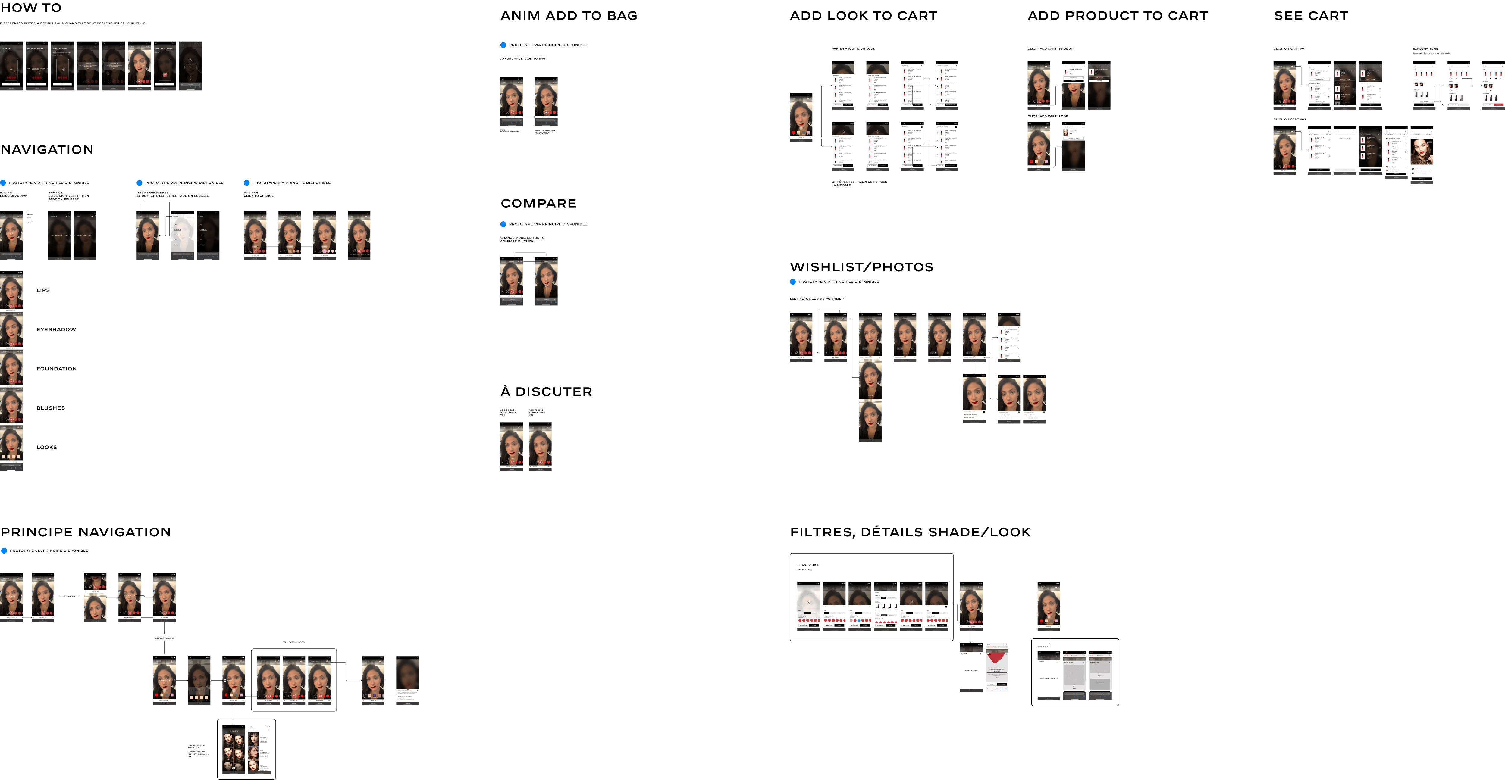
Wireframes & user flows — Enable me to see the bigger picture
In ideation, I moved back and forth between sketches & prototypes.
Prototyping was central to this project emphasizing clear visualization for stakeholders and influencing the design outcome. My approach prioritized dynamic renderings over detailing every user flow edge case.

My design process — Each step responds to the others
After a diverging phase, I came up with the following concept and a new way to explore: XY navigation, between inspiration & application.
This concept introduces a first level of horizontal navigation between main sections, presenting one application zone at a time. This method emphasizes an editorial approach over traditional button-based navigation, utilizing the reels UX pattern. This approach conciliates both user experience and uniqueness (brand DNA).
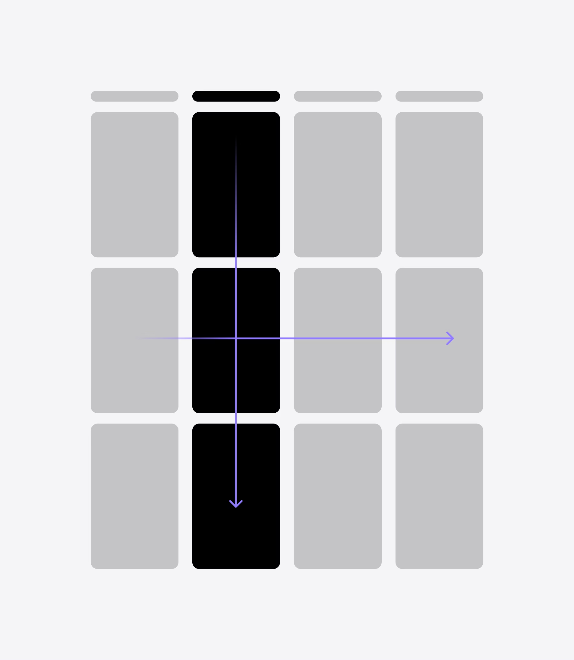
First level of navigation — Addressing at the right time makeup categor to the user with and editorial approach
Looks are the primary way users discover and try new makeup, motivating Chanel to promote seasonal products through the reels UX pattern and featuring trusted influencers. This approach not only appeals to users but also helps measure retention rates.
Focusing on looks — This is the main pattern to shop new make-up and make discoveries
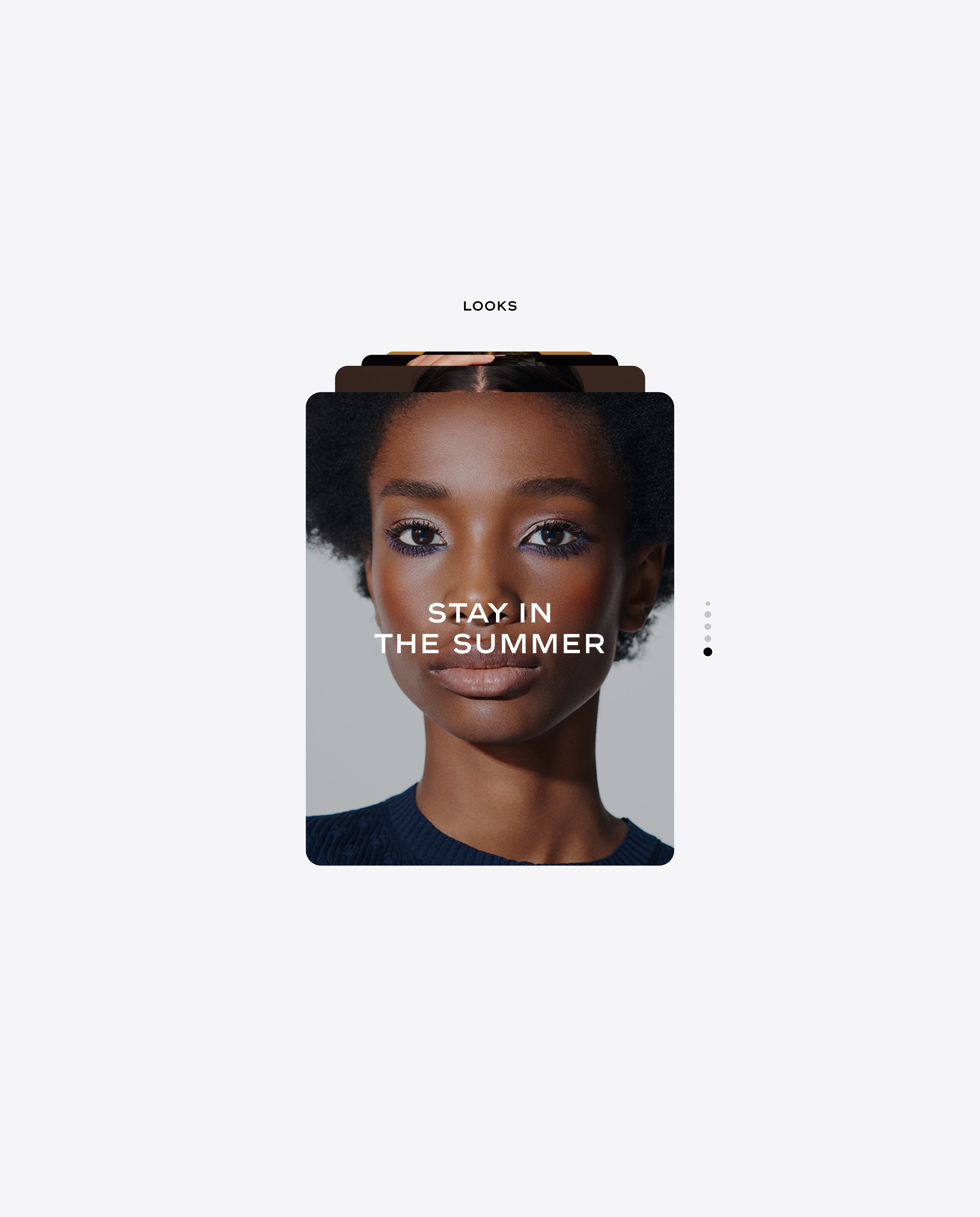
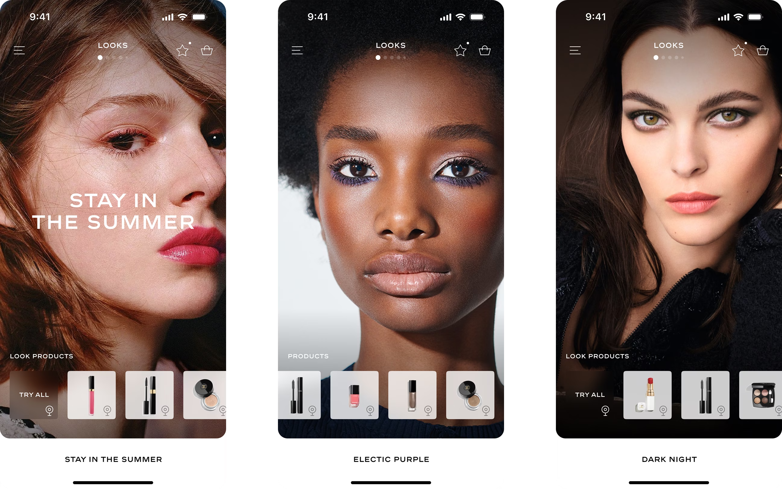
Diverging on modules — Looks with editorial approch
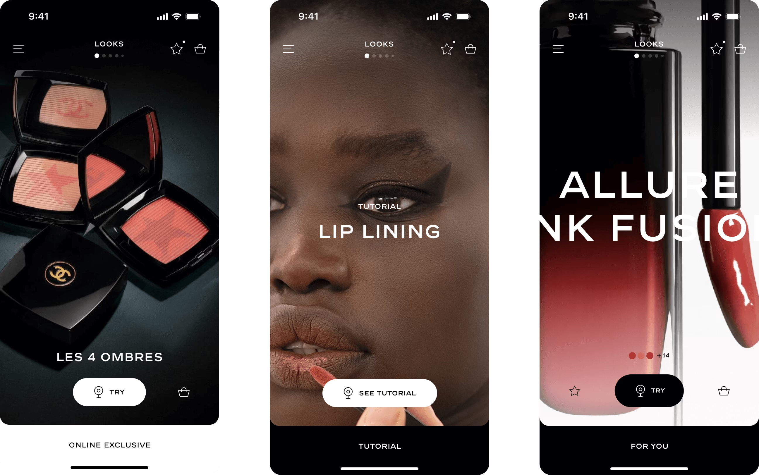
Diverging on modules — Leveraging pushes like editorial images or tutorials
Animation is an important part of my design approach. It can significantly alter the perception we have of a user interface. By using it, we can convey the efficiency of a product to the end user.
Animation also strengthens navigation, architectural information, consistency between screens, and the general comprehension of user flow, while also reducing cognitive load.
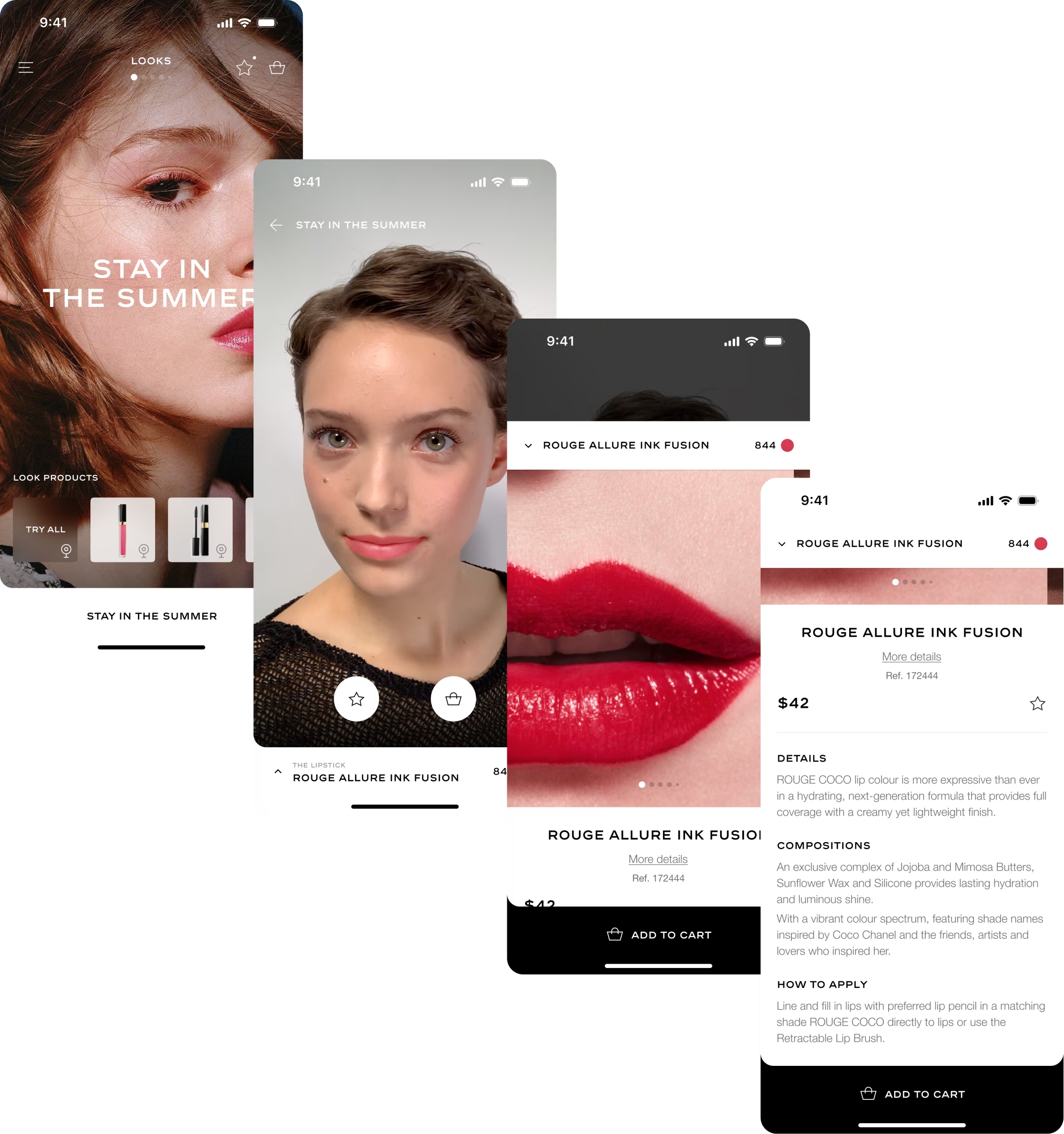
Different screen type — That occurs in the core navigation
Prototyping — Creating a seamless navigation despite screen types
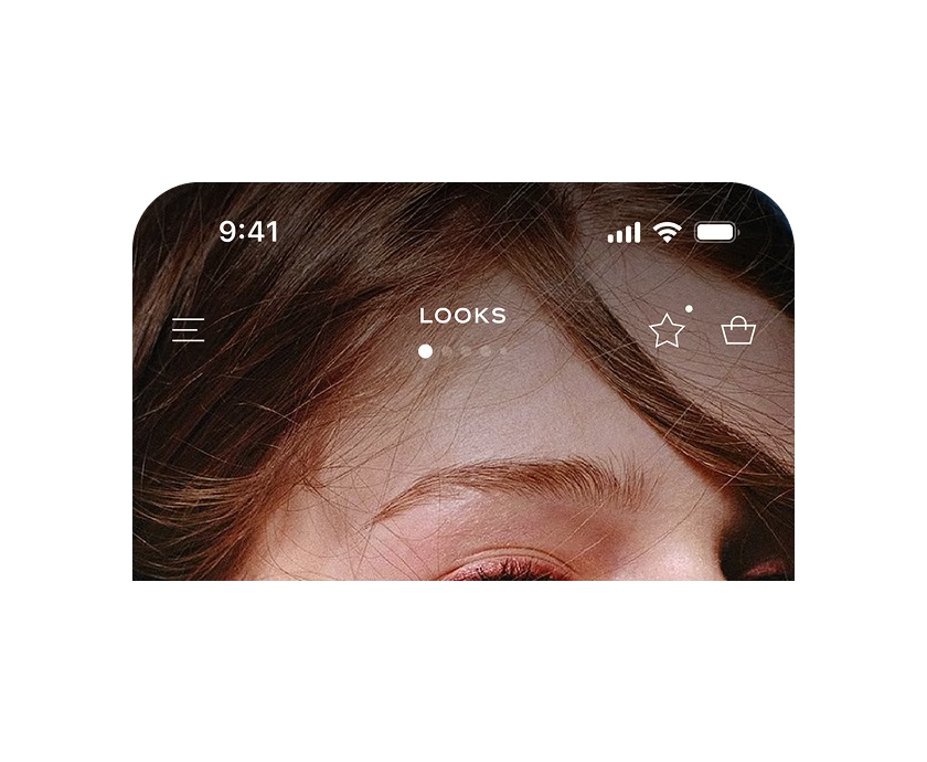
Navigation — Top part for the 1st level of navigation and transverse features
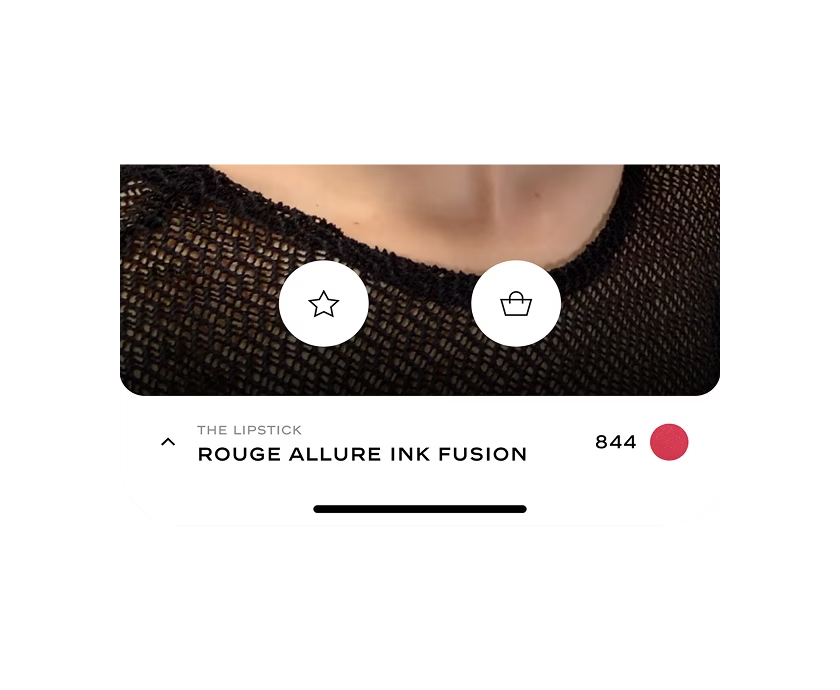
Navigation — Bottom part for contextual navigation
This virtual tool, while helpful, may not fully replicate the physical application of makeup. User insights suggest features like viewing the product on various skin tones for a realistic effect, providing product composition details, application advice, and timely information delivery.
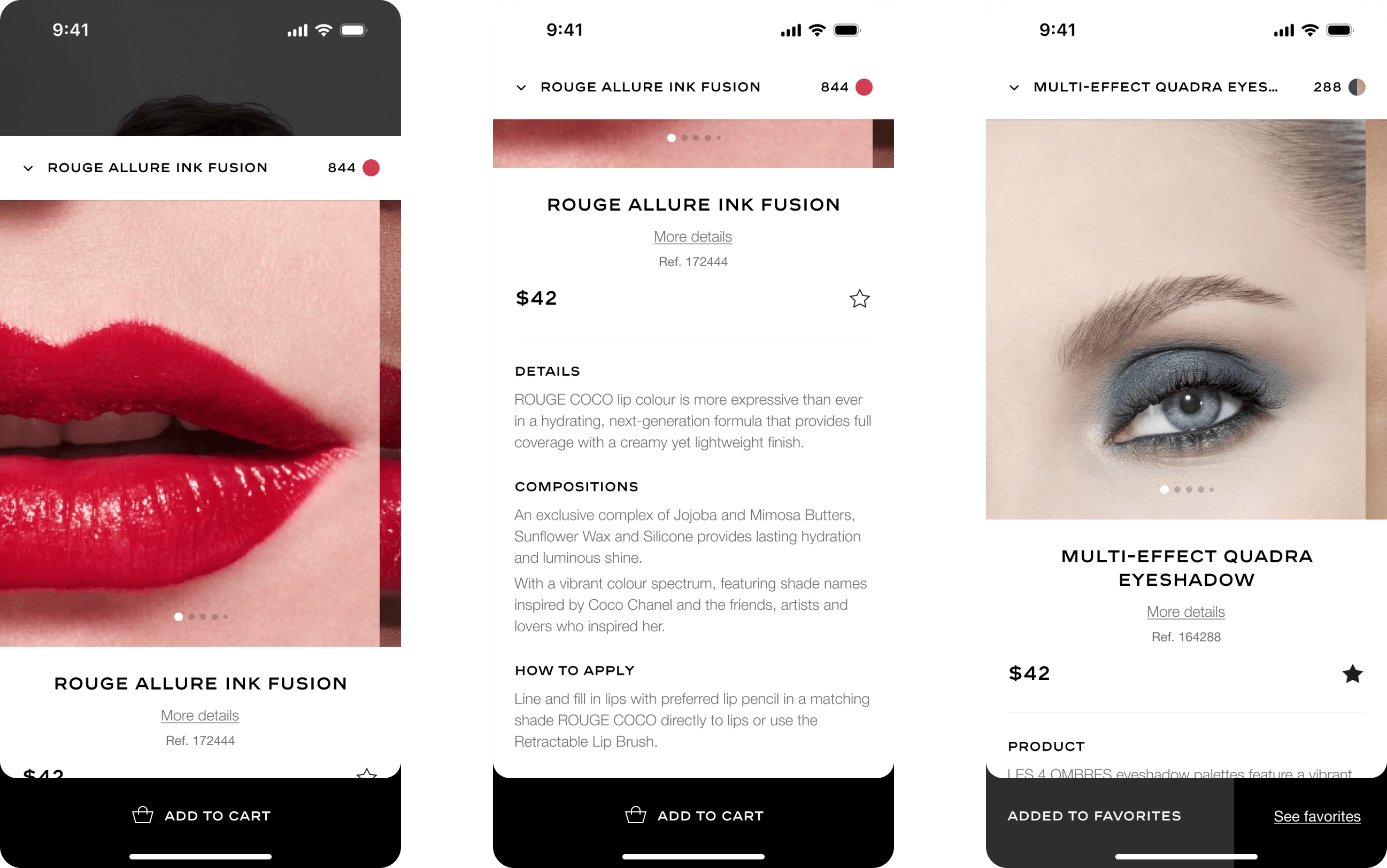
Product detail page — See details with carnation view & quick add to cart action
Others application hubs follow the same navigation pattern and are only dedicated to this specific application zone.
Users can explore and navigate through these zones with an editorial approach, utilizing live camera support for visual content. Specific shades, such as best-sellers or new arrivals, are displayed for each application zone, and filtering occurs while the live view is active.
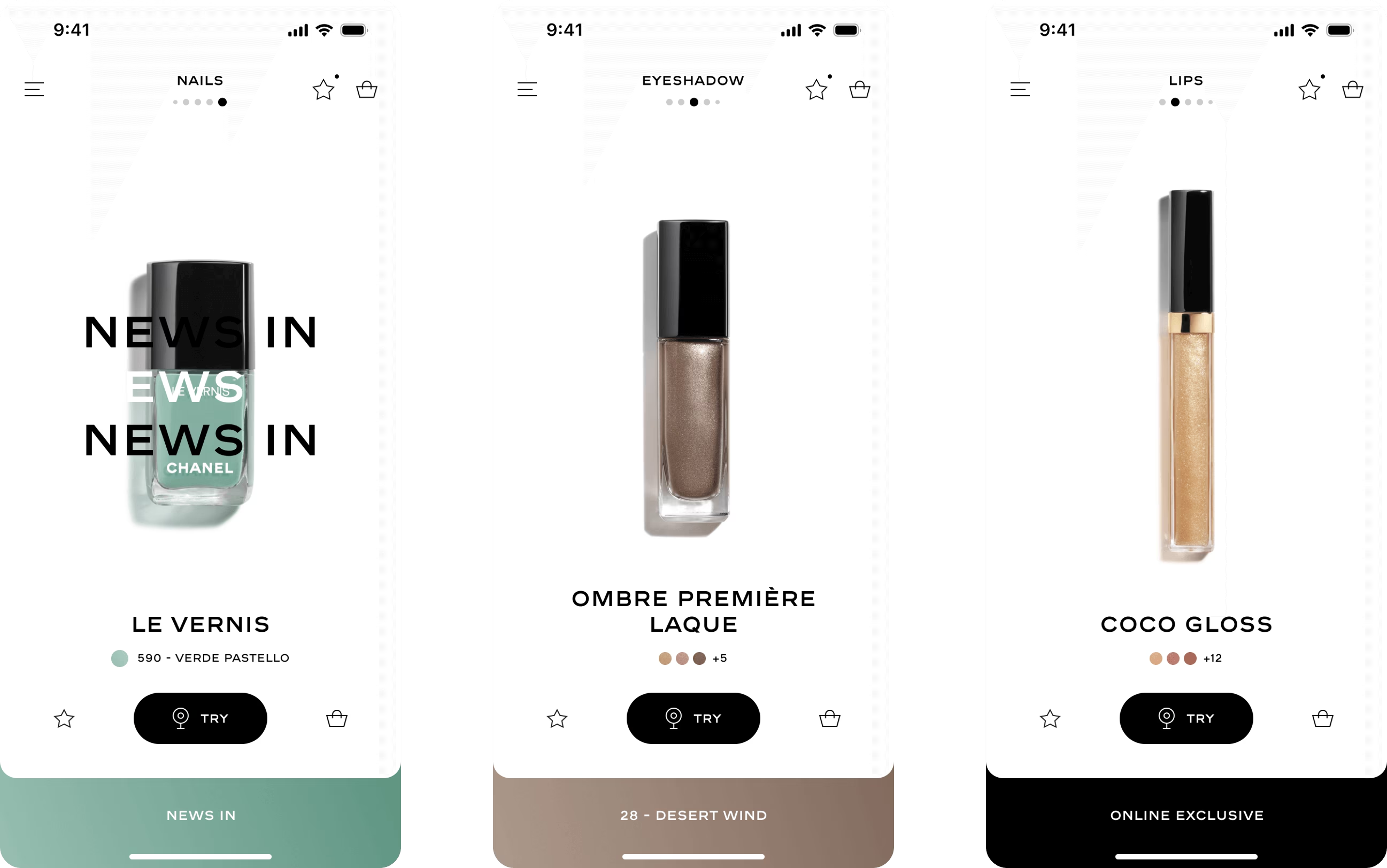
Diverging on modules — Hero products with accent on colors
Prototyping — Lips section
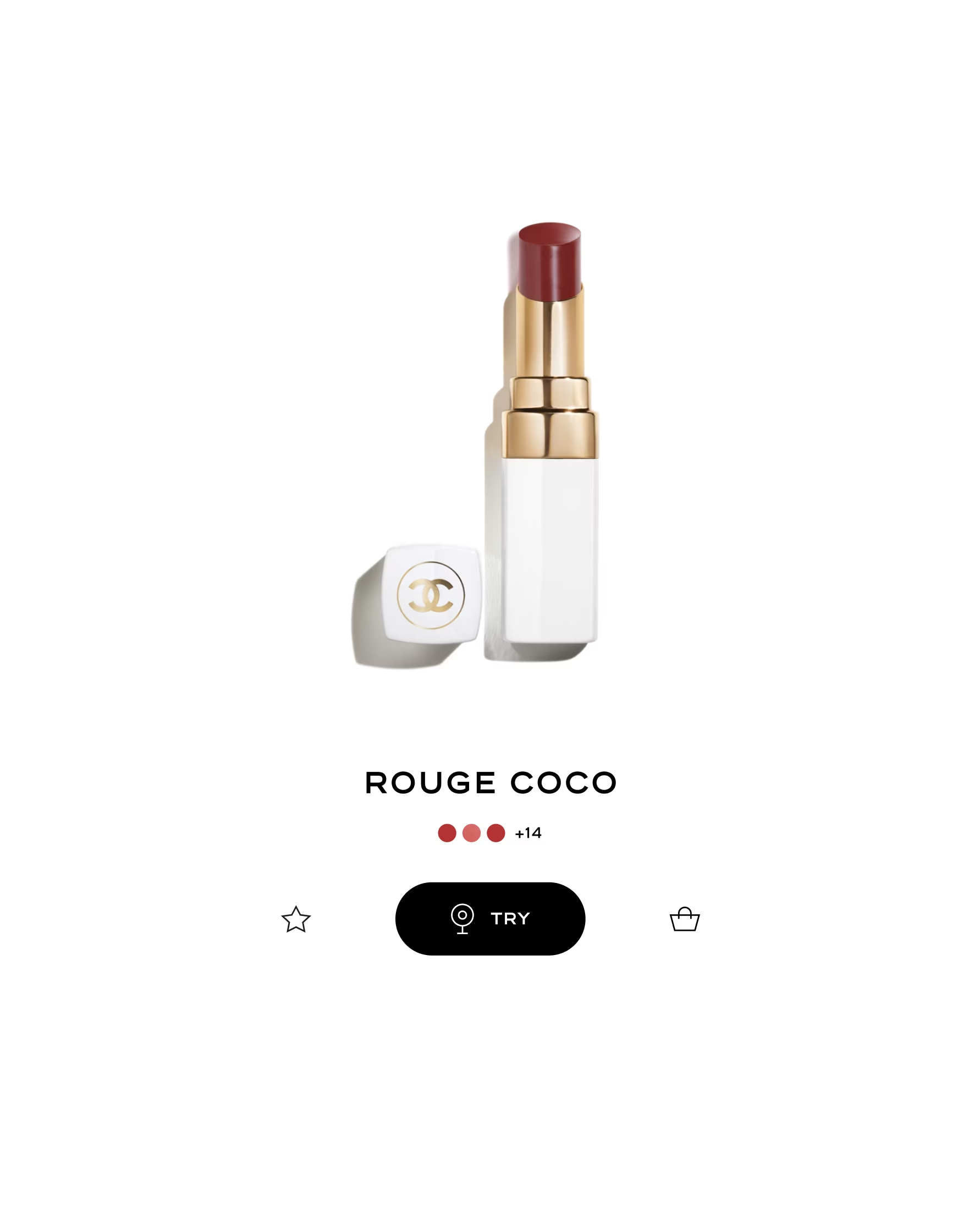
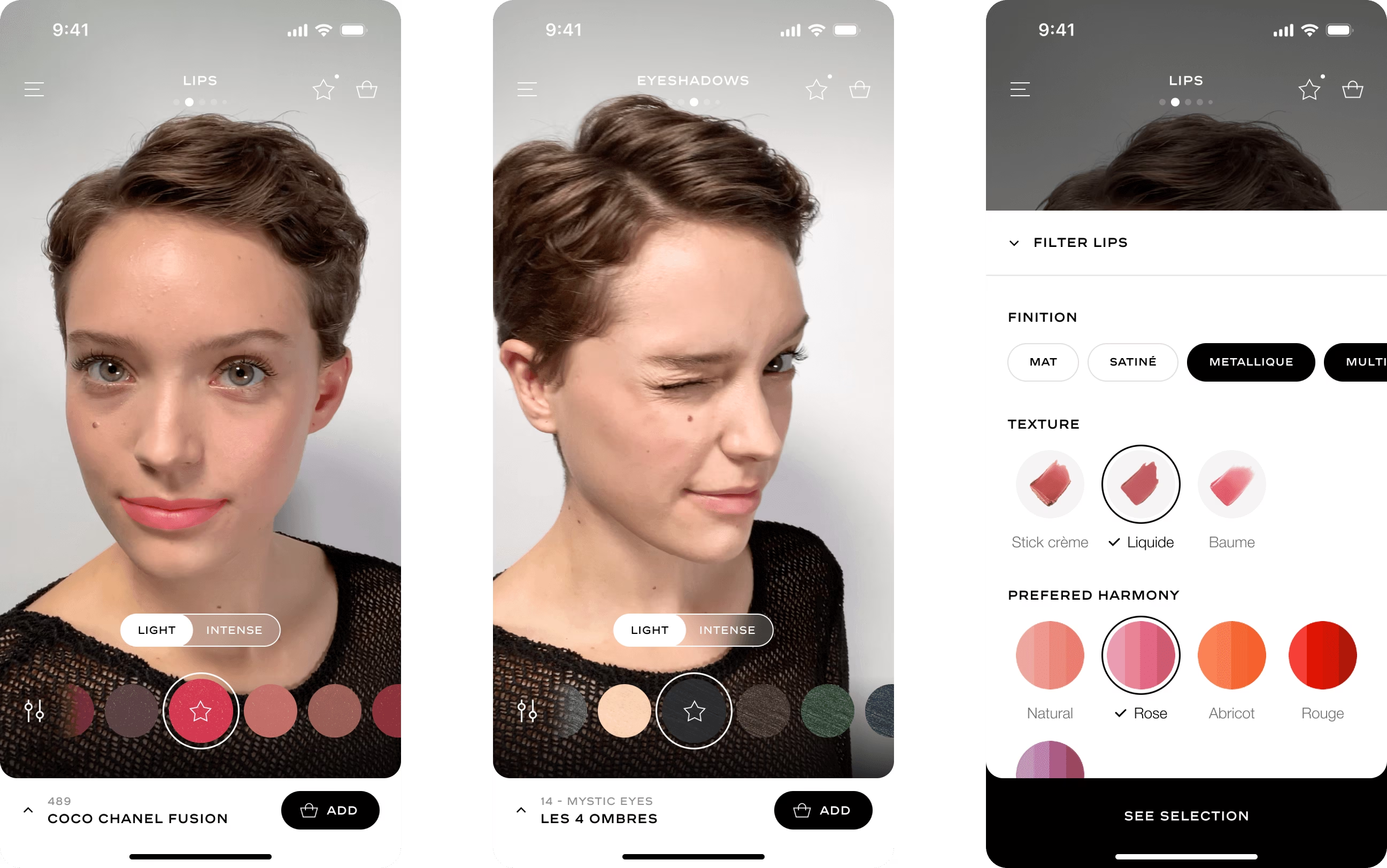
A one scroll page — Giving rhythm with editorail break
Explorations include additional features such as favorite products, a product scanner for accessing tutorials, a user product library, and a browsing experience tailored to user routines and preferences.
These features have the potential to enhance user retention but might require evaluative research to measure their impact relative to the effort involved.
Prototype — Wishlist with quick actions
Prototype — Product library to access dedicated content
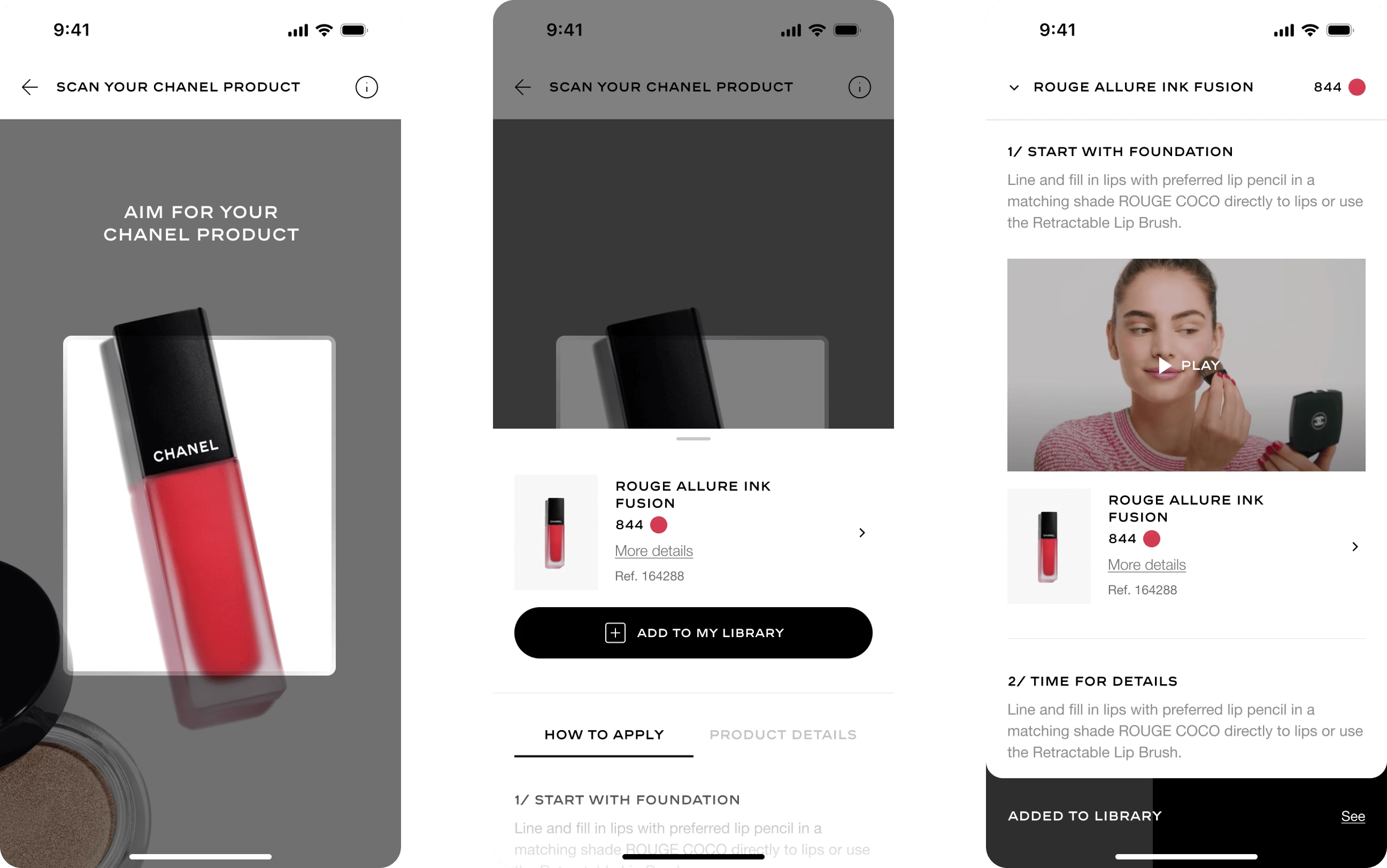
Product scanning — Accessing exclusive content, such as like tutorials for products user owns
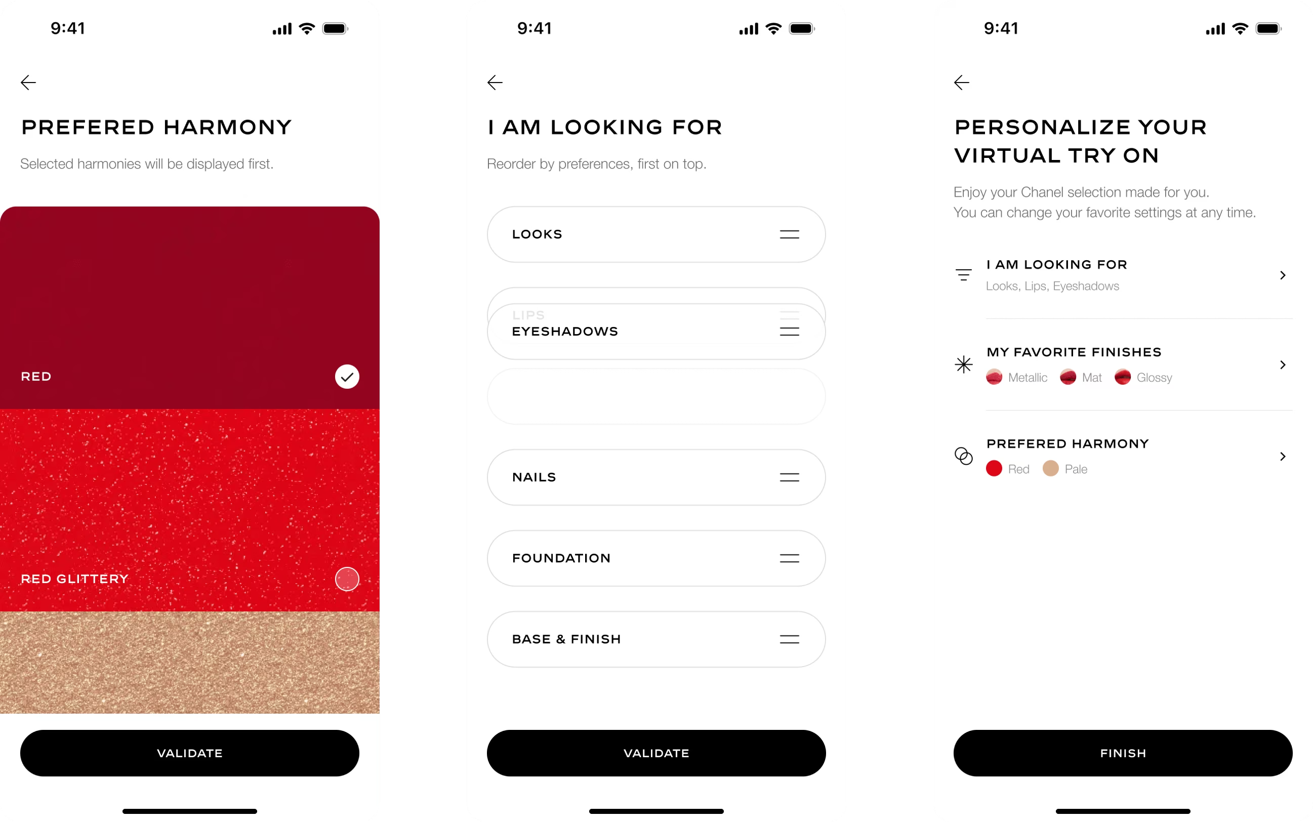
Navigation customization — From onboarding to settings
Creating a product cart, linking Chanel customer's account for a seamless navigation across different touchpoints
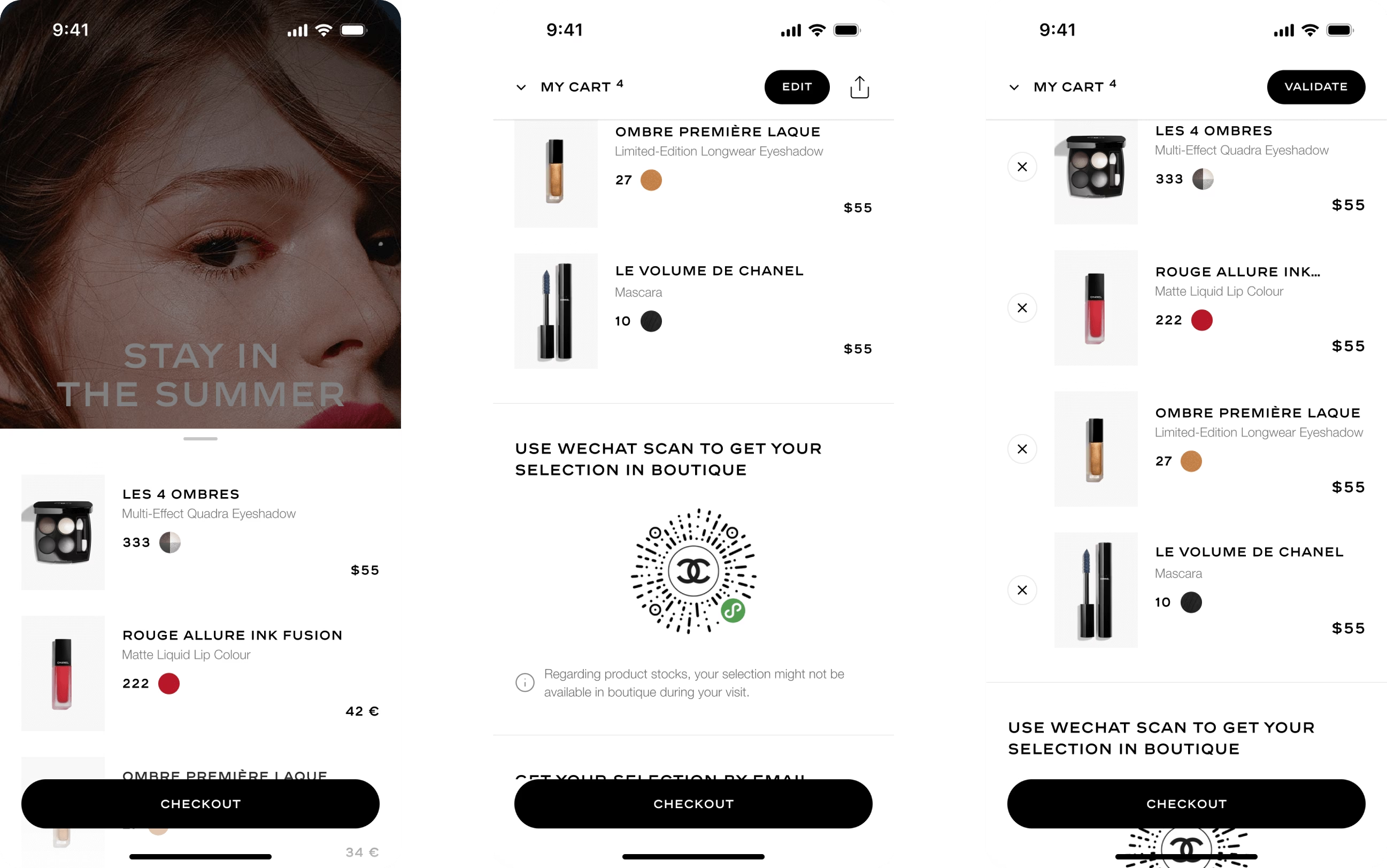
Cart navigation — From editing to creating seamless connexion outside the app
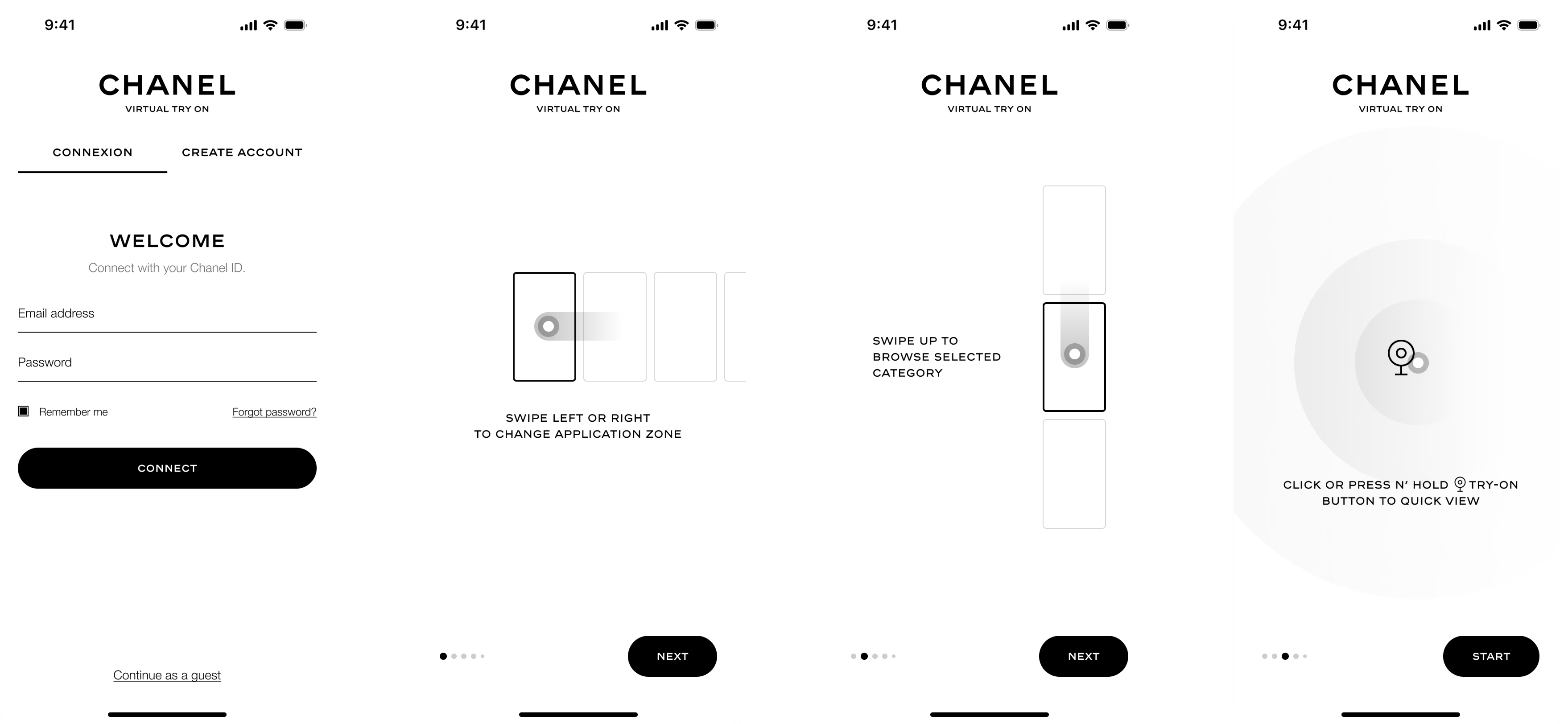
UI explorations — Login and tutorial onboarding
After a positive response, this proof of concept would be use to craft a more detailed, strategic design brief for a future production.
Almost a year after this PoC, I was pleased to find that the core features and main UX patterns were retained in the final client-side implementation.
This project was well received and was a strong asset to secure more project with Chanel, leading to more revenue for the agency
The prototype gave a clear and tangible direction for Chanel. I did not work on the final design production that made it live, but I assume it influenced a lot the outcome
By contacting me, I will provide you the full story
through a presentation deck that covers how I got there.