A full design case study is available on request
Discover the journey
UX/UI Design
Art Direction
Responsive Design
Design System
Building Process
Engineering Collaboration
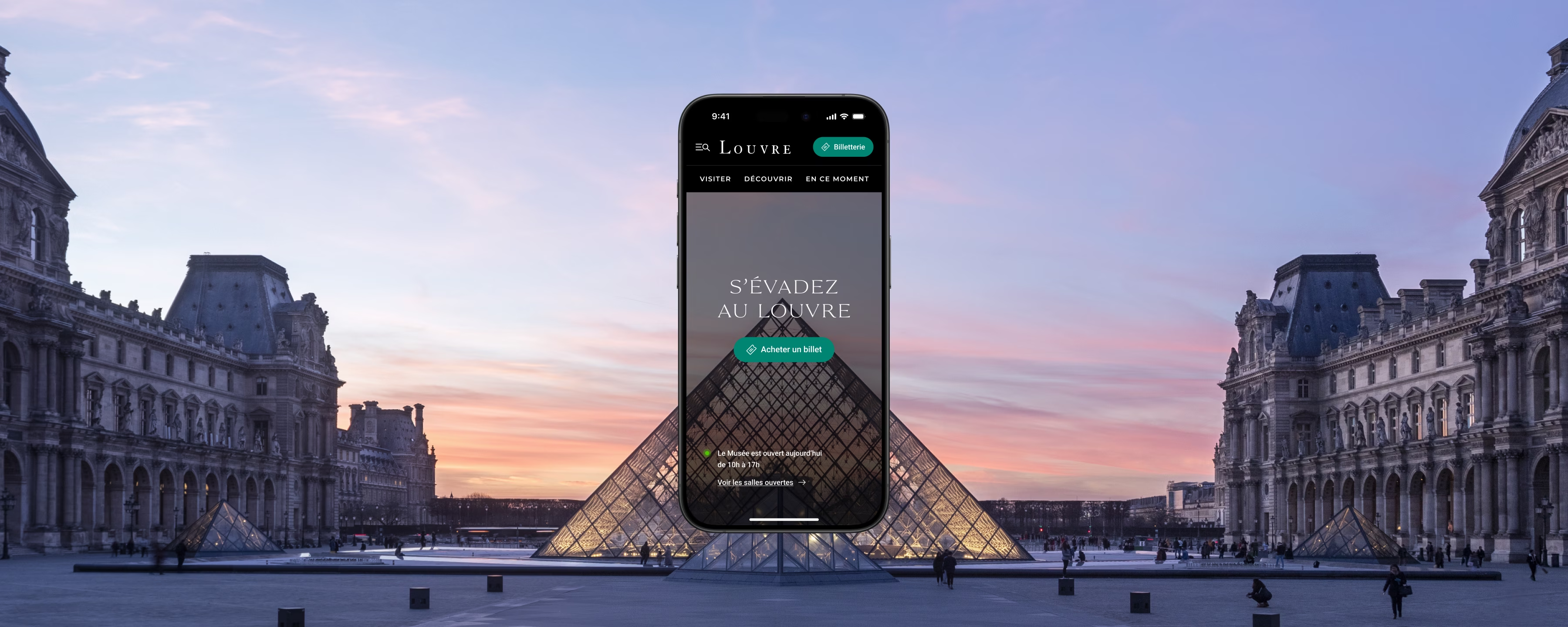
The redesign of the Louvre Museum's platform aims to improve and simplify both the physical and online experience for visitors, adapting it to the high pace of the museum while meeting their expectations.
With challenges such as the scale of the collections, the complexity of navigating the museum, and a significant cultural offering, the goal is to shift from an intimidating place to a guided, connected and coherent platform, making the journey accessible and memorable for every visitor.
→ Increase website CSAT across the whole visitor journey.
→ Ship the new platform in 9 sprints with at least 60% accessibility score.
→ Cut repetitive tasks for the internal content workflow, enabling teams to contribute to the website faster and with greater quality.
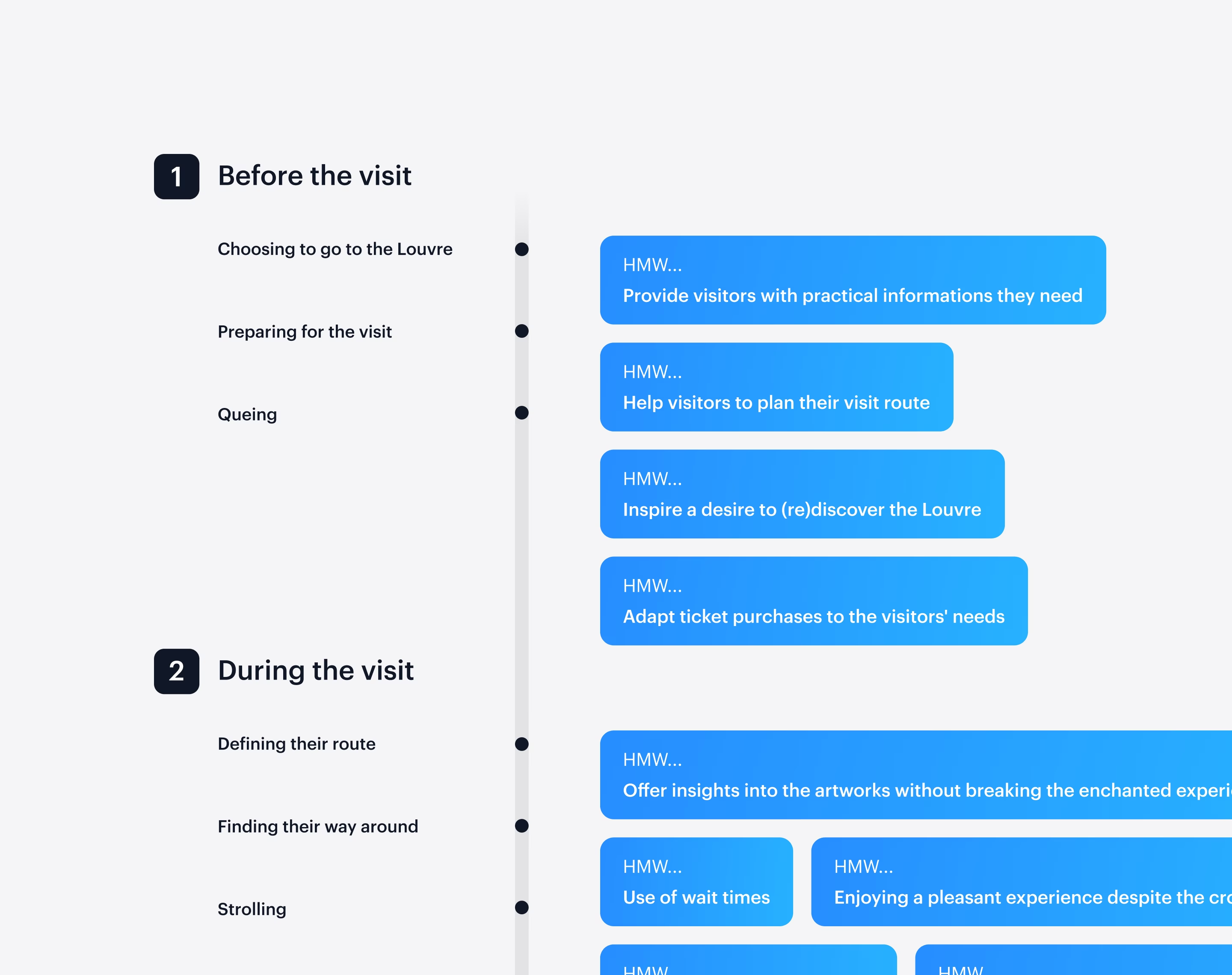
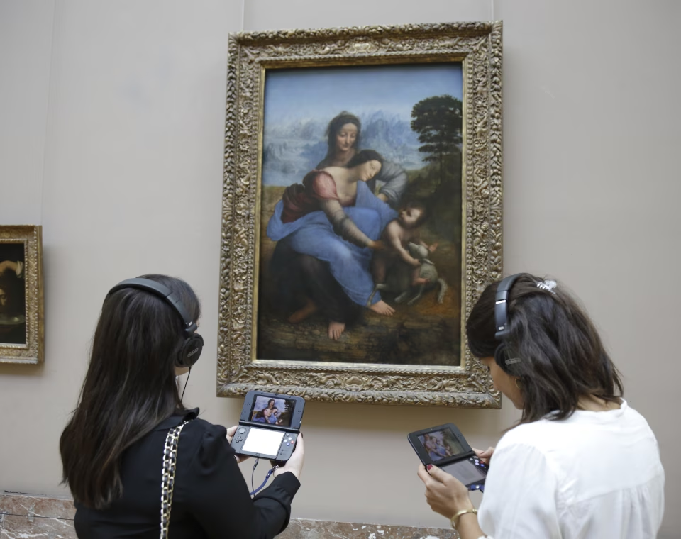
To explore the possibilities of the project, the Louvre team conducted extensive research including interviews with visitors and museum experts.
Then, our team leveraged experience maps and insights from visitors that guided our ideation process through tree mapping and user story: our team and I could move forward with confidence.
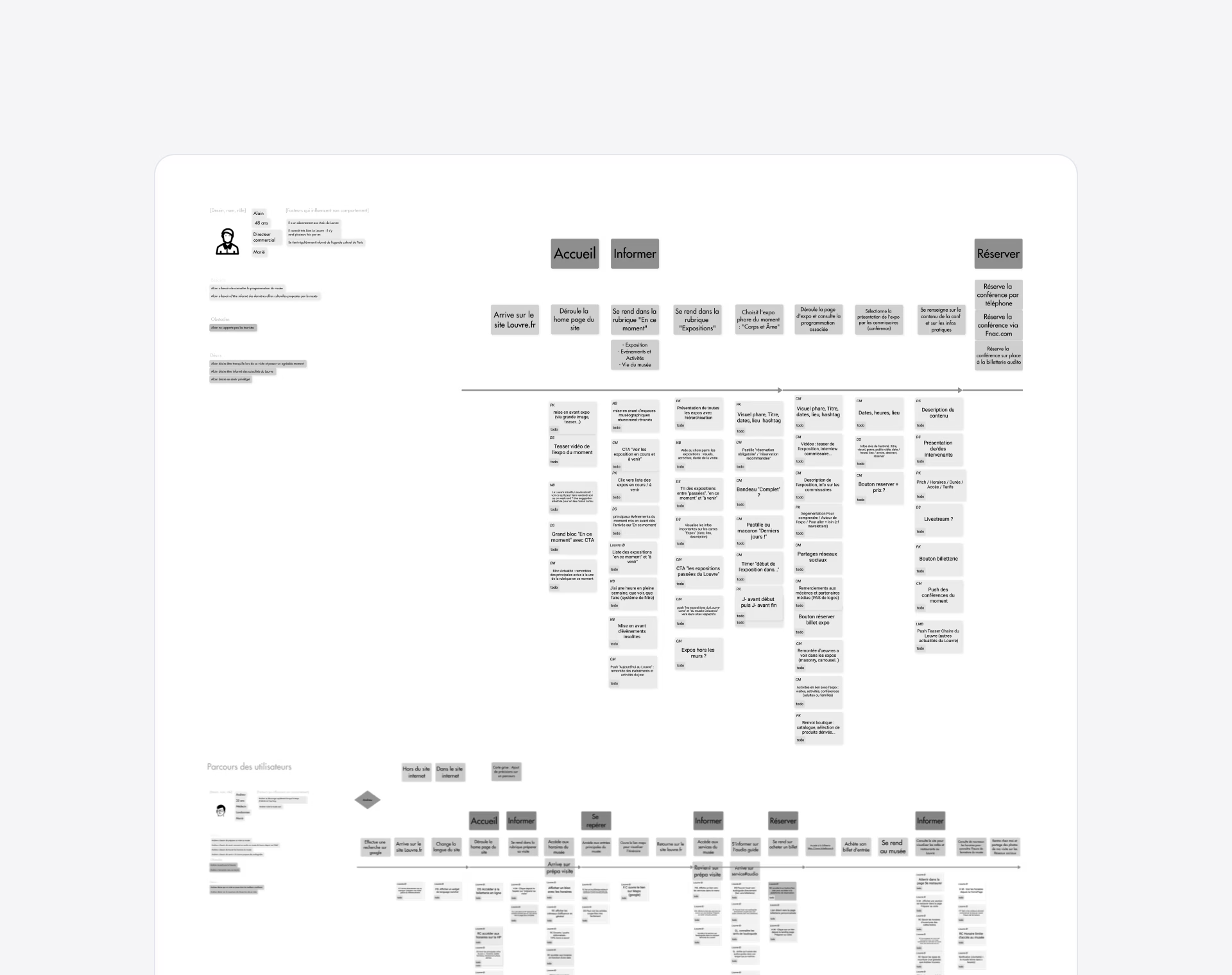
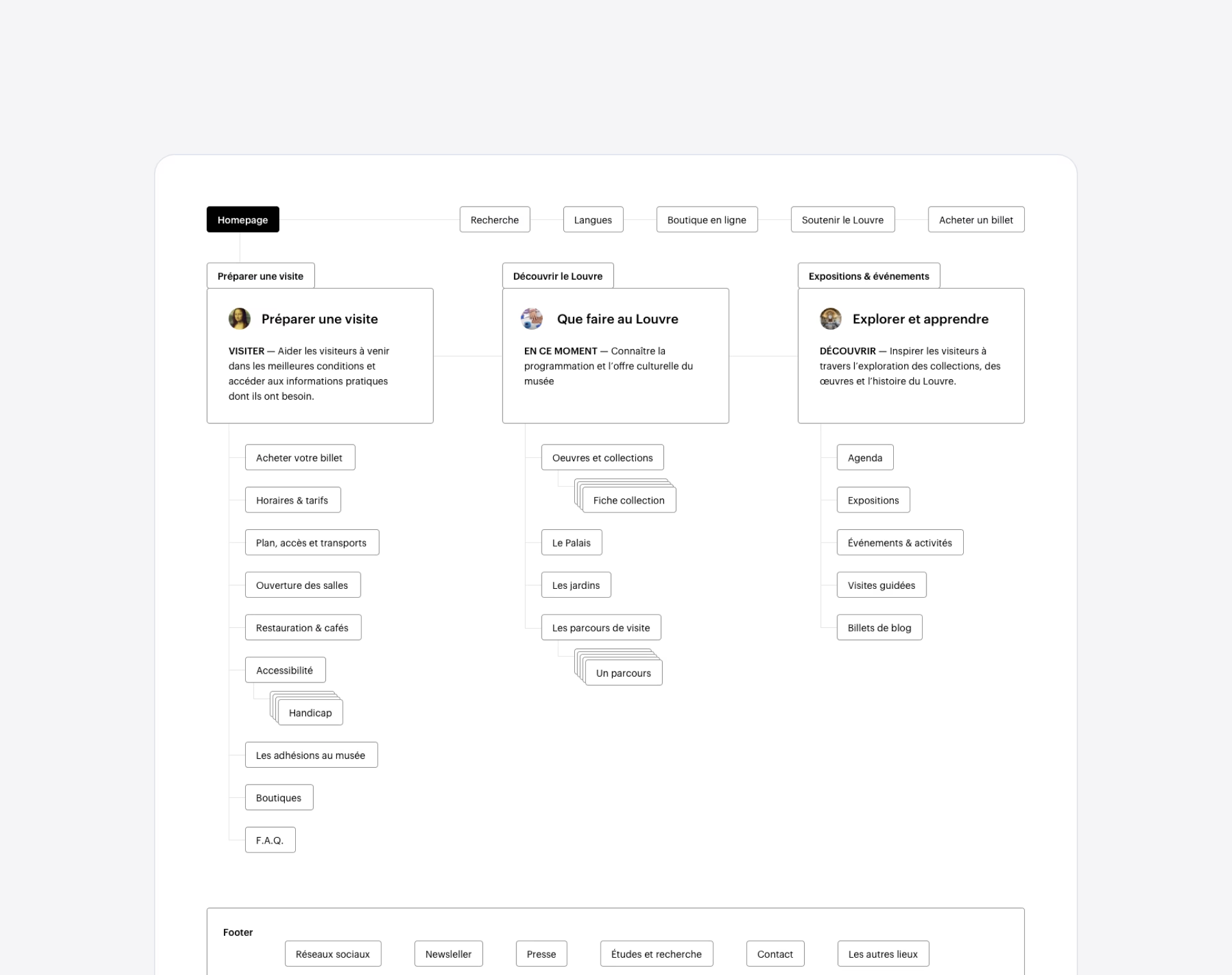
The new platform centers on five UX principles: transparency, visitor support, frustration management, renewed interest, and timely updates.
This approach enhances the visitor experience across three key moments—before, during, and after the visit—while fostering a lasting connection that motivates return visits and solidifies the Louvre's role in the cultural life.
The navigation — Centered on visitors' needs and museum's strategy
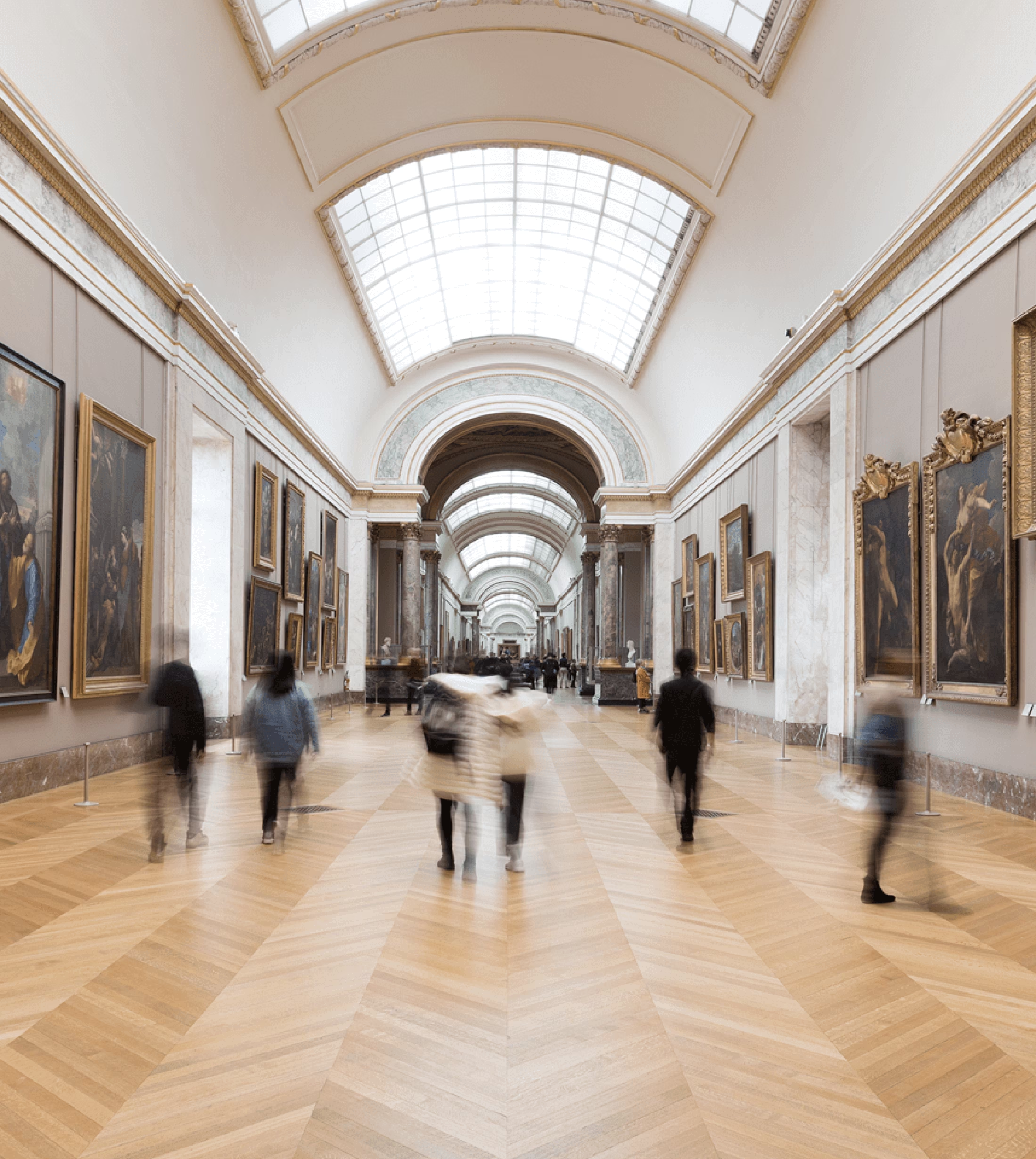
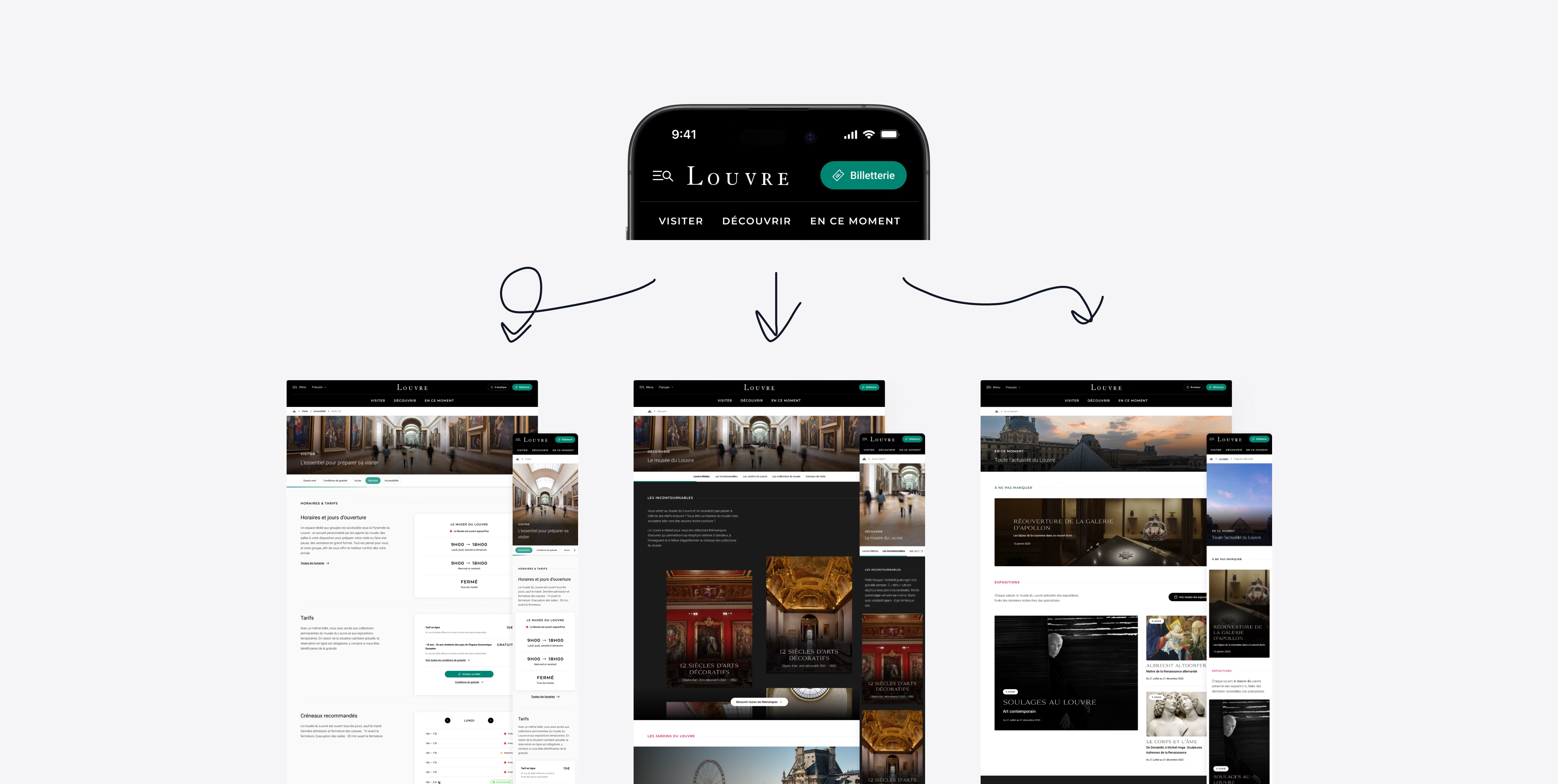
Key information is organized into modules for immediate understanding, guiding the visitor during the highlights of a visit. The platform easily adapts to the museum's pace of life with facilitated content contribution.
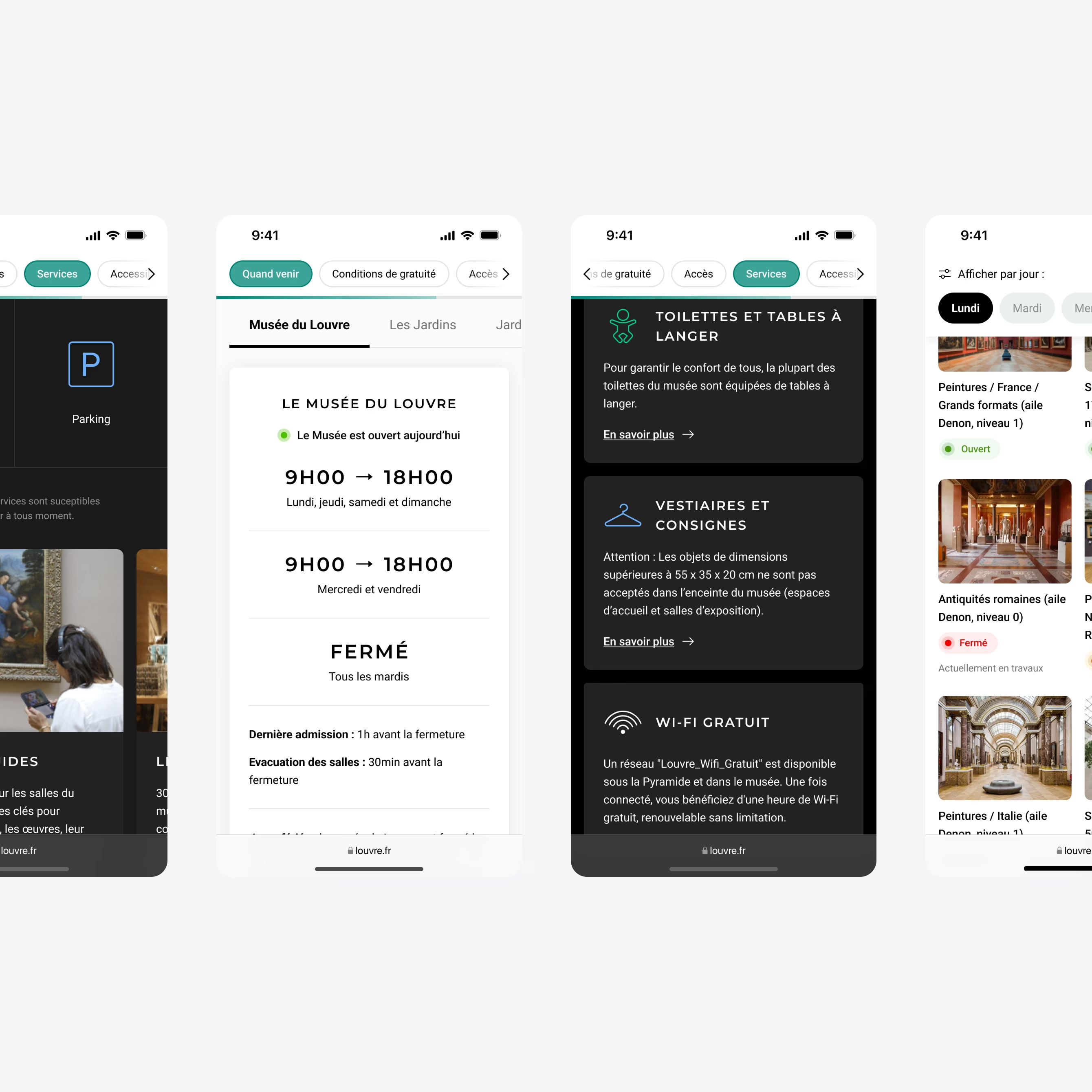
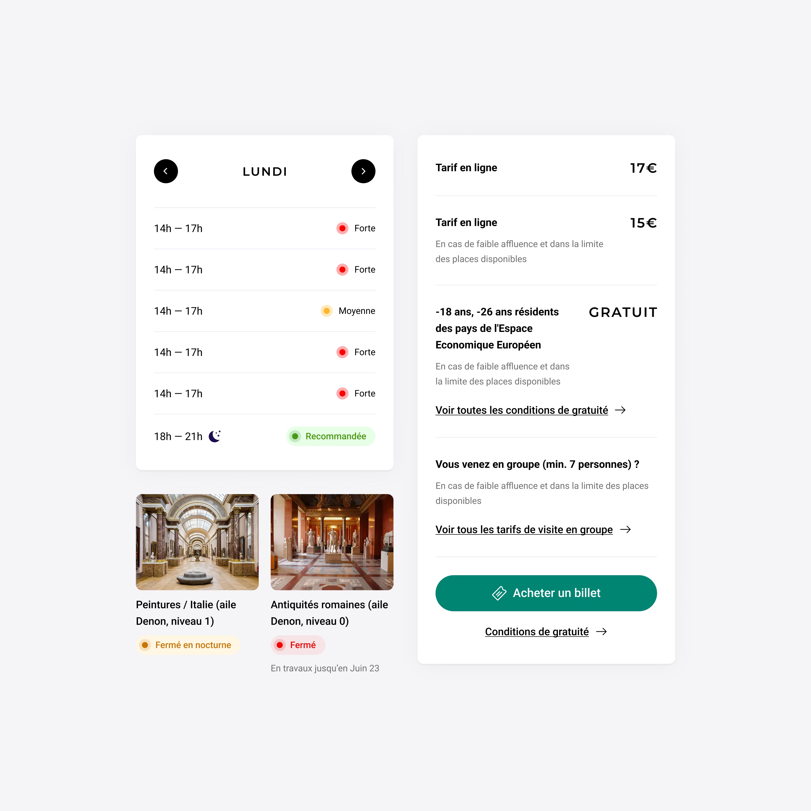
The pages have been designed to be easily contributed to by museum experts. A balance has been found between freedom and constraints to avoid duplicating information.
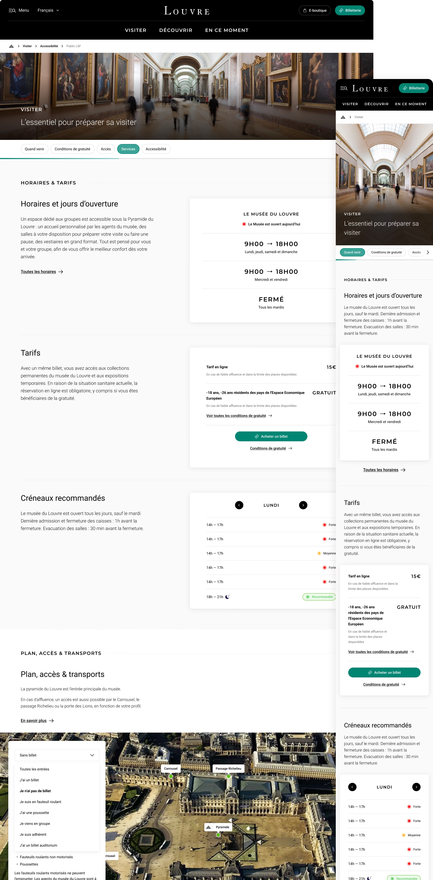
Template #01 (Level 1) — Displaying essential information on landing pages
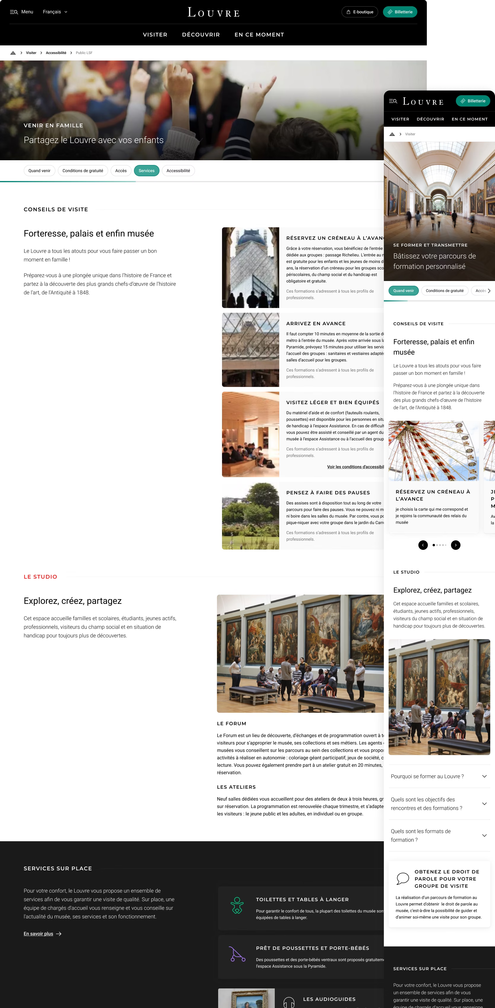
Template #01 (Level 2) — Providing detailed information for each section
Template #02 (Level 2 & 3) — A contributable template for flexibility, paired with a tab system for clarity
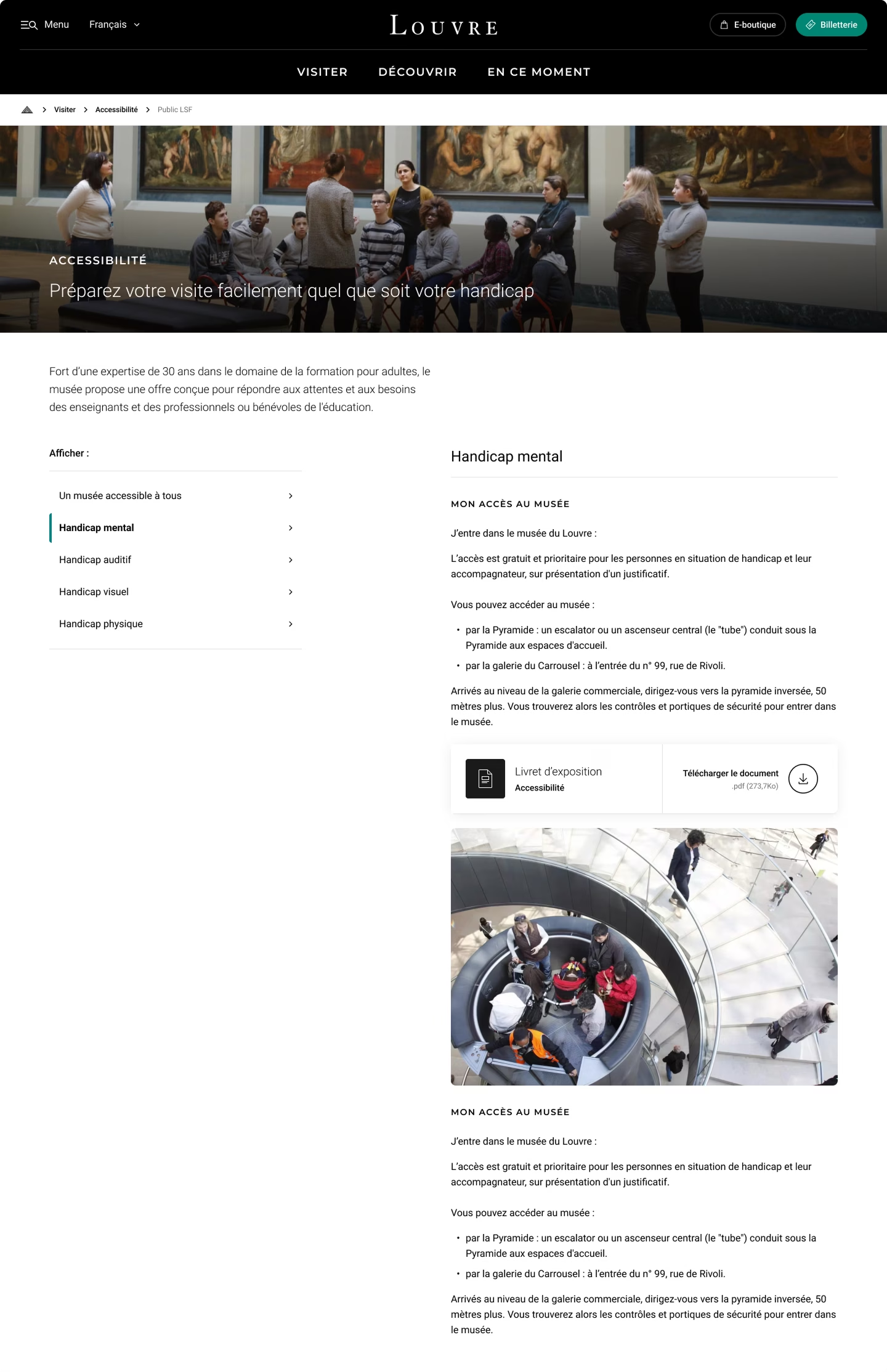
Template #02 (Level 2 & 3) — Desktop version
Facilitate arrival at the museum and provide moments of respite, while linking the magic of the place (iconography) to the practicality of services (icons, information hierarchy)
Access to the museum — Facilitating and guiding before the visit
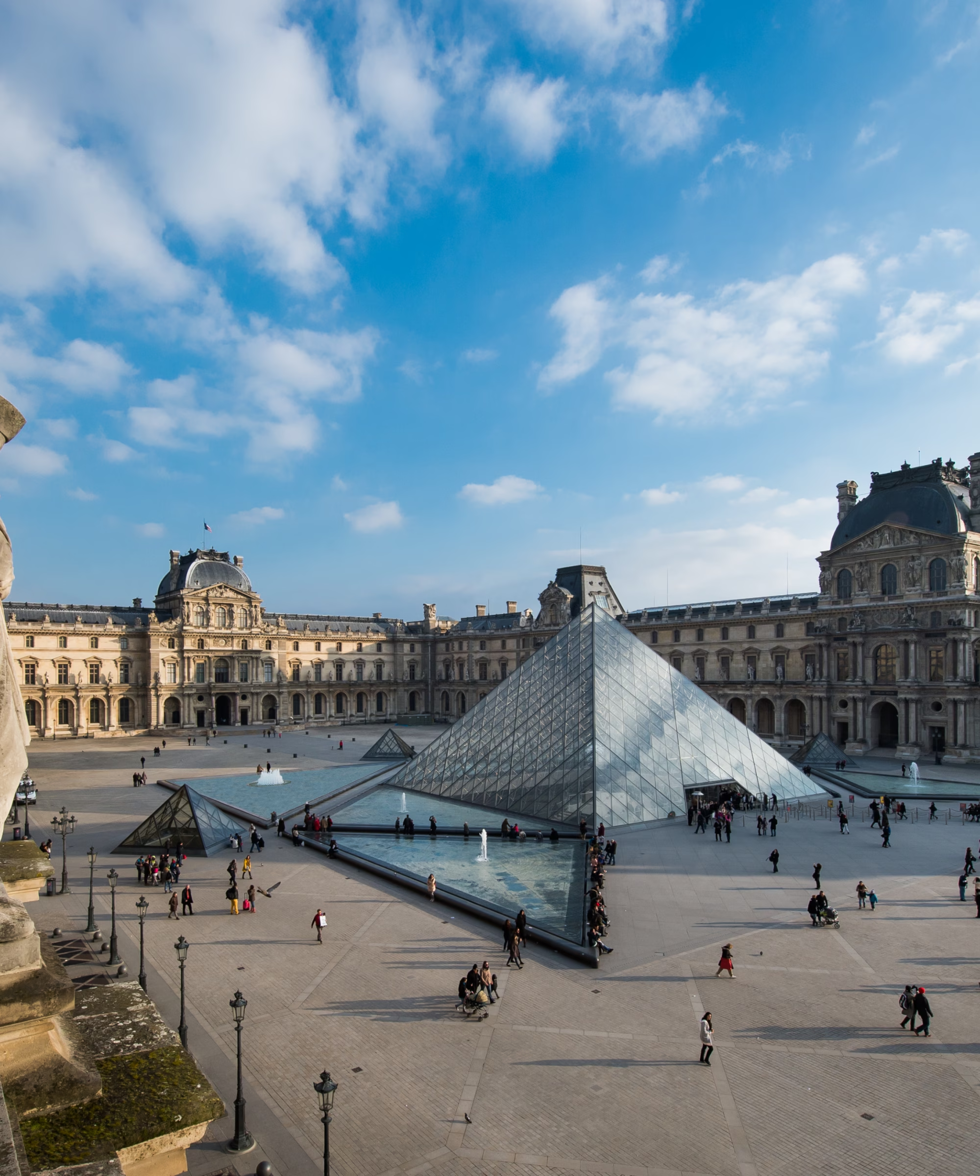
Access to restaurants — Linking the magic of the museum (iconography) to the practicality of services (icons, information hierarchy)
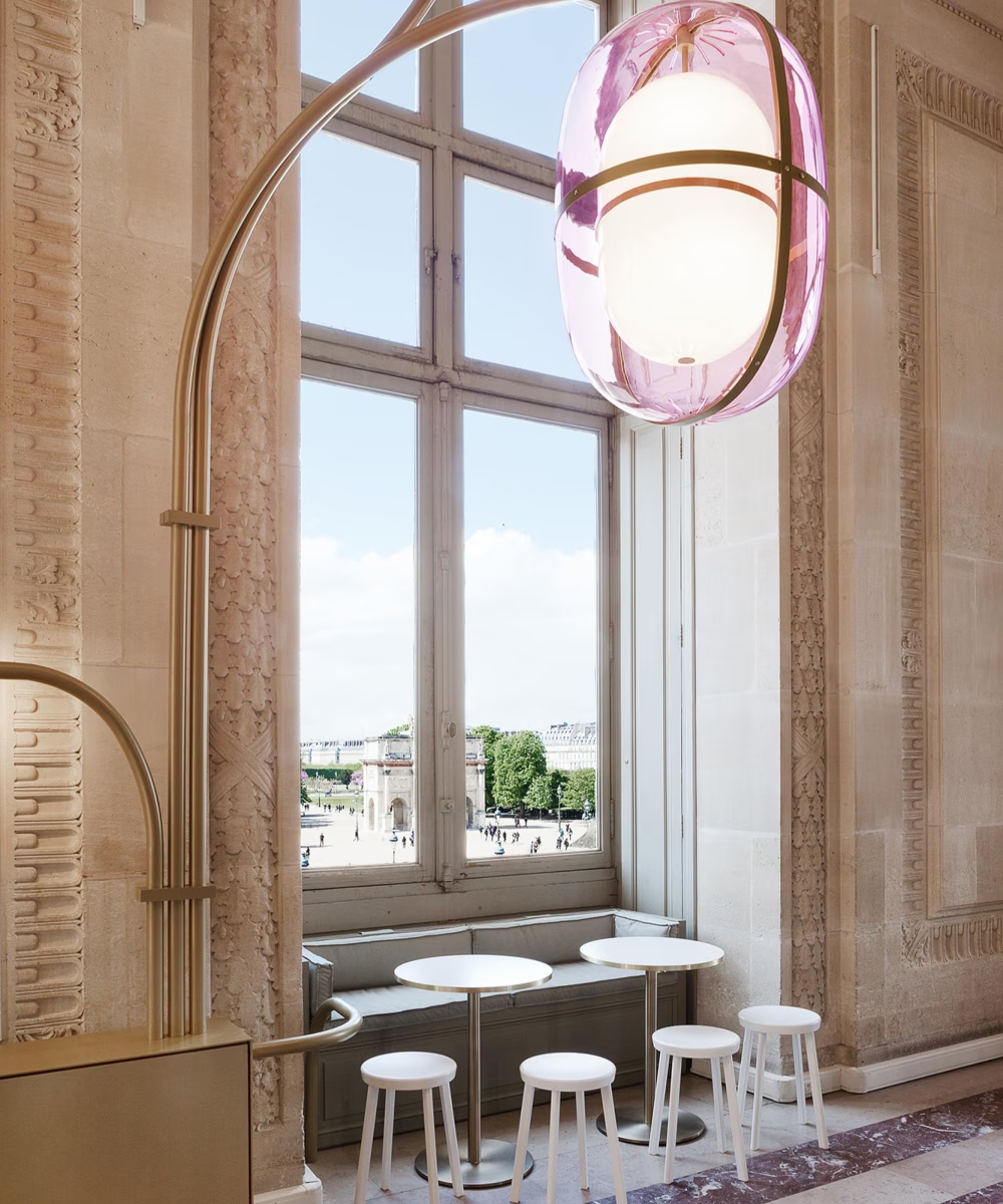
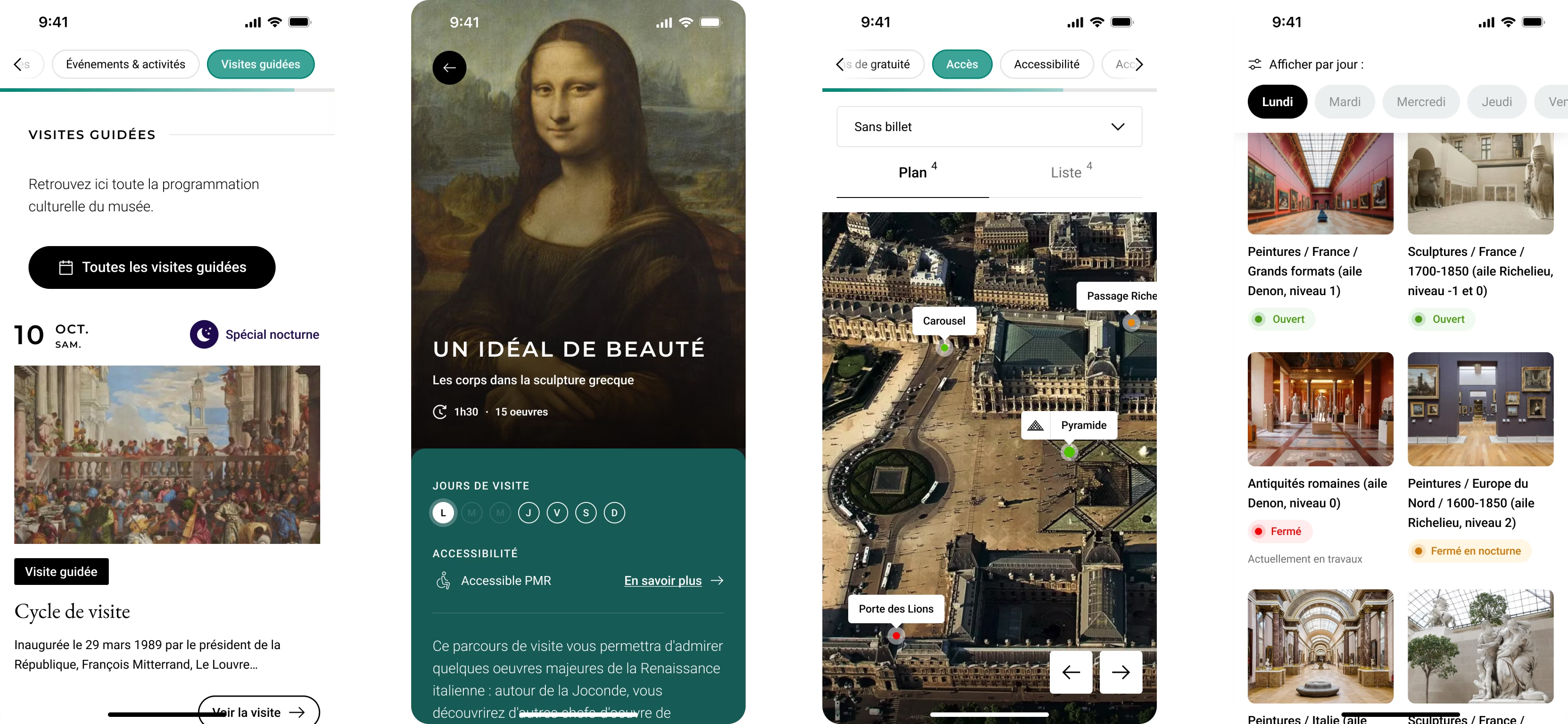
Making the museum accessible to all through the understanding of the artworks and by navigating the vastness of the collections was one of the key angle for the redesign.
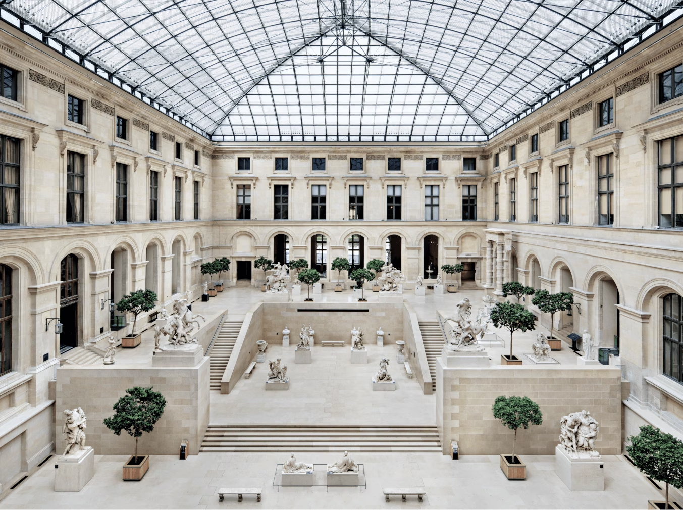
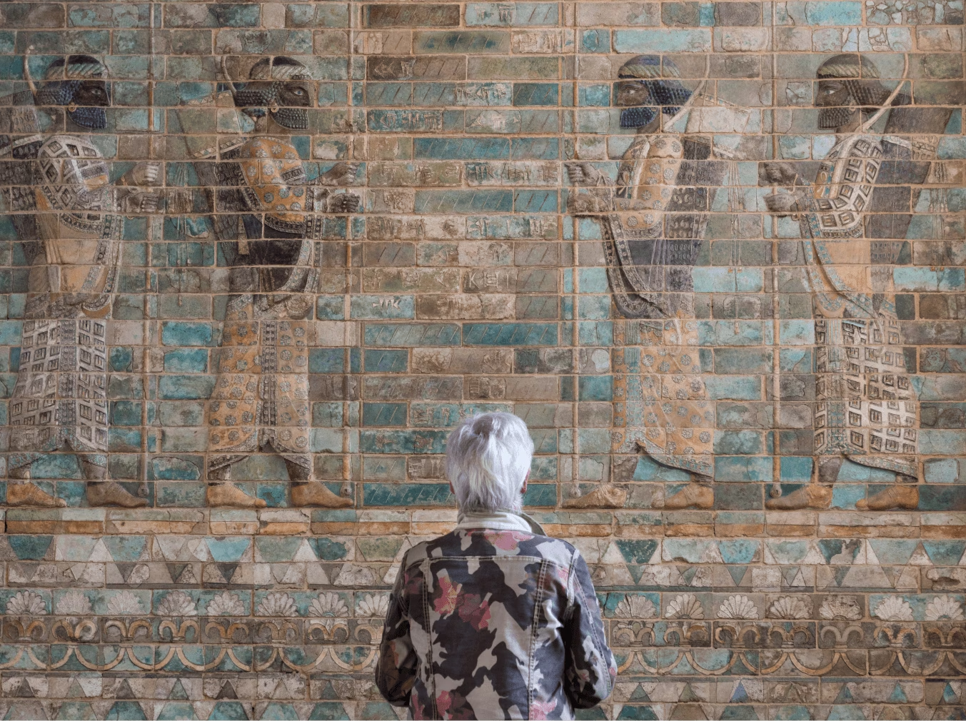
The redesign of guided paths creates a new visiting experience, through simplified routes that highlight lesser-known works. This offers original and more accessible tours for visitors.
The UX fosters an optimize navigation, from the entrance to the exit of a path, incorporating breaks and effective signage to help visitors easily orient themselves.
New UX — Offering targeted and simplified choices of routes, centered around a few artworks
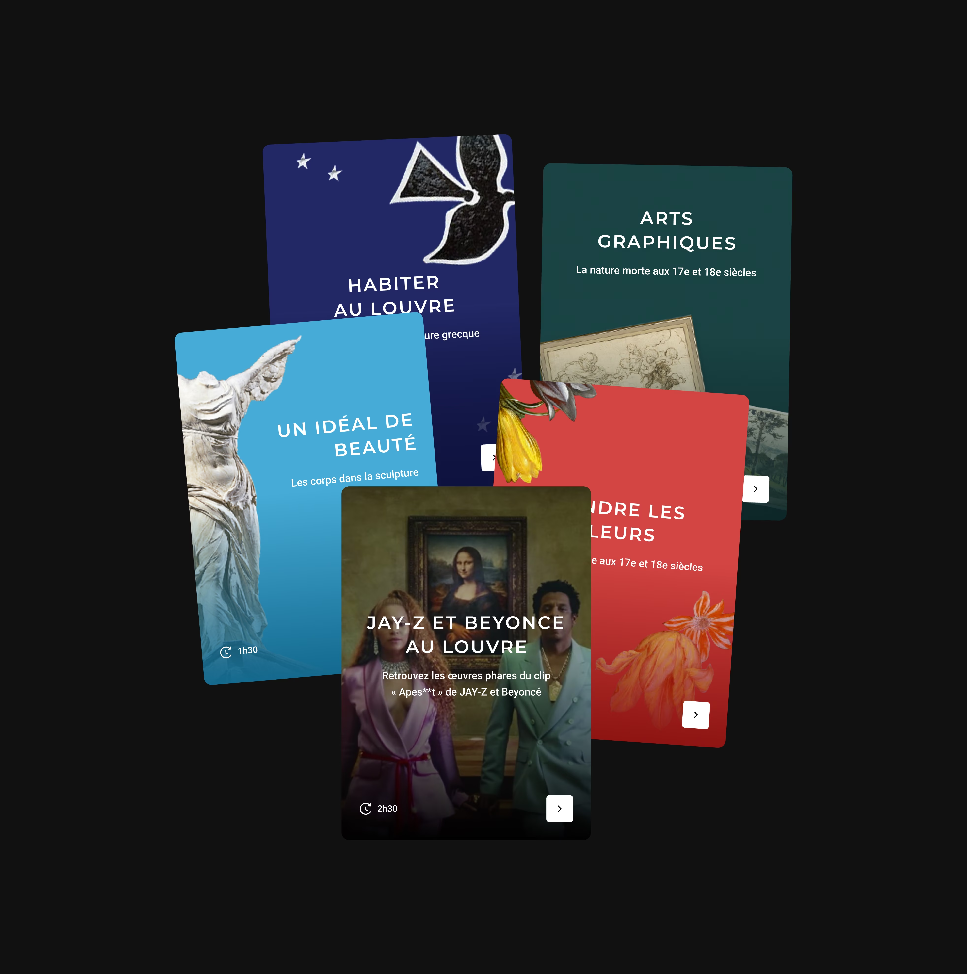
The Louvre Museum is one of the few museums in the world to offer an entry through the premises to present its collections. Thus, the premises are an important part of the wonder of a visit and are at the heart of a guided tour.
This provides the museum with an opportunity to open a book on the history of the Louvre to (re)inspire visitors and to bring the artworks closer to visitors with universal themes of reading, to make them want to return, to help them find information after the visit, and to foster a spirit of discovery.
Dreaming about the Louvre — Creating a fully customizable and contributable iconographic template for a striking visual experience
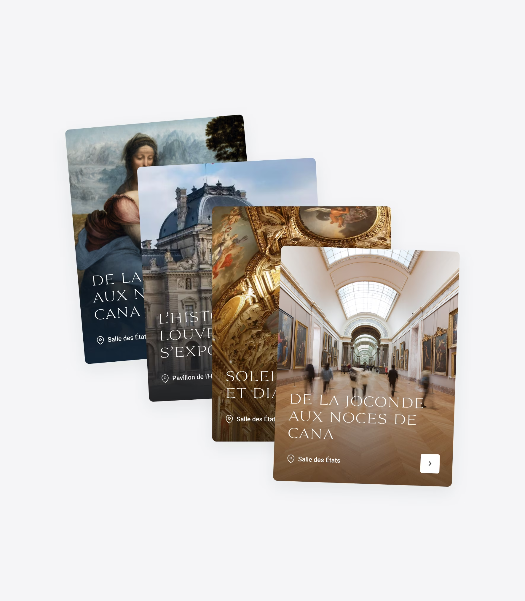
We have reviewed and simplified the Louvre's cultural offerings to make them clearer and more visible, with a new organization that allows for targeting and effectively communicating about the right events to the appropriate audience at the ideal time.
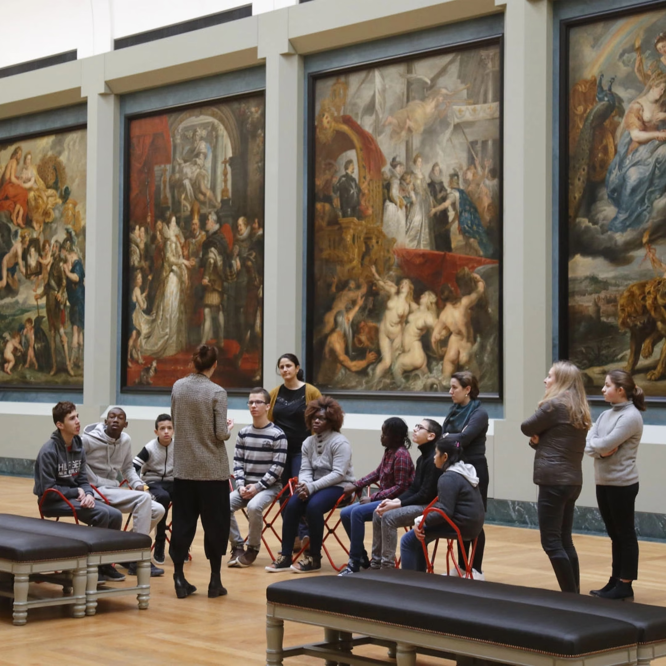
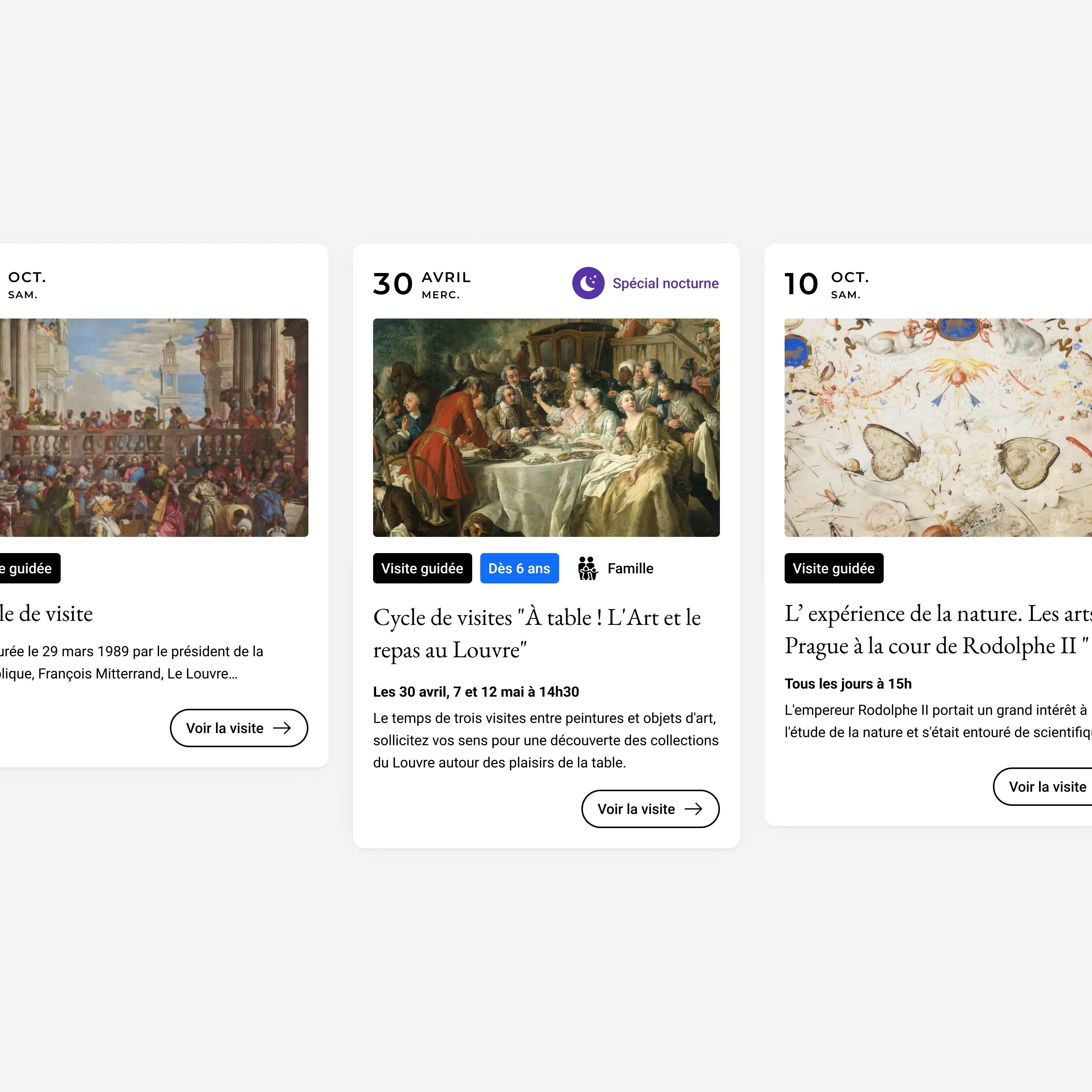
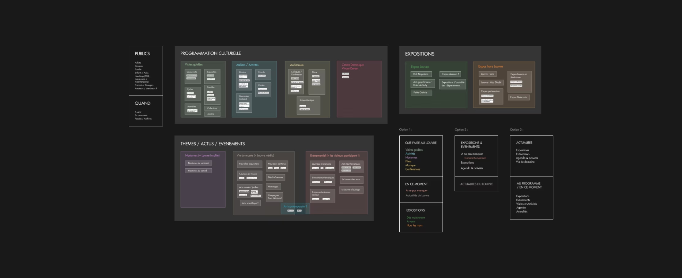
Workshop — Defining programmation articulation with stakeholders
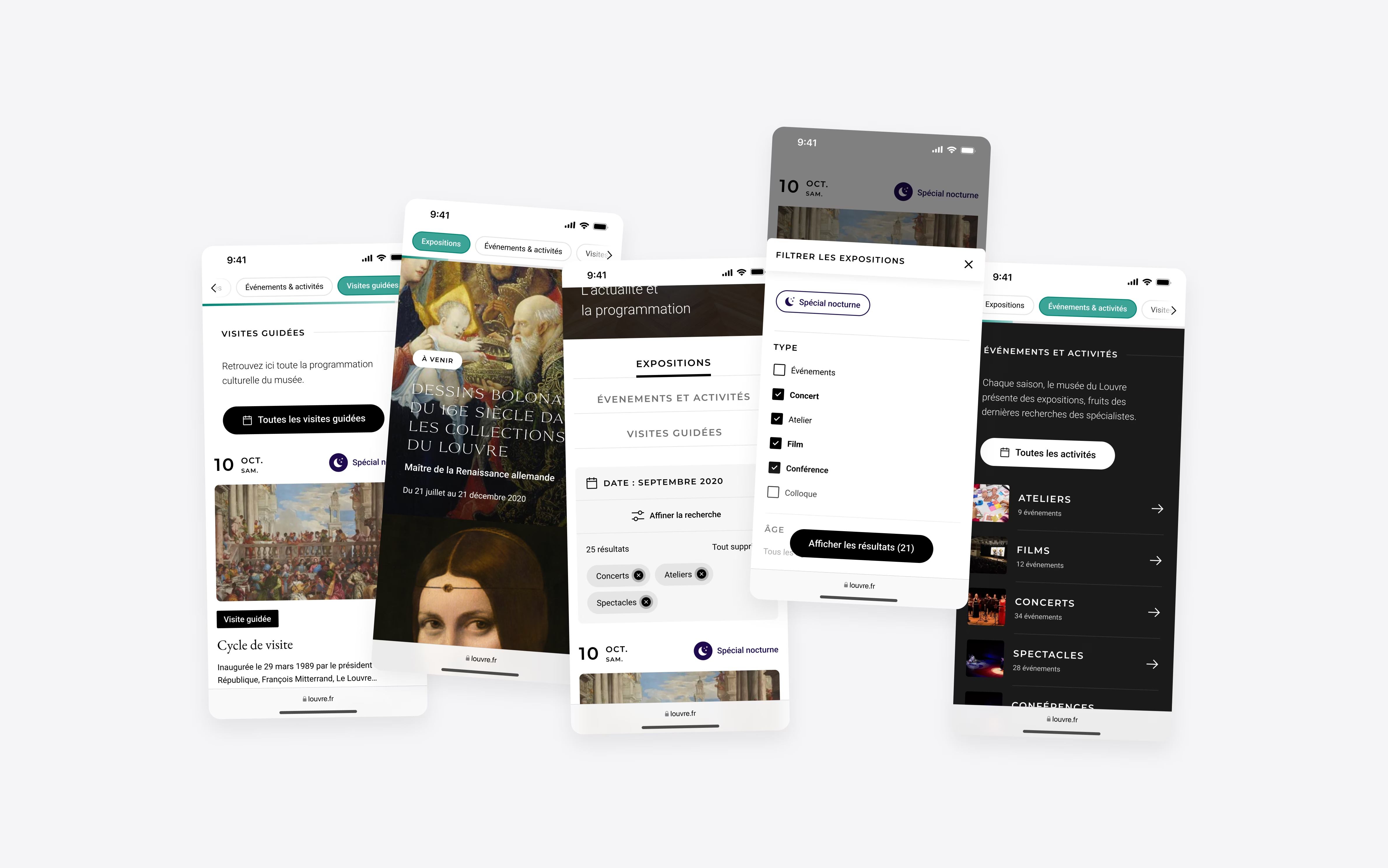
We have simplified the navigation of our platform by highlighting essential information: major exhibitions are pinned to remain visible, with tags indicating their duration, and are primarily aimed at first-time visitors.
Navigation between categories is smooth, facilitating access to organized content, and guided tours, which represent 40% of the museum's activities, are easily accessible.
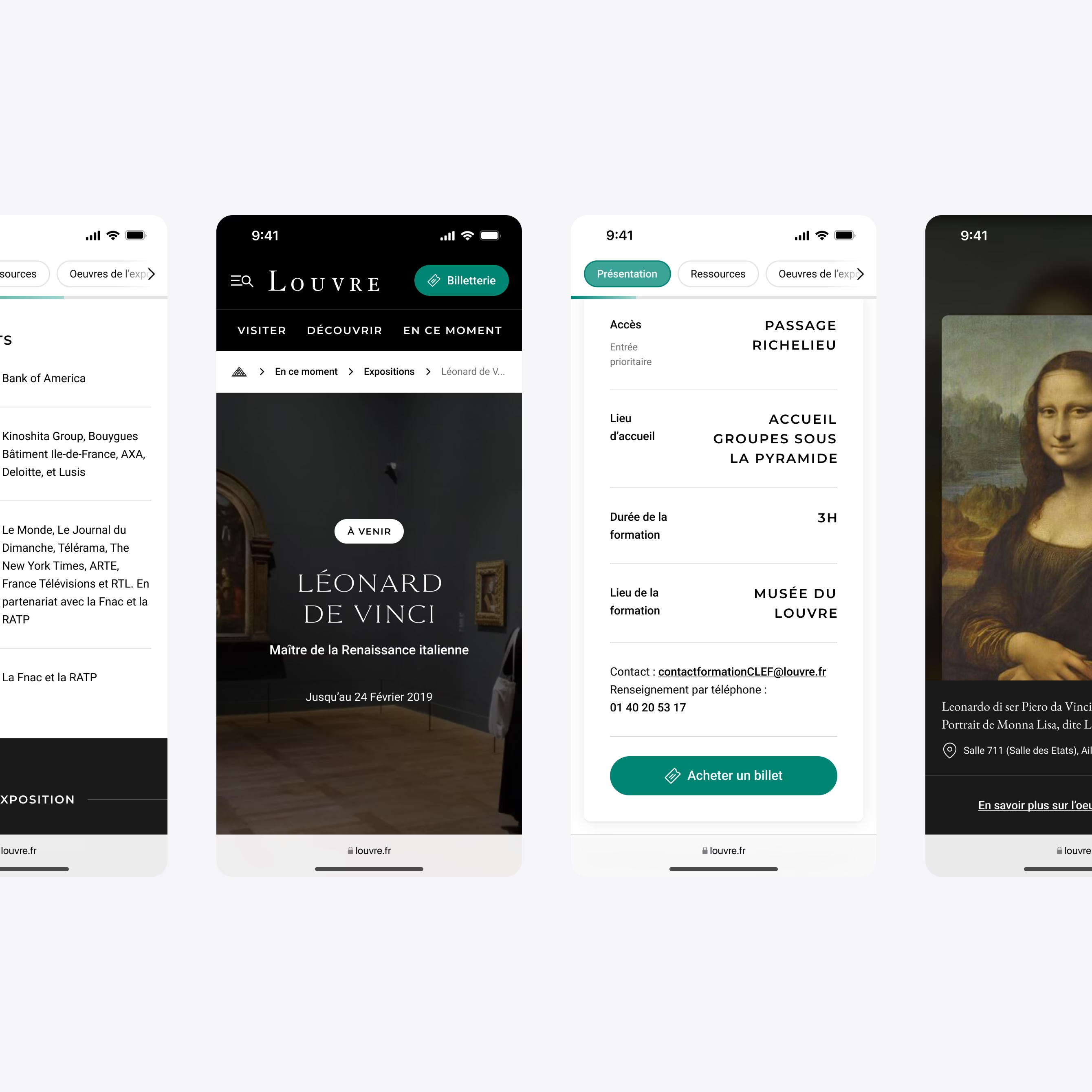
Exhibition pages become modular landing pages & cultural resources thanks to the creation of a UI component library, allowing Louvre teams to accommodate a wide variety of contributions.
Information is organized hierarchically, from the introduction to practical details: what, where, how, when.
This approach aims the visitor to 'take the leap' whle maximizing the clarity of information and making it relevant to their goals.
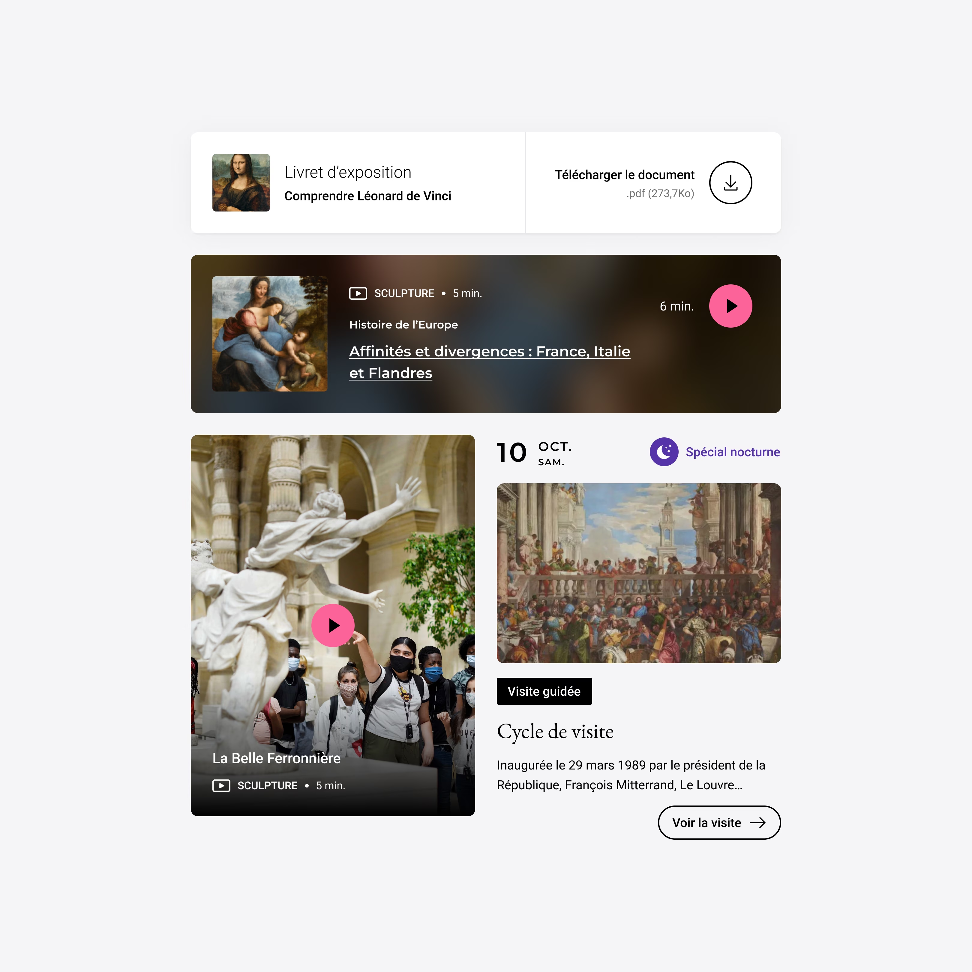
The design system (Figma + Storybook + Code), coupled with close collaboration with the front-end team, was a key factor in the project's success. The use of templates and extensive collaboration enabled rapid development and delivery of the project well ahead of schedule.
The design system anticipates future updates and supports sustainable development.
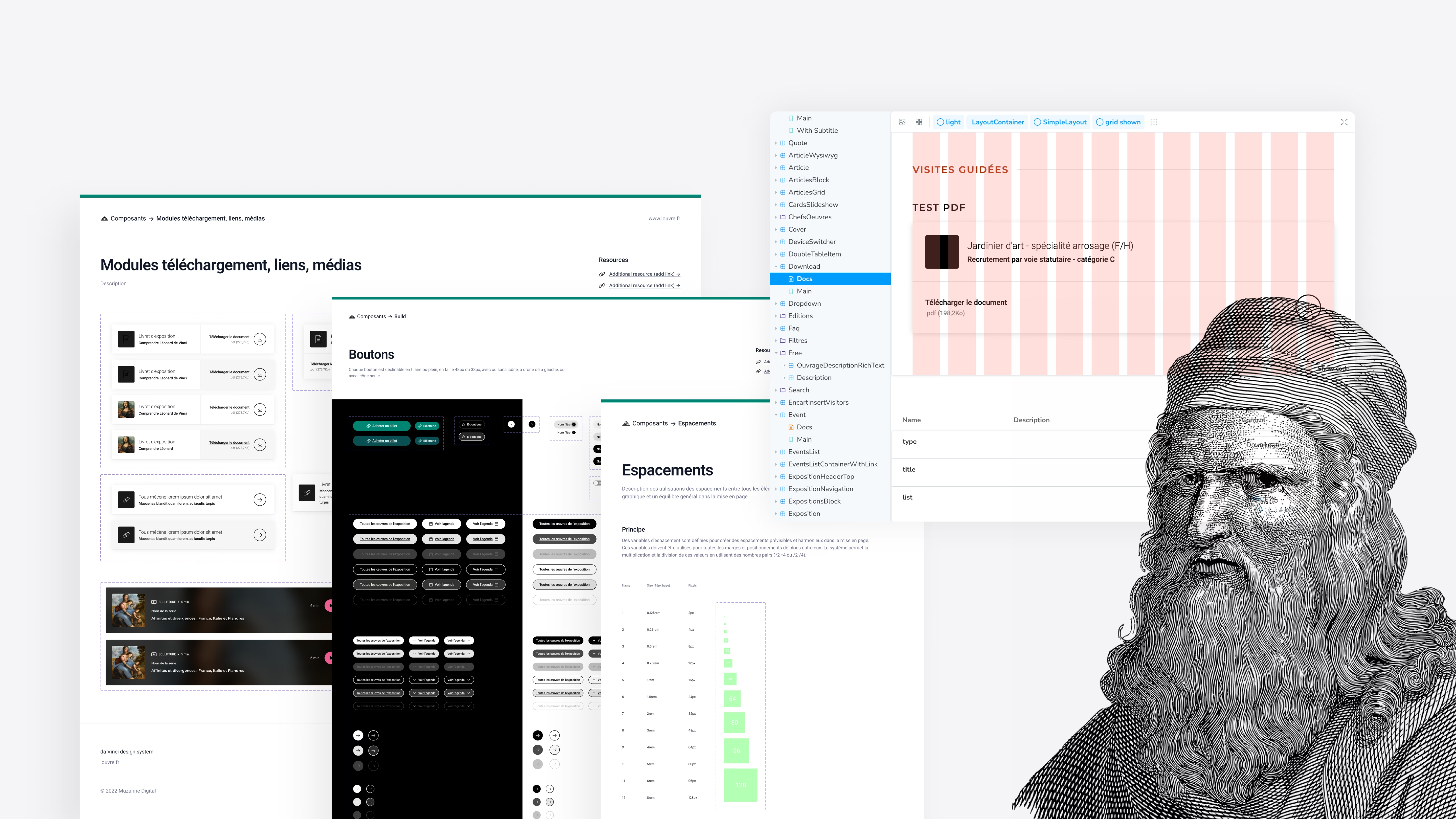
We have created a solid and comprehensible ecosystem to facilitate evolution in the coming years.
A goal achieved: to approach updates and the roadmap of this new cultural product serenely, allowing us to involve visitors in the day-to-day project more effectively.
What shareholders saw during sprints matched what has been shipped on production
Highest score for a museum in France
From Sprint 1 to Sprint 7 with agile methodology and design system
It has never happened before in our agency
Louvre Museum reconducted the contract in 2024, proving their trust in the agency's commitment for quality
By contacting me, I will provide you the full story
through a presentation deck that covers how I got there.